| Author |
 Replies: 59 / Views: 5,705 Replies: 59 / Views: 5,705 |
|
Pillar Of The Community
Australia
2156 Posts |
|
|
Here's a few questions on early Finnish stamps. (1) This seems to be Scott# 42 (1889), but it's an unlisted gray-blue shade very different from the regular ultramarine and dark blue shades. Does anyone with access to a Facit - or other specialised - catalogue know if a gray-blue variety is listed? 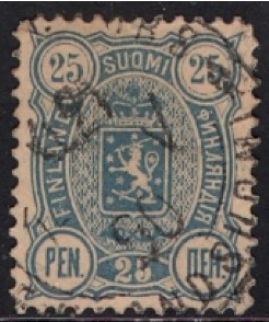 (2) Another shade question: this is probably Scott# 26 (1881), but it's a very unusual shade, somewhere between pink and orange. Pink grapefruit, perhaps! Does anyone know if a shade like this is listed? 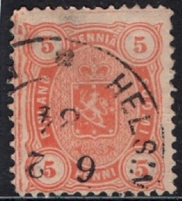 (3) This seems to be Scott# 41 (1889), but it's an unlisted example with rough perfs. In some Scandinavian countries, Norway and Denmark I think, early stamps with rough perfs are extremely valuable. I'm not sure if this would be the case here of course, but it's worth asking the question. Does anyone with access to a Facit - or other specialised - catalogue know if a rough perf variety of this stamp is listed? 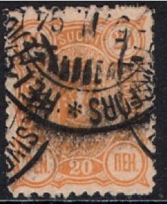 All assistance greatly appreciated, not least because there's a dearth of specialised information about Finnish stamps available online. |
|
Send note to Staff
|
| Edited by jimjamtwo - 04/25/2011 01:17 am |
|
|
|
|
Bedrock Of The Community
United States
12128 Posts |
|
|
Although I have absolutely no expertise in stamps from Finland, I'll take a stab at responding to the first stamp you scanned just to see where it goes.
You have indicated you believe that stamp to be Scott #46, which is a perf. 12.5. It may be you are correct, it just looks like it might be the later reprint Scott #63 with a perf. of 14 x 13. Also, regardless of whether it is a #46 or #63, noted to be ultra is color, both carry color varieties known as #46a and #63a as blue in color (not dark blue), which could possibly be reflecting the stamp you have scanned.
This is just an amateur's attempt to help you out with your question. Others on this site may be able to give you more comprehensive information. |
Send note to Staff 
|
| Edited by wt1 - 04/25/2011 02:08 am |
|
|
Pillar Of The Community
Australia
2156 Posts |
|
|
I appreciate you taking the time to look it up, wt1! I'm very much an amateur myself when it comes to Finnish stamps, and I'd assume that there aren't many people around who are knowledgeable on this subject.
Anyway, this stamp (the first one) is definitely perf 12.5 and it's by no means blue - it's actually a little grayer than it looks in the scan.
What shade do you have for #46a?
|
|
Send note to Staff
|
|
|
Pillar Of The Community
United States
6756 Posts |
|
|
Quote:
(1) This seems to be Scott# 42 (1889) Known color shades for perf 12.5 (Facit color definitions): blue, greenish blue, dull greenish blue, ultramarine blue, dark ultramarine blue, dull ultramarine blue, bluish ultramarine, dull blue, bluish ultramarine, clear ultramarine, dark ultramarine, indigo (black violetish blue), dark ultramarine, grayish blue (big lion variety) Hard to tell color varieties on screen. But you probably have one of the "dull" color varieties. Quote:
(2) Another shade question: this is probably Scott# 26 (1881) orange, yellow orange, yellowish orange, reddish orange, brown orange, orange yellow, brownish yellow, yellow orange, dull orange yellow, yellowish orange, red orange, pale orange (salmon red) Quote:
This seems to be Scott# 41 (1889), but it's an unlisted example with rough perfs. Facit mentions the rough perfs among 4 different perforation varieties, but does not have a separate listing for the rough perf for this set. I'm not convinced you have the rough perf variety -- to me, it looks more like it is worn pins. On the rough perfs, the teeth/holes are poorly defined throughout. My opinion. |
|
Send note to Staff
|
|
|
Pillar Of The Community
Australia
2156 Posts |
|
|
Thnaks, khj - that's a lot of colours!
It seems that each colour doesn't warrant a separate catalogue number?
In the first case, grayish blue is definitely the right one. Thanks for letting me know that it's a listed variety.
As for the stamp with rough perfs, I probably need to flip it over so you can see the perfs properly. I'd probably need to see a visual comparison myself between stamps with worn pins and ones with rough perfs.
Thanks for taking the trouble to look the stamps up! |
|
Send note to Staff
|
|
|
Pillar Of The Community
United States
6756 Posts |
|
|
Quote:
grayish blue is definitely the right one If I read the Facit correctly, the grayish blue occurs on the "big lion" variety. I don't think you have the big lion variety; that is why I suggested that is more likely one of the "dull" color varieties. Your stamp paper is not white at all. If your paper is toned, it will affect how the ink color is perceived. I would think the grayish blue would be a lot more "grayer" than what is shown in your pic. But remember, I'm not good with distinguishing color shades. |
|
Send note to Staff
|
|
|
Pillar Of The Community
United States
6756 Posts |
|
|
Quote:
It seems that each colour doesn't warrant a separate catalogue number? In the Facit catalog, a small letter ID is usually appended to the main catalog number for the MINOR color/perf varieties. In some cases (such as the rough perf variety for your 20p stamp, a minor catalog ID is not even assigned. |
|
Send note to Staff
|
|
|
Pillar Of The Community
Australia
2156 Posts |
|
|
khj, it is grayer than the scan suggests, a point I mentioned earlier in the thread. It could possibly be perceived as dull gray ultramarine, but that's about as far as I could go in search of an alternative.
Regarding the paper, it does seem to be somewhat toned.
Am I correct in saying that the shades you list are not each assigned a catalogue number of their own? If there's no differences in CV, then the matter is of no importance.
In any case, I have three more queries for you, if you have time to look. Please stay tuned!! |
|
Send note to Staff
|
|
|
Pillar Of The Community
Australia
2156 Posts |
|
|
(4) I think this one is Scott# 134 (swastika watermark). It's on very thin paper. Is a thin paper variety listed in Facit? 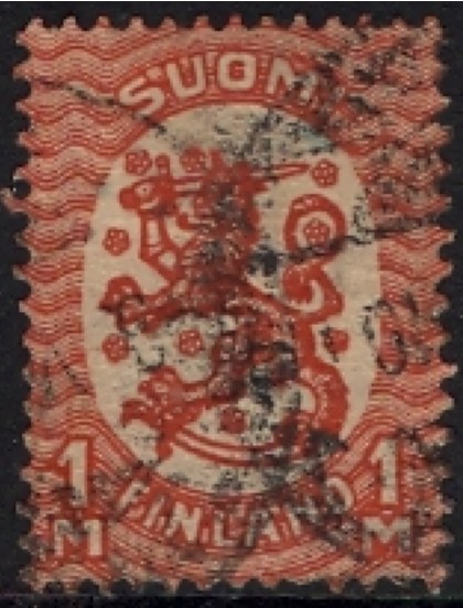 (5) This one (Scott# 80) is on vertically laid paper. Is a laid paper variety listed in Facit? 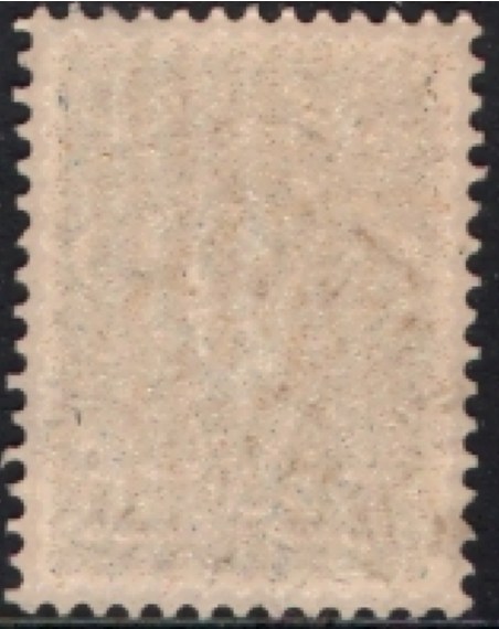 (6) Last, this stamp has an interesting numeral cancel. It just reads '2048.' Does anyone know what these cancels were about? 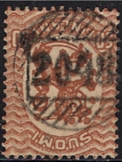 |
|
Send note to Staff
|
|
|
Pillar Of The Community
United Kingdom
3211 Posts |
|
|
Hi Kim,
I also tried looking up the listed shades of the 25p perf 12½ but gave up when I found the second entry for "bluish ultramarine". Is this a typo or am I missing something in the listing that distinguishes the two? |
|
Send note to Staff
|
Nigel |
|
|
Pillar Of The Community
Finland
753 Posts |
|
|
As a native Finn, I'm quoting Finnish Norma specialized catalog: Quote:
(1) This seems to be Scott# 42 (1889), but it's an unlisted gray-blue shade very different from the regular ultramarine and dark blue shades. This value has 11 main shades, and a bunch of additional subcolors. As the release date of each print (and usually the color) is known, spotting the year/date on cancel is the easiest trick to "weed out" non-matching prints off the list . Can You spot the year/date of cancel? Quote:
2) Another shade question: this is probably Scott# 26 (1881), but it's a very unusual shade, somewhere between pink and orange. Pink grapefruit, perhaps! Does anyone know if a shade like this is listed? This type is equally notorious for having tons of shades, and being very easy for changelings (caused by water & sunlight; the ink used on these stamps is very prone to sunlight). Usually these are identified accurately based on postmark + known plate variations. Quote:
(3) This seems to be Scott# 41 (1889), but it's an unlisted example with rough perfs. In some Scandinavian countries, Norway and Denmark I think, early stamps with rough perfs are extremely valuable. I'm not sure if this would be the case here of course, but it's worth asking the question. Does anyone with access to a Facit - or other specialised - catalogue know if a rough perf variety of this stamp is listed? These are very common with this value. Catalog values range from 0.50-4 depending on specific shade. Quote:
(4) I think this one is Scott# 134 (swastika watermark). It's on very thin paper. Is a thin paper variety listed in Facit? On general, finnish collectors are not that much into thin vs. thick paper discussion; and catalogs pretty much disregard thickness issues. The handbook for type-1917 however does provide "generic" overview of know paper variations, but these have "interest" only for highly specialized collectors. Quote:
5) This one (Scott# 80) is on vertically laid paper. Is a laid paper variety listed in Facit? If this is a used stamp, then I think this is just gum remainder. Give the stamp a good wash in warm water (and rinse the glue away with fingers), and it will become normal paper. Quote:
(6) Last, this stamp has an interesting numeral cancel. It just reads '2048.' Does anyone know what these cancels were about? This one's a rural cancel. These are somewhat common. |
|
Send note to Staff
|
|
| Edited by scb - 04/25/2011 11:28 am |
|
|
Pillar Of The Community
United States
6756 Posts |
|
|
Hiya, Nigel!  Quote:
I also tried looking up the listed shades of the 25p perf 12½ but gave up when I found the second entry for "bluish ultramarine". Is this a typo or am I missing something in the listing that distinguishes the two? Nigel's question refers to Finland #31cc and #31d in the Facit catalog. Both are listed as "bluish ultramarine". #31d is from the 4th printing/plate, while #31cc is from the 3rd printing/plate. Because the "cc" suffix is used, you have to get the basic printing info from #31c (which states it is from the 3rd printing). Although Facit sometimes provides some info on the more popular varieties, in most cases you have to go to more specialized books to learn how to ID the different printings. I do not have those references (which is probably fortunate for me). |
|
Send note to Staff
|
|
|
Pillar Of The Community
Australia
2156 Posts |
|
|
scb, regarding (1), it's hard to be definite, but I think the date is 1890.
Regarding (5), the stamp has been washed. It's definitely laid paper, not gum residue.
Thanks so much for your input!
|
|
Send note to Staff
|
|
|
Pillar Of The Community
United States
6756 Posts |
|
|
Great replies, scb!
I do not see a laid paper variety for stamp 5. If it were vertically laid paper, those shadows should extend all the way to the stamp edge. It looks more like the stop before reaching the perforations. Or maybe I don't see it that clearly in the pic.
Paper thickness varieties in Facit are usually only listed for the earliest issues.
Yes, those are all considered minor color varieties, so they do not have their own MAJOR catalog numbers in Facit. Most of the minor color varieties carry no additional (or very small) premium. There are a small number that have a major premium, but those are usually associated with the plate rather than the actual color.
The color IDs in Facit tend to be extremely subjective (my opinion). As scb noted, often deciphering the cancel date is very useful for eliminating color shades, as most of these color shades are associated with a specific printing/plate. |
|
Send note to Staff
|
| Edited by khj - 04/25/2011 11:33 am |
|
|
Pillar Of The Community
Australia
2156 Posts |
|
|
khj, the shadows do extend all the way from the top to the bottom of the stamp.
You can just see the vertical lines more clearly where the printed design of the stamp exists. |
|
Send note to Staff
|
|
|
Pillar Of The Community
Australia
2156 Posts |
|
|
Replies: 59 / Views: 5,705 |
|


