| Author |
 Replies: 353 / Views: 58,898 Replies: 353 / Views: 58,898 |
|
|
|
Valued Member
Canada
305 Posts |
|
|
Valued Member
United States
188 Posts |
|
|
I just managed to fill all these holes in my Canada album and thought I would share a pic. There is a mix of used and mint, but all-in-all not a bad group...for me. 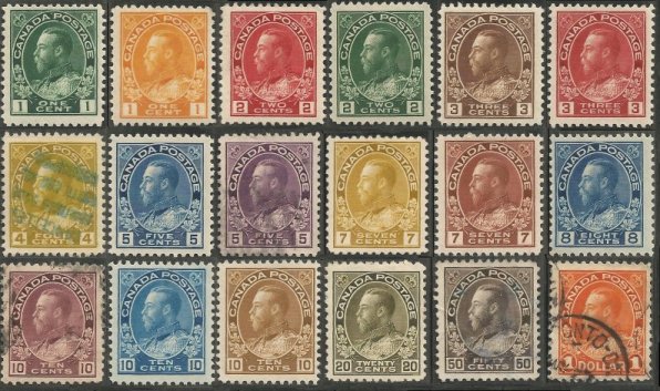 This is my first attempt at embedding an image. Hope it works! Not sure what the green cancel on the 4-cent is about - any ideas? Al |
Send note to Staff 
|
|
|
Valued Member
United States
86 Posts |
|
|
Excellent set of Admirals BreefmackUSA! I am striving to accomplish what you have done myself. Congratulations, they are beauties! |
|
Send note to Staff
|
|
|
Valued Member
United States
188 Posts |
|
|
Thanks fjrosetti! Here's a blow-up of that #110: 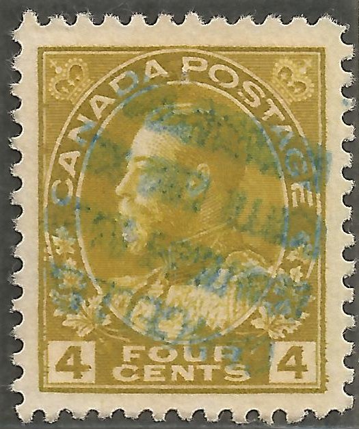 I'm going to try retroReveal on it when I get a chance and see if that will bring up the readability at all. Al |
|
Send note to Staff
|
|
|
Valued Member
United States
86 Posts |
|
|
Valued Member
Canada
124 Posts |
|
|
The cancel is upside down... On the last line (first when turned over), it is written "CANCELL?"... but I cannot read the rest, to fuzzy. Could it be a revenue usage??? |
|
Send note to Staff
|
|
|
Valued Member
United States
188 Posts |
|
|
I still haven't been able to figure it out either Pepere_jack! I ran it through retroReveal and got these images, but I still can't make it out. I think I see an "E" at the end the first line - like "CANCELLE" and I think I see the word "With" on the third line. You're right though it is upside-down. I rotated these 160-degrees to the right: 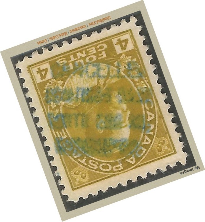 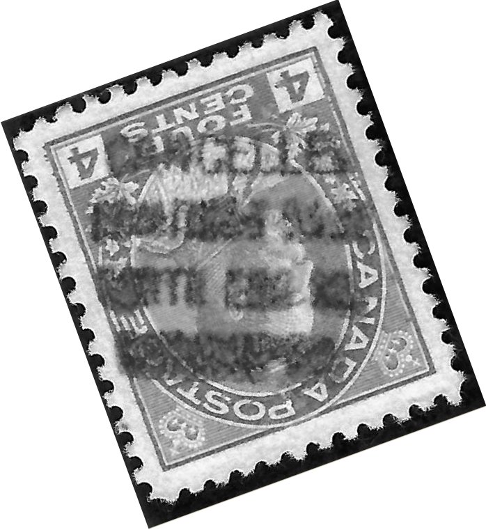 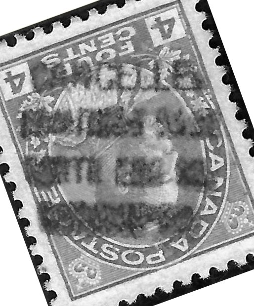 I don't think I have any other Canadian stamps with a text-only cancellation - or in greenish-blue for that matter. Al |
|
Send note to Staff
|
|
|
Pillar Of The Community
Canada
644 Posts |
|
|
My guess is that it's a fiscal (revenue) cancel as mentioned. Someone may have an answer, or have something similar. The coloured ink also makes me think is revenue cancelled. |
|
Send note to Staff
|
|
|
Valued Member
Canada
124 Posts |
|
|
This is what I get by playing with HUE and SATURATION starting from the first picture you gave.  The result is pretty fuzzy as the original picture was fuzzy also. |
|
Send note to Staff
|
|
|
Valued Member
United States
188 Posts |
|
|
Wow.
That's probably about as good as anybody would be able to get, but I'm still drawing a blank - just too much pressure and smear to ever know for sure I guess unless somebody else has something similar. I liked the centering on this stamp, but if it is a revenue usage maybe I will keep my eyes open for a mint copy to replace it with.
Thanks for the effort anyhow - great job!
Al |
|
Send note to Staff
|
|
|
Valued Member
United States
188 Posts |
|
|
...and now for something completely different: I picked this one up not too long ago and when it came in and I scanned it, I got a little concerned with the perfs. 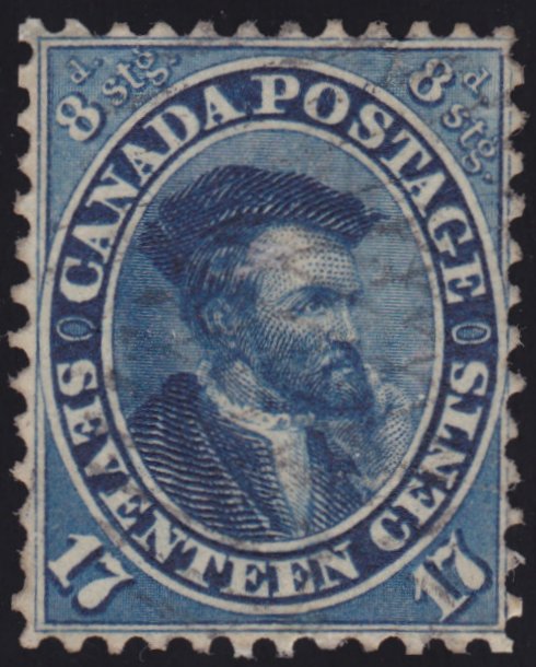 Is it me? Al |
|
Send note to Staff
|
|
|
Valued Member
Canada
305 Posts |
|
|
Nice stamp ! Top and bottom perfs look fine but yeah, both sides raise questions.
Nice ink pull on the 4 cent admiral ! |
|
Send note to Staff
|
|
|
Valued Member
United States
188 Posts |
|
|
Thanks Coriandre!
Yes, the upper-left and lower-right look like there was some cutting done and the sides are just beat-up - but its mine and I guess I'll just keep it for now!
Al |
|
Send note to Staff
|
|
|
Valued Member
United States
188 Posts |
|
|
Don't know if these are classified as "Classics", per-se, but how about some Special Delivery? 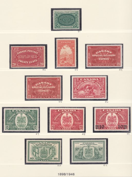 E1: 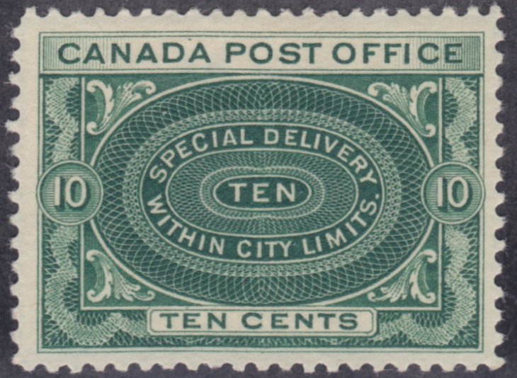 E2: 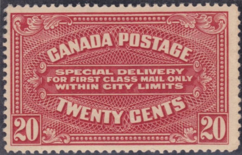 E3 (my favorite): 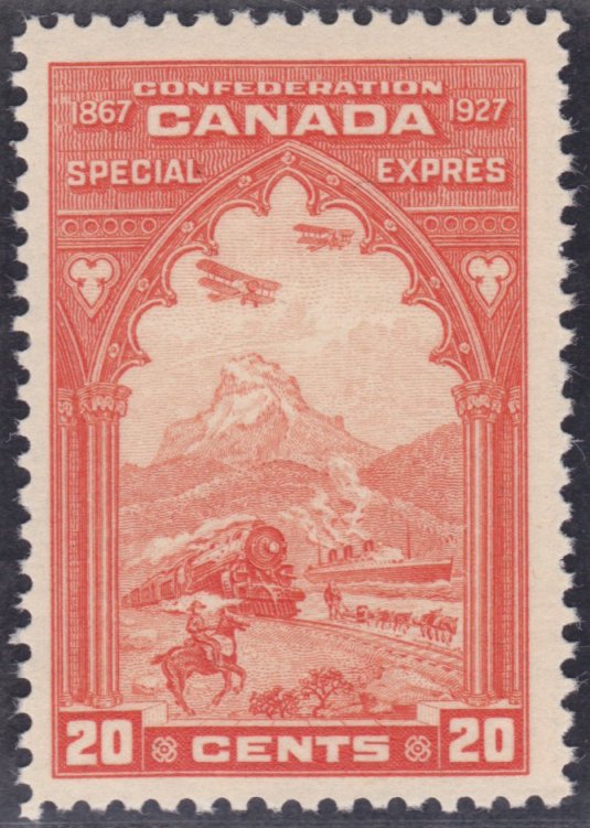 E4: 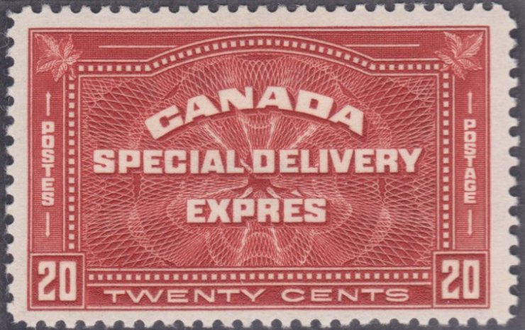 E5: 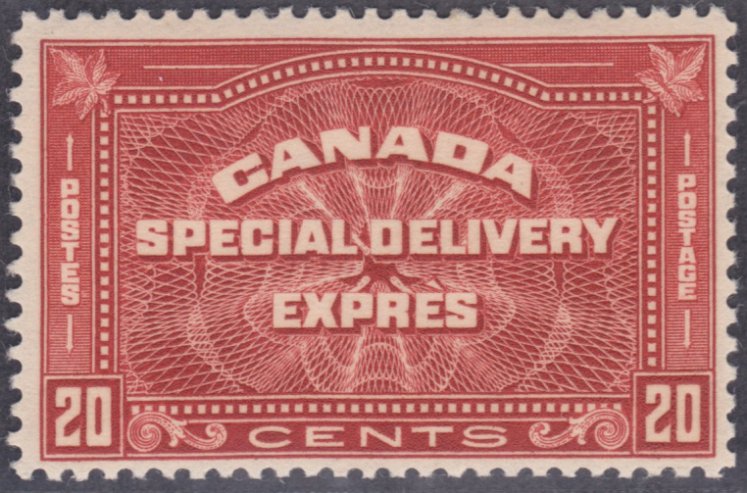 E6: 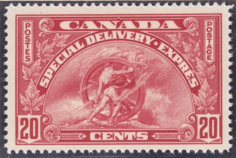 E7: 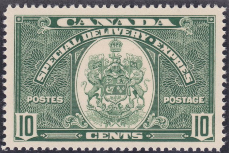 E8: 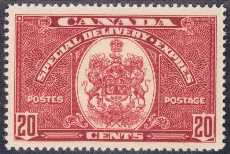 E9: 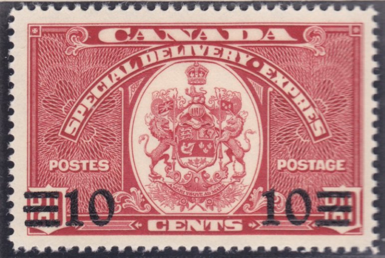 E10: 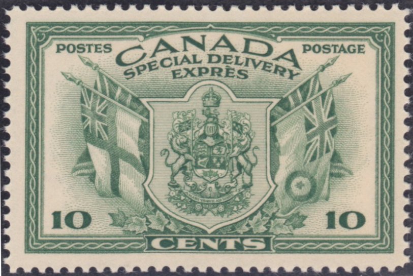 E11: 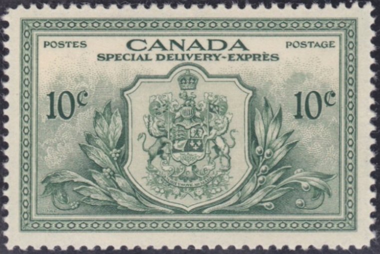 These are all NH except for E1 & E4 (glad I don't need them today!). Al |
|
Send note to Staff
|
| Edited by BreefmackUSA - 02/07/2014 6:36 pm |
|
|
Valued Member
Canada
242 Posts |
|
|
Replies: 353 / Views: 58,898 |
|


