| Author |
 Replies: 103 / Views: 15,324 Replies: 103 / Views: 15,324 |
|
|
|
Pillar Of The Community

United States
3046 Posts |
|
|
Mystic has no images up for 2012. But for 2011 and older, there's a great resource there just to suck down stamp images. |
Send note to Staff 
|
|
|
Pillar Of The Community
United States
2941 Posts |
|
|
Here's the latest.  What I've done with the photo source is to give you an option -- local or Mystic. If you choose local, it will look to the local filepath given in the master table. If it doesn't find one, it will look to Mystic. Vice versa if you choose Mystic. If it can't find a photo in either, it will notify you of the error, and identify which stamp it was unable to find. There are two catches -- one that I'm working on, and the other I can't control: 1. If there's a local filepath listed in the master table but the file's not actually there, it still kicks an error. I'm working on that. 2. Your catalog numbers in the master table have to match Mystic's file naming convention. Namely, sets should be 4440-43, not 4440-4443. |
|
Send note to Staff
|
|
|
|
Pillar Of The Community
United States
3046 Posts |
|
|
Saying "You Rock" doesn't even begin to describe how cool I think this is. I'm going to put Windows 7 and 32-bit Office 2010 Professional Plus on my laptop (bye, Ubuntu. I'll miss you!), just so I can play with this! |
|
Send note to Staff
|
|
|
Pillar Of The Community
United States
978 Posts |
|
|
Hi PostmasterGS
Great job!
A couple of questions.
Why does the output have to pile up on each other? Is there no way to get the "block size" of the output from Publisher? If so it should be pretty easy to put the next output "block" nn mm away. What I mean by "block size" is the maximum width of the top caption, image or bottom caption.
I did this in WORD by using a 1 cell table. I then put everything in the table. I used a table cell because I needed vertical justification which, in WORD, you can only do in a table cell.
What does the text look like if you use "justified" instead of "center"?
Again, nice job!
Jerry B |
|
Send note to Staff
|
|
|
Pillar Of The Community
United States
2941 Posts |
|
|
Aligning the blocks off of the previous could be done, but it's a lot of coding to keep multiples from exceeding the page dimensions, and I didn't have an opportunity given the time limitations.
Justified is flush left and right. |
|
Send note to Staff
|
|
|
|
Pillar Of The Community
United States
978 Posts |
|
|
Hi PostmasterGS
I agree that it is a lot given a short time. You've do a lot as it is.
To fit in horizontal wasn't too bad but since I did it in WORD vertical was a pain because of headers and footers. Later a friend told me to just create a table for the whole page using autofit to window and calculating how many rows between header and footer. I guess it pays to read the book.
Jerry B |
|
Send note to Staff
|
|
|
Pillar Of The Community
United States
3046 Posts |
|
|
So, what are people's preferences for album page layouts? I'm trying to lay out 2012 by release date, and it just looks like crap. They released so many darn stamps that it's almost impossible to lay out the pages well.
So, I was thinking of going to the White Ace route and laying them out alphabetically.
I definitely WANT to mix commemoratives, definitives, air-mail and semi-postal. I see no point to back of book sections. All stamps from the same year should be mounted together in my opinion. |
|
Send note to Staff
|
|
|
Pillar Of The Community
United States
978 Posts |
|
|
Hi apastuszak Quote:
I definitely WANT to mix commemoratives, definitives, air-mail and semi-postal. I see no point to back of book sections. All stamps from the same year should be mounted together in my opinion. If a set contains air mail issues and/or registered overprints I will place everything together. Other than that I have air mail only and back-of-the-book only pages. I suggest modifying your thoughts and do it that way, especially in the US where everything separated is the norm. Quote:
So, I was thinking of going to the White Ace route and laying them out alphabetically. Alphabetically, to me, makes no sense. It will still be "just looks like crap". I lay out everything by issue date. Quote:
So, what are people's preferences for album page layouts? I'm trying to lay out 2012 by release date, and it just looks like crap. They released so many darn stamps that it's almost impossible to lay out the pages well. I have some pages where every stamp is a different size. It is possible to lay out pages like that so that it is pleasing to the eye. It is just a matter of lining up stamp centers, horizontally and vertically. I ignore the tops. I wish I had a scanner so that I could show you a page or two. Before I put stamps to paper I lay out the stamps, in mounts, on a blank piece of paper. Once I have a pleasing arrangement, I put the stamps on a manila stock sheet in the same relative position. I remove each stamp from the mount, leaving the stamp "in position", and place the mount on the page in the desired position. Once the mounts are placed and "dry", I then insert the stamps. It sounds like a lot of work but once one gets used to this method it is really not all that bothersome. Question. Once you have the "stamp blocks" that PostmasterGS produced for you, what software are you using to place the blocks and once finished to print the page? I am assuming MS Publisher. If so you can do alignments and distribution of the blocks pretty easily Just some thoughts on your comments. Jerry B |
|
Send note to Staff
|
| Edited by jbcev80 - 06/29/2012 10:51 am |
|
|
Pillar Of The Community
United States
3046 Posts |
|
|
Pillar Of The Community
United States
3046 Posts |
|
|
So, I can make Commemorative, Definitive, and Air Mail pages. The, since I hate BOB sections, I can just put all the pages next to each other. Others that DO like BOB, can take the Air Mail and Semi-Postal stamp pages and stick them in the BOB if they chose to do so. That might be a good compromise, and make it easier to lay the pages out. |
|
Send note to Staff
|
|
|
Pillar Of The Community
United States
978 Posts |
|
|
Hi apastuszak
Let's try this with the page you displayed.
=====================================================
1. Move John H. Johnson up a little.
2. Vertically center the blocks Dogs At Work and John H. Johnson on Bonsai. May have to adjust Bonsai up or down.
3. Move Year of The Dragon and Heart Health vertically unitl the spacing is about the same as Dogs At Work and John H. Johnson.
4. Vertically center the blocks Year of The Dragon and Heart Health on Bonsai.
5. Horizontally and Vertically center all the blocks together on the page.
=====================================================
I hope the above makes sense. The result should be eye appealing and not so random.
If you wish, email the 5 images, separately, and I can move them and show you visually. E-mail to jerrybemail-stamps "at" yahoo "dot" com.
Jerry B |
|
Send note to Staff
|
| Edited by jbcev80 - 06/29/2012 1:11 pm |
|
|
Bedrock Of The Community
United States
12128 Posts |
|
|
Just an observation on my part, but is there any reason why the text below the stamps have to be larger than the box for the stamps themselves? I am looking at your latest page, and while it looks nice, my eye keeps getting drawn to the text under the "Dogs at Work" and "Year of the Dragon" stamps. The bottom text below these two stamps run right into the page border and doesn't look quite right (at least to me). There seems to be more than enough room that you could adjust these margins so that there would be at least a little "white space" between the text and the overall page border that would be a bit more visually pleasing.
I would make a similar comment about the use of the phrase "Postage Stamps Of" at the top of the page, as that, too, is too close to the top page border that it just doesn't look quite right. I'd tend to think about removing that phrase altogether, as "United States of America" is certainly sufficient to identify the page, and it's pretty much a given that the page is for postage stamps.
Finally, it looks like you missed the punctuation period (.) after the "H" in "John H. Johnson".
I don't mean to criticize; it's your stamp album page, so do with it as you please. These are just my observations for whatever they're worth.
|
|
Send note to Staff
|
|
|
Pillar Of The Community
United States
3046 Posts |
|
|
All observations are good! Let me go make all these changes and see how it looks |
|
Send note to Staff
|
|
|
Pillar Of The Community
United States
3046 Posts |
|
|
Ok, I follow your instructions and it just didn't look right to me. I tinkered some more, and came up with this, which is better, but still sucks.  |
|
Send note to Staff
|
|
|
Bedrock Of The Community
United States
12128 Posts |
|
|
I like the earlier version better, where the Bonsai stamps are centered on the page. I know we can all be armchair critics on this sort of thing, but this is what I had envisioned: 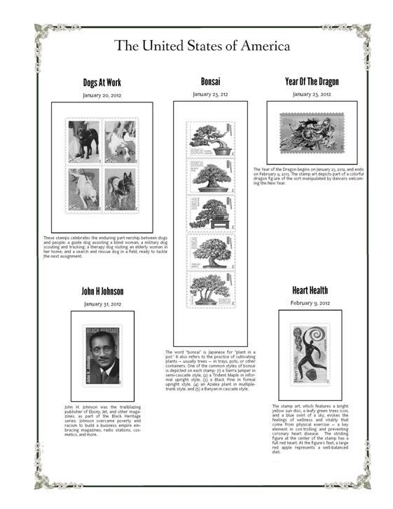 |
|
Send note to Staff
|
|
|
Replies: 103 / Views: 15,324 |
|


