| Author |
 Replies: 57 / Views: 12,415 Replies: 57 / Views: 12,415 |
|
|
|
Valued Member
Canada
94 Posts |
|
|
I nominate #858, the composers from the O Canada Centenary issue of 1980. Another weird psychedelic portrayal of some portraits that just don't seem to do the subject justice. I omitting it's se-tenant counterpart, #857, because the injustice doesn't seem as severe to depict the bars of music in a colourful motif. #858 (image borrowed from the Canadian Postal Archive) 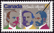 |
Send note to Staff 
|
|
|
Pillar Of The Community
United States
816 Posts |
|
|
THat is pretty bad. Total lack of imagination. |
|
Send note to Staff
|
Member of the Central Oregon Stamp Club.
Redmond, OR 97756 Mailer's Postmark Permit #1
APS 239403 |
|
|
Pillar Of The Community
Canada
652 Posts |
|
|
I have to disagree studystamps. Jean Paul Riopelle is my number one favourite Canadian artist. |
|
Send note to Staff
|
|
|
Pillar Of The Community
Canada
6525 Posts |
|
|
Here's the set I referred to earlier. Canada's Supernatural Series from 1997. These are scanned from the Unitrade catalogue, because I wouldn't even have these in my house! 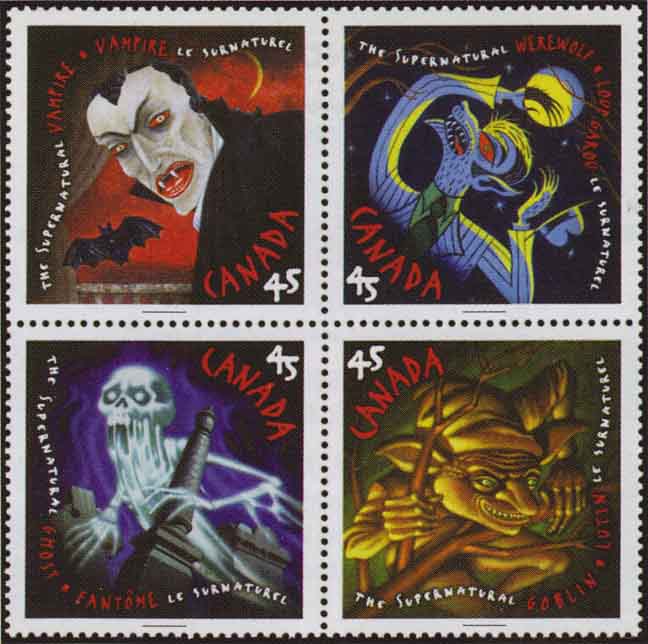 |
|
Send note to Staff
|
|
|
Pillar Of The Community
United States
521 Posts |
|
|
I like the ghost and goblin ones, and I can deal with the werewolf, but that vampire is just TACKY. |
|
Send note to Staff
|
|
|
Pillar Of The Community
669 Posts |
|
|
I just flipped through images of Canadian stamps in the pages of Scott's and Canada has put out a fair share of "ugly" stamps. One of the reasons there aren't that many in my collection. |
|
Send note to Staff
|
|
|
Pillar Of The Community
United States
7075 Posts |
|
|
Everyone is talking about the Riel stamp, but no one is showing it. 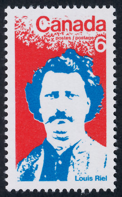 [Borrowed, because I've done no sorting at all on modern Canada.] Not great, but I think worse has already been shown. I didn't like the $2 QEII when it was released, but it has grown on me a bit. Looks better in person, too. Enlarging it does the queen no favors. My 2d. |
|
Send note to Staff
|
|
|
Valued Member
Canada
449 Posts |
|
|
Art is in the eye of the beholder.
Ok, you caught me. I admit that I do not understand art*, certainly many of the art images shown on Canadian stamps.
In particular, the Riopelle stamps. To me, those are the ugliest art stamps Canada has issued. I simply don't "get them"; nor do I intend to learn, by the way ("can't teach an old dog new tricks").
* ["Art" in this instance, is certain paintings and sculptures. Music is the same way for me; in one ear, speed up to the sound of light, then out the other ear. Both art and music are just not my forte.] |
|
Send note to Staff
|
|
|
Pillar Of The Community
Canada
6525 Posts |
|
|
Pillar Of The Community
923 Posts |
|
|
Studystamps reply was interesting. Stamps are really tiny art pieces, I guess. Chaqu'un á son goût. Riopelle must be celebrated with a "Riopelle", of course. Here is one that, for me, straddles the question: #678 (1975) 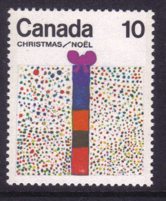 It's kid's artwork - meant to be... cutsy naïve. But, with apologies to drawer Debbie Lovely, I remember when this was issued and had no idea what it was for the longest time. So the criticism falls, not on the artists in these cases, but in the designer who chooses the material. (Oops on spelling) |
|
Send note to Staff
|
| Edited by sak - 07/17/2013 10:25 am |
|
|
Pillar Of The Community
Canada
652 Posts |
|
|
Quote:
I admit that I do not understand art Haha I was like that for a long time. I have a friend who was an art major and she explained everything to me which made me appreciate art a lot more. Art is in everything. It is not limited to paint on a canvas. It's in the design of your car, your toothbrush, your house and your cereal box. You don't have to love all art just because it's art. Some art is designed to make a statement and make you question its very existence. Just because I like Riopelle's art doesn't mean you have to like it. I would love to have one of his paintings hanging on my wall. I do not like any of Group of Seven's art so I put this out there for anyone to critique my taste in art haha |
|
Send note to Staff
|
|
|
Pillar Of The Community
United States
5894 Posts |
|
|
I am with Jamesw, that supernatural set is the worst. I rather like the Marconi stamp. |
|
Send note to Staff
|
|
|
Pillar Of The Community
Canada
1415 Posts |
|
|
Pillar Of The Community
United States
816 Posts |
|
|
Sak, Is that supposed to represent a gift???? At first glance it bordered offensive.  |
|
Send note to Staff
|
Member of the Central Oregon Stamp Club.
Redmond, OR 97756 Mailer's Postmark Permit #1
APS 239403 |
|
|
Pillar Of The Community
Canada
1415 Posts |
|
|
Replies: 57 / Views: 12,415 |
|