| Author |
 Replies: 57 / Views: 12,416 Replies: 57 / Views: 12,416 |
|
|
|
Valued Member
China
314 Posts |
|
|
There are some pretty bad ones there. I often wonder in the 70's if they knew everything was tacky but nobody had the courage to state it. |
Send note to Staff 
|
|
|
Valued Member
Canada
94 Posts |
|
|
Gilles, now that you bring it up, that is a pretty ugly stamp. Despite having a portrait in some believable colour scheme the pose, the frame, the lettering just are not aesthetically pleasing. It's just a poor design, no queation. (well IMHO) |
|
Send note to Staff
|
|
|
Rest in Peace
Canada
544 Posts |
|
|
Pillar Of The Community
923 Posts |
|
|
Yeah, that BC looks like a stack of blankets. (Yes, guykickinit, it's a polka-dotted Christmas present.) Now, if I were a close friend or relative of Margaret Lawrence, I would be pretty non-plussed with this one: #1622 (1996)  ... and writing all over her face! |
|
Send note to Staff
|
|
|
Valued Member
Canada
123 Posts |
|
|
There are many ugly stamps in my opinion as well as some really beautiful ones. Too many have been made with little thought to aesthetics. The new band stamps are an example. However, I cringe whenever I come across the #868 in my catalogue. To me it is creepy. I prefer the pre-1960s for pure artistry. |
|
Send note to Staff
|
|
|
Valued Member
187 Posts |
|
|
I think this topic is worth reviving. Share your examples of the ugliest Canadian stamps! How about roadkill squirrel  |
|
Send note to Staff
|
|
|
Valued Member
Canada
414 Posts |
|
|
The World Health Day stamp gets my vote - hate the thing and I have a whole envelope full of them; thinking of a bonfire. |
|
Send note to Staff
|
|
|
Valued Member
Canada
242 Posts |
|
|
 and 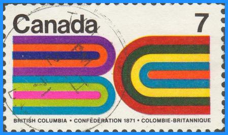 Definitely a tie between these two... I'm also not a fan of those Christmas stamps that look like wings with the middle stickers you could add. |
|
Send note to Staff
|
|
|
Valued Member
187 Posts |
|
|
Faken I agree, although I must say that beautiful CDS on the 7c is nice...Although it's like putting lipstick on a pig. |
|
Send note to Staff
|
|
|
Valued Member
Canada
242 Posts |
|
|
Some folks really put an effort in to centering that CDS :) I saw a #4 beaver the other day at CUPX 35 in mtl and the ol 7 ring bullseye cancel was perfectly centered right over the beaver lol! I cracked a joke to the dealer saying someone was sure focused on the brown beaver, didn't even crack a smile... I was booed off the stage. |
|
Send note to Staff
|
|
|
Pillar Of The Community
923 Posts |
|
|
I thought Studystamps found a real "uglie" with #2290 (2008). It looks like the aftermath of a nuclear explosion. It reminded me of the previous Francophonie stamp #1589 (1995). A very strange design, indeed - four different fonts, obscure symbolism, and two parallel brown lines 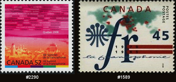 |
|
Send note to Staff
|
|
|
Pillar Of The Community
923 Posts |
|
|
Just to bump the topic along a bit. Here is a strangely deconstructed Terry Fox #915 (1982) You can almost feel the pain. 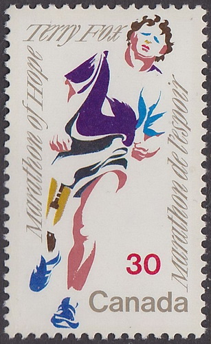 but the Post Office got the rare chance to get it right the second time with a much-improved #1824c (2000) 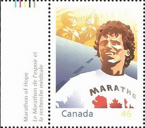 |
|
Send note to Staff
|
|
|
Pillar Of The Community
Canada
5821 Posts |
|
|
This thing here is a disgrace to the whole idea of nationhood.  I copied the image from Canadian Postal Archives Database. Thank You. Can you imagine the US printing something similar using the stars and stripes for the Fourth of July. Any 5 year old could have done this yet it took 4 people to come up with this garbage. Based on an illustration by Laurie Lafrance Designed by Jean-Pierre Veilleux, Lisa Miller, R oger Séguin
Why did Canada Post (us/we) pay good money for this crap ? Stuff like that is the reason why I stopped collecting Canadian stamps long ago. |
|
Send note to Staff
|
|
|
Pillar Of The Community
923 Posts |
|
|
I've been pretty well flyspecked to death lately on this auspicious blog and so, when I spotted the following stamp on ebay, I thought I'd revive this topic for a moment. There is a deformed-tailed Canadian symbol and two 50's hidden in this Rorschach test. (Also a white D (Design) & black C (Canadian) to complement the more obvious lower case G (Graphic)) 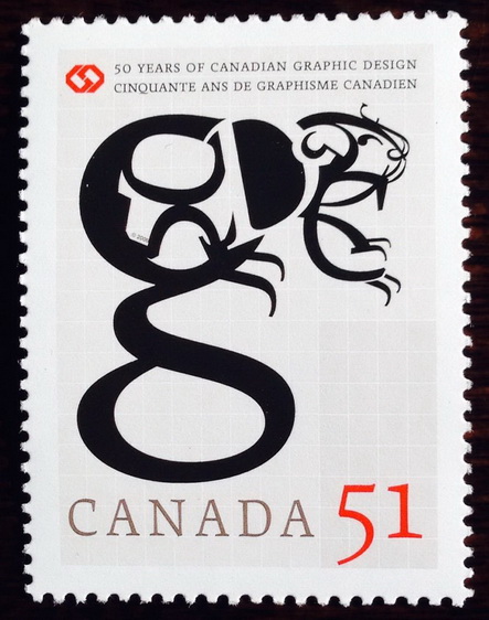 It is ironic (to me, at least) that an issue celebrating graphic design should depict such a juvenile and contrived example. |
|
Send note to Staff
|
| Edited by sak - 03/16/2014 09:46 am |
|
|
Pillar Of The Community
Canada
1415 Posts |
|
|
Replies: 57 / Views: 12,416 |
|


