Stamp Community Family of Web Sites
Thousands of stamps, consistently graded, competitively priced and hundreds of in-depth blog posts to read


Stamp Community Forum
 
Username:
Password:
Save Password
Forgot your Password?

This page may contain links that result in small commissions to keep this free site up and running.

Welcome Guest! Registering and/or logging in will remove the anchor (bottom) ads. It's Free!

3c Small Queen With Marking Ul Corner.

 
To participate in the forum you must log in or register.
Author Previous TopicReplies: 8 / Views: 1,884Next Topic  
Valued Member
410 Posts
Posted 01/24/2014   11:39 pm  Show Profile Bookmark this topic Add CoinWatcher to your friends list Get a Link to this Message
What do you make of the markings in the UL corner, kiss print or re-entry? Also looks like doubled lower frame line and tops of lettering. The 3's look doubled as well,or am I just seeing things?


https://www.stampcommunity.org/uplo...SON_opt2.jpg[/img


Send note to Staff

Valued Member
Canada
382 Posts
Posted 01/24/2014   11:49 pm  Show Profile Bookmark this reply Add gportch to your friends list  Get a Link to this Reply
Hi Coinwatcher

The post 1890 printings of the Small Queens are notorious for over inking and other sloppy workmanship. The upper left margin ink is over-inking as is the apparent doubling of the design. Sorry, but this time I think you are just seeing things.
I have been studying Small Queens for 25+ years and can assure you that you will find hundreds of inking anomalies with the 2nd Ottawa printings (all values). I believe that the general lack of quality control in this period was one of the issues leading to the award of the printing contract to the Canadian Bank Note Company for the Maple Leaf and Numeral Issues that appeared in 1898.
GJP
Send note to Staff  Go to Top of Page
Valued Member
410 Posts
Posted 01/25/2014   12:05 am  Show Profile Bookmark this reply Add CoinWatcher to your friends list  Get a Link to this Reply
Thanks GJP
Send note to Staff  Go to Top of Page
Valued Member
Canada
305 Posts
Posted 01/25/2014   01:18 am  Show Profile Bookmark this reply Add Coriandre to your friends list  Get a Link to this Reply
Kind of a over inked kiss print. The paper used seems of lower quality also
Send note to Staff  Go to Top of Page
Pillar Of The Community
3859 Posts
Posted 01/25/2014   3:27 pm  Show Profile Bookmark this reply Add jogil to your friends list  Get a Link to this Reply
It still was the American Bank Note Company (ABNC) Ottawa, Ontario which was a subsidiary of the American Bank Note Company (ABNC), New York, New York which again printed Canadian postage stamps from 1897 with the Diamond Jubilee Issue until the end of 1922 when its name was then changed to the Canadian Bank Note Company (CBNC) Ottawa, Ontario which was still a subsidiary of the American Bank Note Company (ABNC), New York, New York. This change in the name there also came along with the new introduction of dry intaglio printing that started gradually replacing wet intaglio printing, especially for the Admiral Issues and those Canadian Bank Note Company (CBNC) issues afterwards until intaglio printing was replaced many years later.
Send note to Staff  Go to Top of Page
Edited by jogil - 01/25/2014 3:31 pm
Rest in Peace
Canada
6750 Posts
Posted 01/25/2014   10:34 pm  Show Profile Bookmark this reply Add Puzzler to your friends list  Get a Link to this Reply
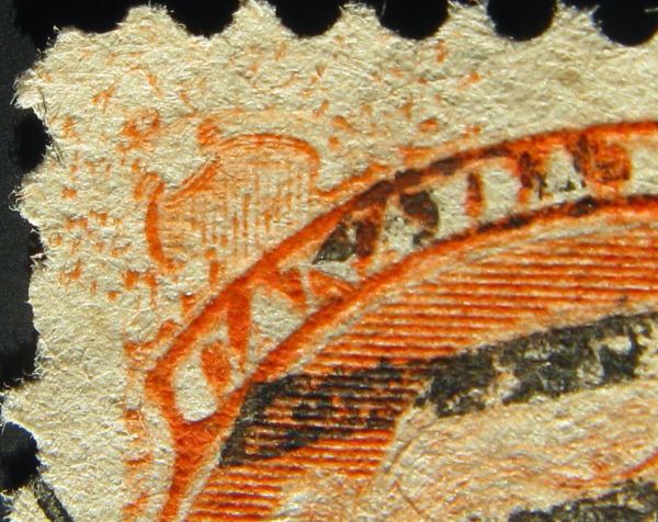
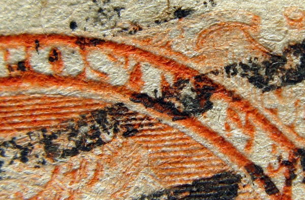
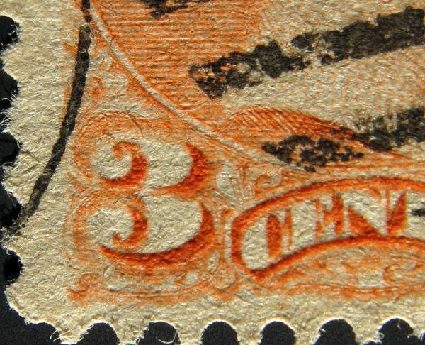
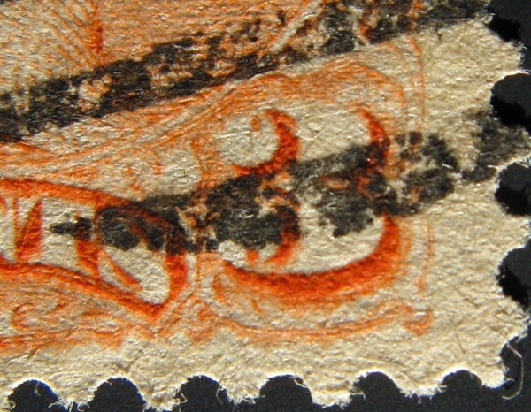
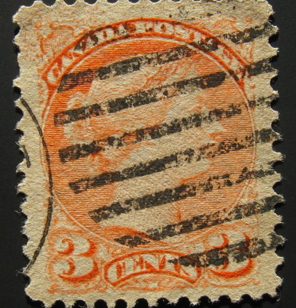
The letters are OK and the 3's are OK, over-inkng.

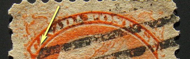
But, through the top of the C and E of CENTS and through the bottom of the first C of CANADA there are seemingly engraving cuts showing orangish ink. These would be mistakes in engraving or re-entries(?) if other stamps did not have these same varieties.


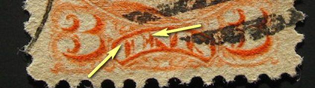
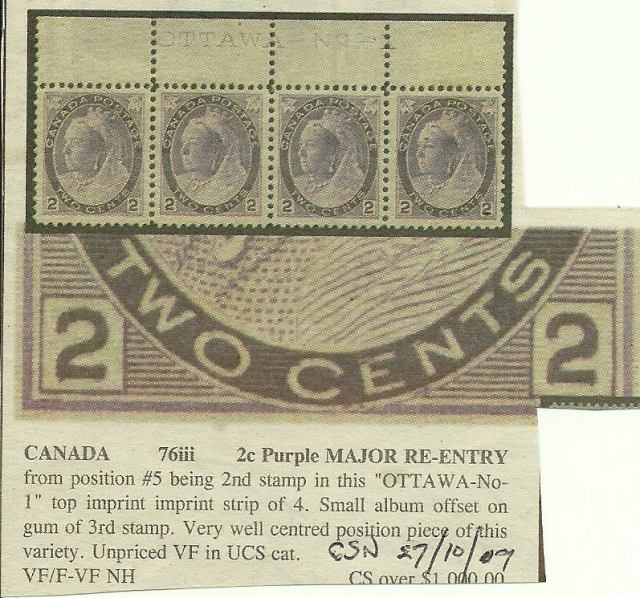
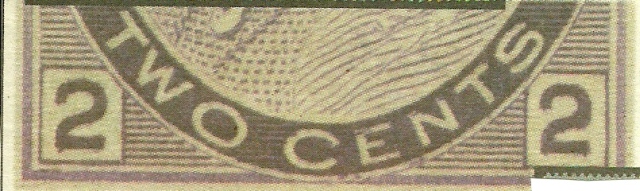
Better scans or clearer photos are need to see these clearly. Your zoomed in images are somewhat off from your zoomed out image of the entire stamp.

Your photos, nice as they are, are out of focus for such detailed work. You need to scan these at 300 to 600 dpi on a flatbed scanner to see in-focus and clear details please. Libraries have scanners at times.
Send note to Staff  Go to Top of Page
Valued Member
410 Posts
Posted 01/27/2014   12:24 pm  Show Profile Bookmark this reply Add CoinWatcher to your friends list  Get a Link to this Reply
I heard back from Bill Burden on this stamp and he said "I believe you have a very nice slip print from a dirty plate. I do not see any of the clear, sharp doubling required to indicate 're-entry'. Great stamp, but not constant."
Thanks to everyone on your opinions about this stamp.
Send note to Staff  Go to Top of Page
Valued Member
Canada
382 Posts
Posted 02/01/2014   01:57 am  Show Profile Bookmark this reply Add gportch to your friends list  Get a Link to this Reply
If Bill Burden is commenting on Small Queens, I advise readers to pay attention. He really knows his stuff!
GJP
Send note to Staff  Go to Top of Page
Pillar Of The Community
Canada
4648 Posts
Posted 02/01/2014   4:48 pm  Show Profile Bookmark this reply Add Bujutsu to your friends list  Get a Link to this Reply
While we are on the topic of re-entries, I thought I would show this clipping (not one I am keeping). This strip of 4 was offered by Saskatoon Stamps in 2009 with the imprint. You can see the re-entry in the top of the word "CENTS"

Chimo

Bujutsu


Send note to Staff  Go to Top of Page
  Previous TopicReplies: 8 / Views: 1,884Next Topic  
 
To participate in the forum you must log in or register.

Go to Top of Page

Disclaimer: While a tremendous amount of effort goes into ensuring the accuracy of the information contained in this site, Stamp Community assumes no liability for errors. Copyright 2005 - 2026 Stamp Community Family - All rights reserved worldwide. Use of any images or content on this website without prior written permission of Stamp Community or the original lender is strictly prohibited.
Privacy Policy / Terms of Use    Advertise Here
Stamp Community Forum © 2007 - 2026 Stamp Community Forums
It took 0.16 seconds to lick this stamp. Powered By: Snitz Forums 2000 Version 3.4.05