| Author |
 Replies: 8 / Views: 2,102 Replies: 8 / Views: 2,102 |
|
|
Rest in Peace
United States
7097 Posts |
|
|
F.D.C. U.S. Scott #1015- 3¢ Newspaper boys - released on October, 4th, 1952.
Thank you Gary.
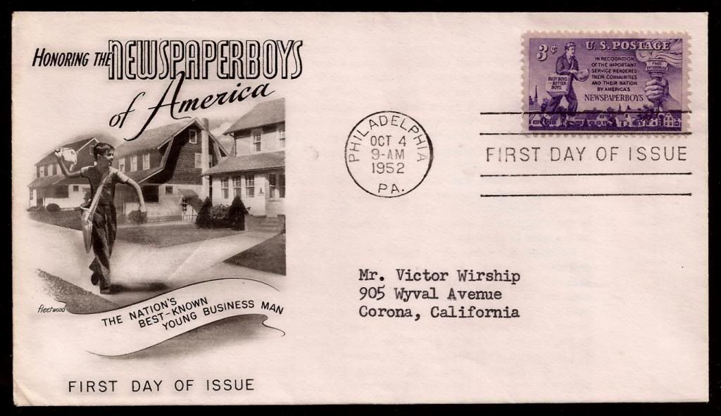
F.D.C. content
 Mint sheet with plate number and selvedge. Mint sheet with plate number and selvedge.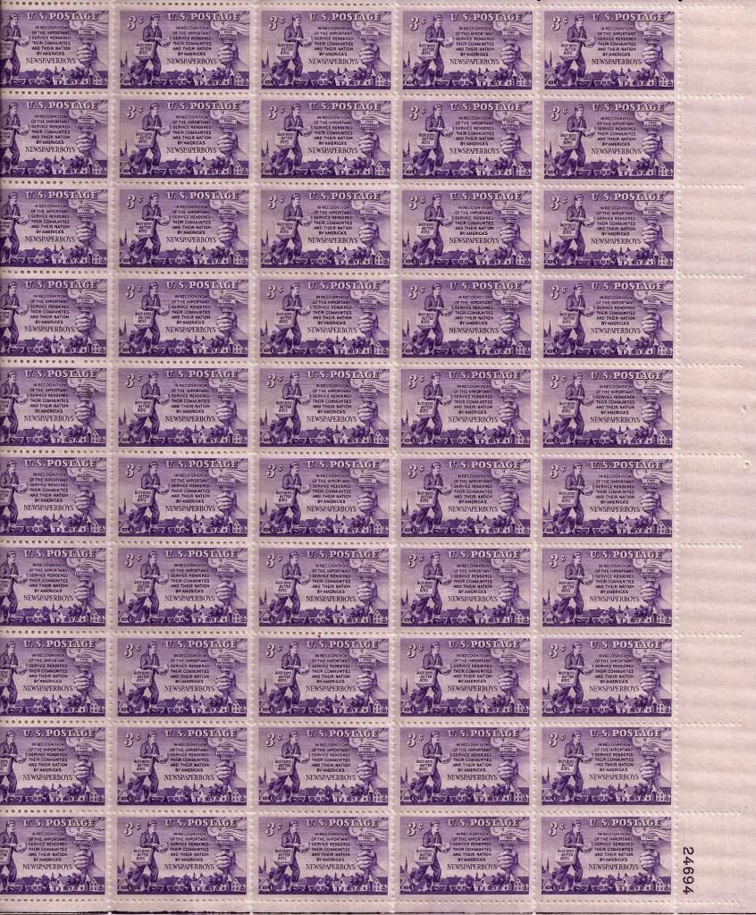
|
|
Send note to Staff
|
| Edited by I_Love_Stamps - 03/08/2014 2:29 pm |
|
|
|
|
Valued Member
United States
240 Posts |
|
|
Jeff, Your welcome my friend. Glad it made it to its new home. Was wondering ,because over here in Ca. we had an 18 wheeler from the USPS burn on the freeway this past week. So wasn't to sure if it was in there. Gary |
Send note to Staff 
|
|
|
Rest in Peace
United States
7097 Posts |
|
|
Bedrock Of The Community
United States
12128 Posts |
|
|
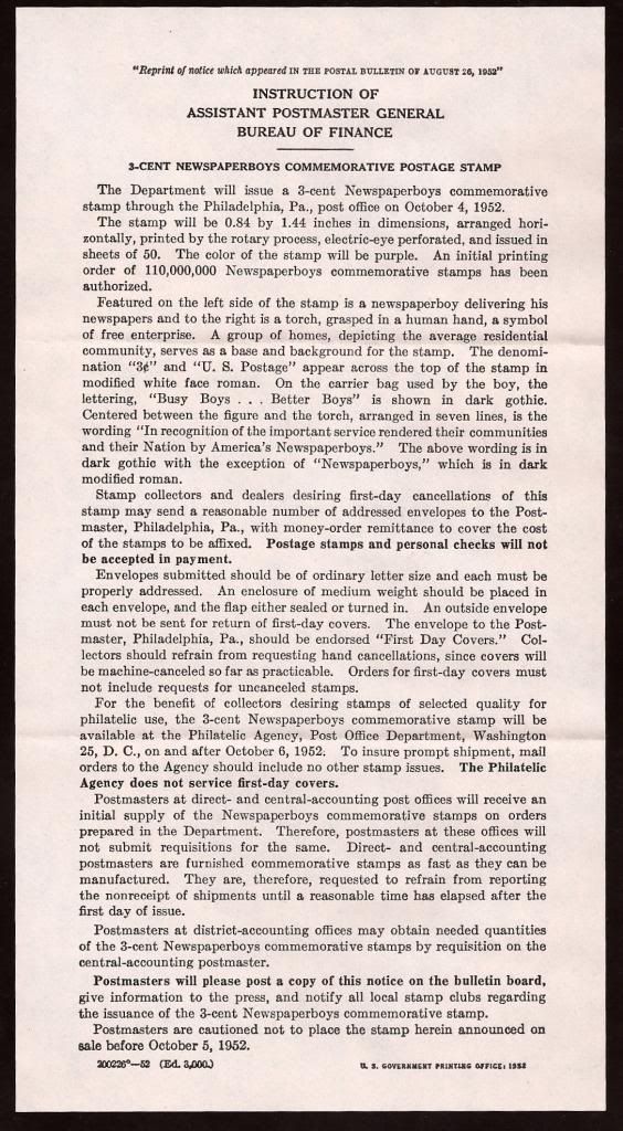
Nice first day cover. Interesting reading in how things have changed with regard to the processing of first day cancellation requests, not only in the pre-payment and the post office affixing the stamps, but in the fact that "an outside envelope must not be sent for return of first day covers."
Here's an interesting question: How is it that the bulletin scanned above suggests that 110 million stamps were printed, yet the Scott Catalog lists that issue as having a print run of 115,430,000? I wonder what accounts for the nearly five and half million stamps that weren't announced in the initial print run? Or could the Scott Catalog be in error? |
|
Send note to Staff
|
| Edited by wt1 - 03/08/2014 2:02 pm |
|
|
Rest in Peace
United States
7097 Posts |
|
|
I think the actual production numbers were always a topic for debate as far as stamp literature is concerned. I wonder if you could find actual production numbers/figures federally documented? |
|
Send note to Staff
|
|
|
Pillar Of The Community
Canada
1324 Posts |
|
|
An archaic cover from the days when girls were considered too frail - or too incompetent - to hold a job. Thankfully those days are gone. |
|
Send note to Staff
|
|
|
Pillar Of The Community
Canada
6525 Posts |
|
|
Pillar Of The Community
United States
2544 Posts |
|
|
When I see stamps of this era, I always wonder why old-fogey collectors say the old engraved stamps were better than those of the 1960-2000 era. This stamp appears visually cramped, artistically, and colour-wise awful [to me], as are most from this era. Add to that the gum and paper are also crappy - it is not a pretty picture. |
|
Send note to Staff
|
|
|
Rest in Peace
United States
7097 Posts |
|
|
I agree to a point chasa. It looks UN-balanced and too wordy for a stamp. Who wants to read a postage stamp -generally speaking of course? A better image would have sufficed like the one depicted on the cachet. Just my opinion. I prefer the classic era for a reason. |
|
Send note to Staff
|
|
| |
Replies: 8 / Views: 2,102 |
|


