| Author |
 Replies: 11 / Views: 3,608 Replies: 11 / Views: 3,608 |
|
|
Pillar Of The Community
923 Posts |
|
|
Tonight, while listening to the CBC news, I heard that a Calgary radio station was back-tracking on its intention to play only abbreviated versions of popular songs. Apparently the artists did not appreciate their art being treated this way. I was reminded of a 1991 Canadian stamp issue: Arrival of Ukrainians #1326-9 featuring the art of William Kurelek. Here's one: 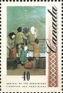 I imagine Mr. Kurelek would have felt the same - when you consider the original piece of art and his obvious attempt to portray the vastness of Canada. 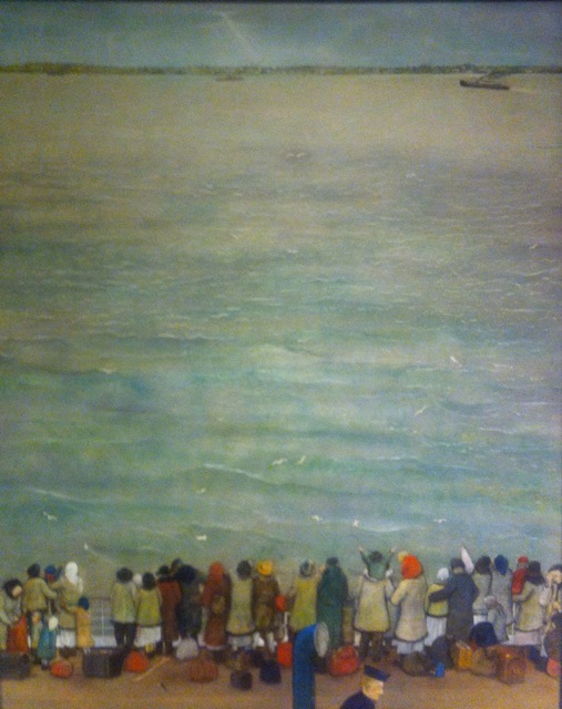 The stamp completely misrepresents Kurelek's work, as do the other three stamps in the set. |
|
Send note to Staff
|
|
|
|
|
Pillar Of The Community
United Kingdom
1187 Posts |
|
|
This is an example of what always grips me about some modern stamp design. Whoever put this design together took a wonderful piece of artwork, cropped it so severely it lost its meaning, and then added unnecessary embellishments and text. The figures might just as well be a family on a trip to the seaside feeding the gulls. All the original image needed was a White 40 in the top left with Canada in smaller white type across the sky to it's right. It doesn't have to say on the stamp what it is about if the issue is well explained and catalogued. But if it was desired it could have been put in as a line of text in a small, clear, sans serif typeface along the bottom.
I also agree with the artists about the truncation of their music.
Terry |
Send note to Staff 
|
|
|
Pillar Of The Community
Canada
6525 Posts |
|
|
Not sure I agree, Terry.
As an illustrator and designer, I can see the need, sometimes, to crop images due to space or content. I don't think the image looses any of it's meaning being cropped the way it is. It's pretty obvious (to me) that those are not holiday revellers enjoying the seaside. Their dress and luggage suggest exactly who and what they are.
Sometimes it ok to check out the bark of the tree and ignore the rest of the forest. |
|
Send note to Staff
|
|
|
Pillar Of The Community
United Kingdom
1187 Posts |
|
|
Seems we are in the same game james, and I agree that cropping is often necessary. I just think the designer went a wee bit too far here resulting in a design that is an overcrowded mix of symmetrical and asymmetrical elements. I like the power of the original painting and feel that has been lost.
Terry |
|
Send note to Staff
|
|
|
Pillar Of The Community
923 Posts |
|
|
Here's the 6th in the Kurelek Ukrainian series: 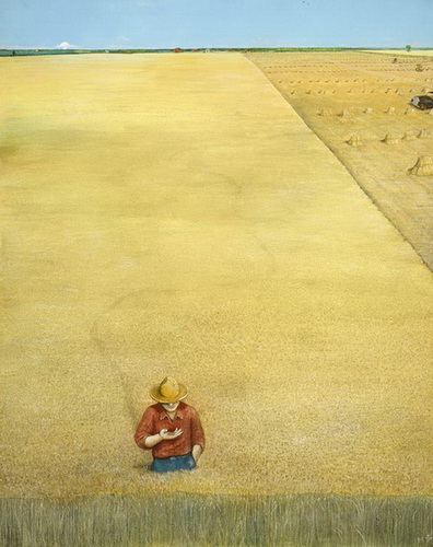 and the stamp #1329 (1991) 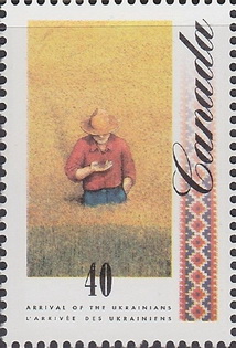 Not really the same affect, eh? |
|
Send note to Staff
|
|
|
Rest in Peace
7742 Posts |
|
|
sak...I really dont think anything is lost when Canada Post crops a painting...The farmer is looking at grains in his field..Thats what they want us to see, not the huge field of grain..Not the blue sky...I think the point they are trying to make works when a picture is cropped like that. |
|
Send note to Staff
|
|
|
Pillar Of The Community
United Kingdom
1187 Posts |
|
|
What is lost is the sense of space. The whole point of the paintings is to emphasise the vastness of Canada.
Terry |
|
Send note to Staff
|
|
|
Pillar Of The Community
Canada
6525 Posts |
|
|
Context. The entire painting would be lost on a tiny stamp. For the job the image is doing on the stamp, it works.
The paintings themselves are beautiful and poignant - I love that the horizons are in the same place, and the openness and vastness of the prairies is so wonderfully represented. But they are different, paintings and stamps. If I may mix metaphors, it's like comparing apples and oranges, not Cortland and Macintosh.
edit-sorry the 'mixed metaphor was lost in editing... |
|
Send note to Staff
|
| Edited by jamesw - 08/21/2014 09:29 am |
|
|
Rest in Peace
7742 Posts |
|
|
Terence Collins...The lost of space is not too important..Take for instance a painting of say Ottawa skyline in a painting from say 1800's...Canada Post wants to show the old parliament buildings..If you included the whole painting your eyes would not concentrate on what they were intended to show case..The parliament buildings. |
|
Send note to Staff
|
|
|
Moderator

United States
4788 Posts |
|
|
"Every stamp is a work of art..."
In these cases, a DERIVATIVE work of art. But as to whether "better" or "worse," it lies in the eye of the beholder.
Just my 2¢,
Kirk |
|
Send note to Staff
|
|
|
Valued Member
United States
146 Posts |
|
|
looks just like another guy texting without looking where he is going. So common today. He is about to fall over a cliff. |
|
Send note to Staff
|
|
|
Rest in Peace
7742 Posts |
|
| |
Replies: 11 / Views: 3,608 |
|


