| Author |
 Replies: 85 / Views: 21,807 Replies: 85 / Views: 21,807 |
|
|
|
Bedrock Of The Community
United States
10629 Posts |
|
|
Color charts of other issues from the pre-Bureau era have little use in determining shades because they were often produced by different bank note companies on different equipment and with different paper. Even first issue ultramarines do not look quite the same as m&m ultras do, largely because of the differences in plate wear. However they are close and can be used to disprove the more obvious blue shades. The best light to observe ultramarine is always sunlight.
The best of the above scans is the August Eichle, which is notorious for being badly centered. This example is EF for this stamp.
The Frank E Clark stamp is part of what is know as the "Woodbridge Group", which includes all the other companies which used that design. They were often put on with an afixing machine and usually have cut edges from them. I am suspicious of the left side of this example which may have been reperforated after being cut in this manner. |
Send note to Staff 
|
|
|
Valued Member
United States
270 Posts |
|
|
Believe me, I paid the piper for the August Eichle. That one, aside from Eric's site, is the best centered example I have come across over the years. I do think the perfs are legit on the left side of the RO59e, these ARE known for being cut apart. If it is re-perfed, it was a good job. Close examination of the cuts appear to coincide with other copies of this issue. I am not the expert of course, but have seen many re-perf jobs that were much too perfect. They do not align right to left is my only concern. Honestly, for what I paid, I am still happy if it is. Thanks for your input as always.
Revenues are addictive, so many variety's and cancels to sort through. At least this persons addiction is something I dont mind passing down to my daughters. I am glad they will pick up a loupe and search for silk fibers. I test them on paper types. They are actually pretty good at it. My goal is to get them interested on expanding on this collection, and learning the history. After-all, its not about the money, its about the story. |
|
Send note to Staff
|
|
|
Bedrock Of The Community
United States
10629 Posts |
|
|
"They do not align right to left is my only concern".
They should never align exactly, these stamps were line perforated. But they are much too round, and do not look like the perfs on the other 3 sides. Also if the perfs are cutting that far into the design on the left then it is somewhat surprising not to see a bit of the next stamp on the right. It's possible, but it just doesn't look right from an image. You might want to line the perfs up with another old paper m&m or a first issue revenue and see if they do line up. |
|
Send note to Staff
|
|
|
Valued Member
United States
270 Posts |
|
|
Bart, I tried to select an unbiased comparison here. IF I understand you correctly, the Woodbridge Group would apply to all printings of this design. So I still see that perfs are similar to test stamp. Some indentions curve downward and some upward (perf pin holes). Any one's guess on if the total total width is to narrow, test stamp was not the skinniest I have. What do you think?? Perfs seem to align left to right on test stamp too, although this could just be a coincidence. As I keep looking, the right side perfs seem more suspect then left. Thanks in advance, and ROLL TIDE!  |
|
Send note to Staff
|
|
|
Bedrock Of The Community
United States
10629 Posts |
|
|
Problem number 1 is that is not how one aligns perfs to check them. They should always be aligned perf tip to perf tip. Problem number 2 is that the Clark stamp was printed by Butler & Carpenter; the B&N might or might not have been. Now in theory they are both perf 12 and should be identical, but in practice there might be minor differences, so using stamps from the same company is always to be preferred. It's the left perfs that I question in this case, although they might still be genuine. |
|
Send note to Staff
|
|
|
Valued Member
United States
270 Posts |
|
|
Guess I should have been more clear. The reference stamp was not to show perf alignment between the two, merely to show overall width and the way the cut-out were similar in the two. Thanks again for your knowledge and help. All my other FEC stamps have at least one vertical cut edge, and would not make the comparison I sought. |
|
Send note to Staff
|
|
|
Pillar Of The Community
United States
770 Posts |
|
|
Hi Bart. I have a question for you if you don't mind. You alerted me to the undervalued nature of the RS35c. There must be other m and m's that are undervalued but very tough to come across. Offhand do any come to mind? |
|
Send note to Staff
|
|
|
Bedrock Of The Community
United States
10629 Posts |
|
|
The only way to work on that is to spend time looking at as many large lots as possible on ebay, at shows and at auctions. After a while you will start to recognize the stamps you see all the time, and notice which of the empty spaces show up all the time, or which only seem to be defective even if you see them regularly. |
|
Send note to Staff
|
|
|
Pillar Of The Community
United States
770 Posts |
|
|
Pillar Of The Community
United States
791 Posts |
|
|
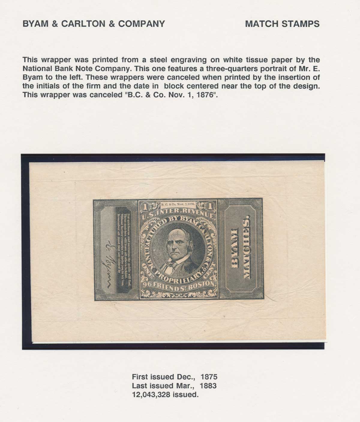
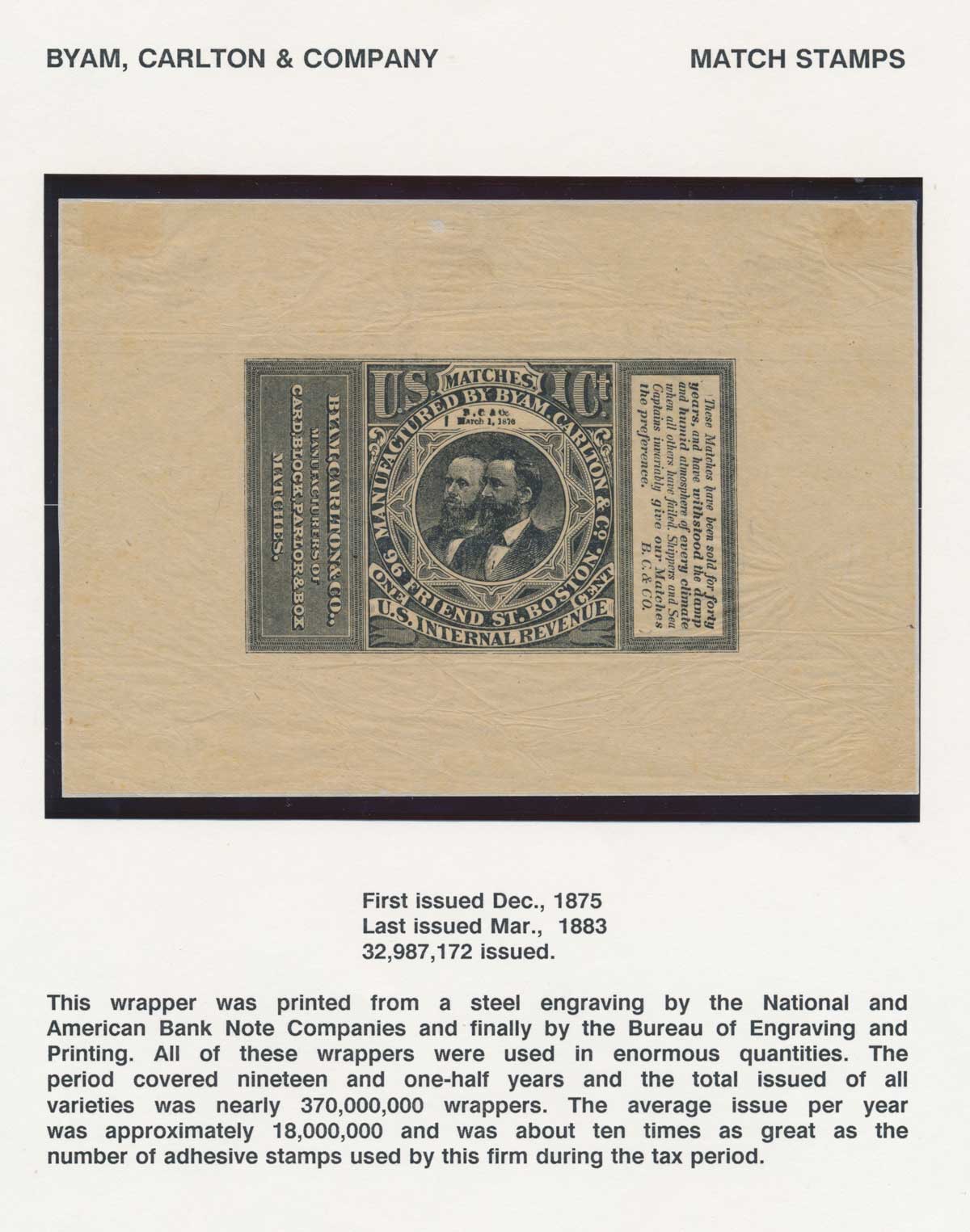
You almost never see the wrappers in that nice a condition. Awesome pickup. |
|
Send note to Staff
|
|
|
Bedrock Of The Community
United States
10629 Posts |
|
|
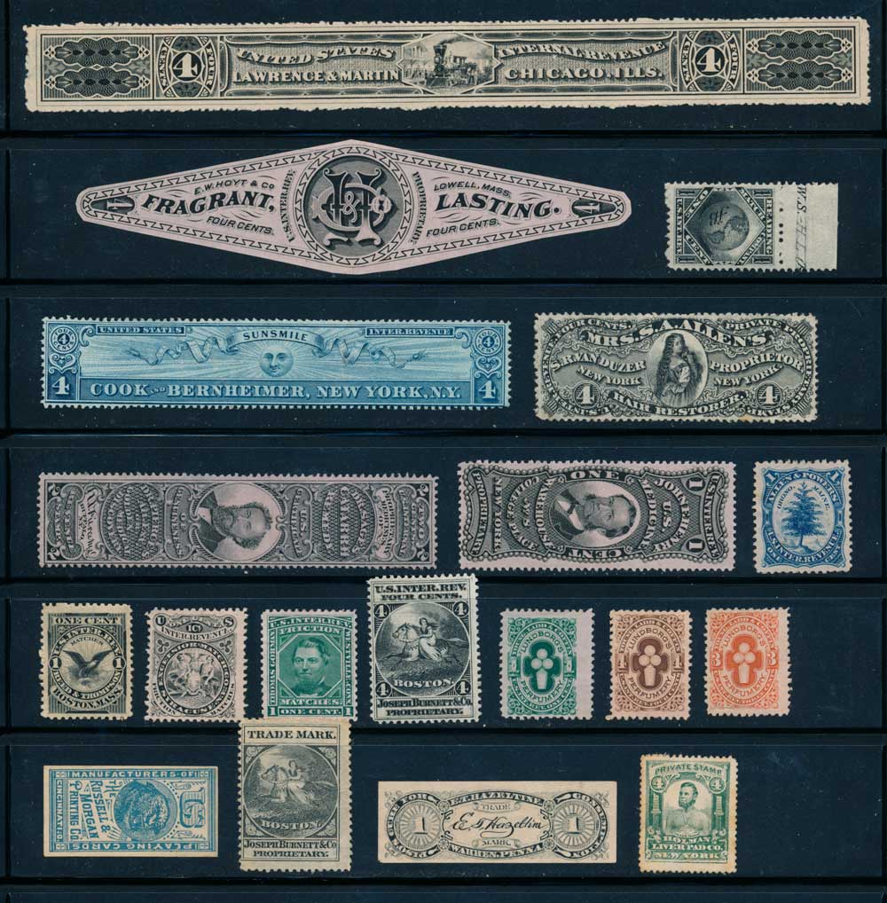
These wrappers do come in nice condition to a larger extent then some others, but it's always nice to find them. The Cook & Bernheimer is very nice, that's a stamp that is not always found so nice. Sunsmile was 97% Rye whiskey, they were trying to avoid the rectifiers tax which was higher. The government soon started charging both taxes and exit Sunsmile. However Cook & Bernheimer were big in the liquor business for a long time.
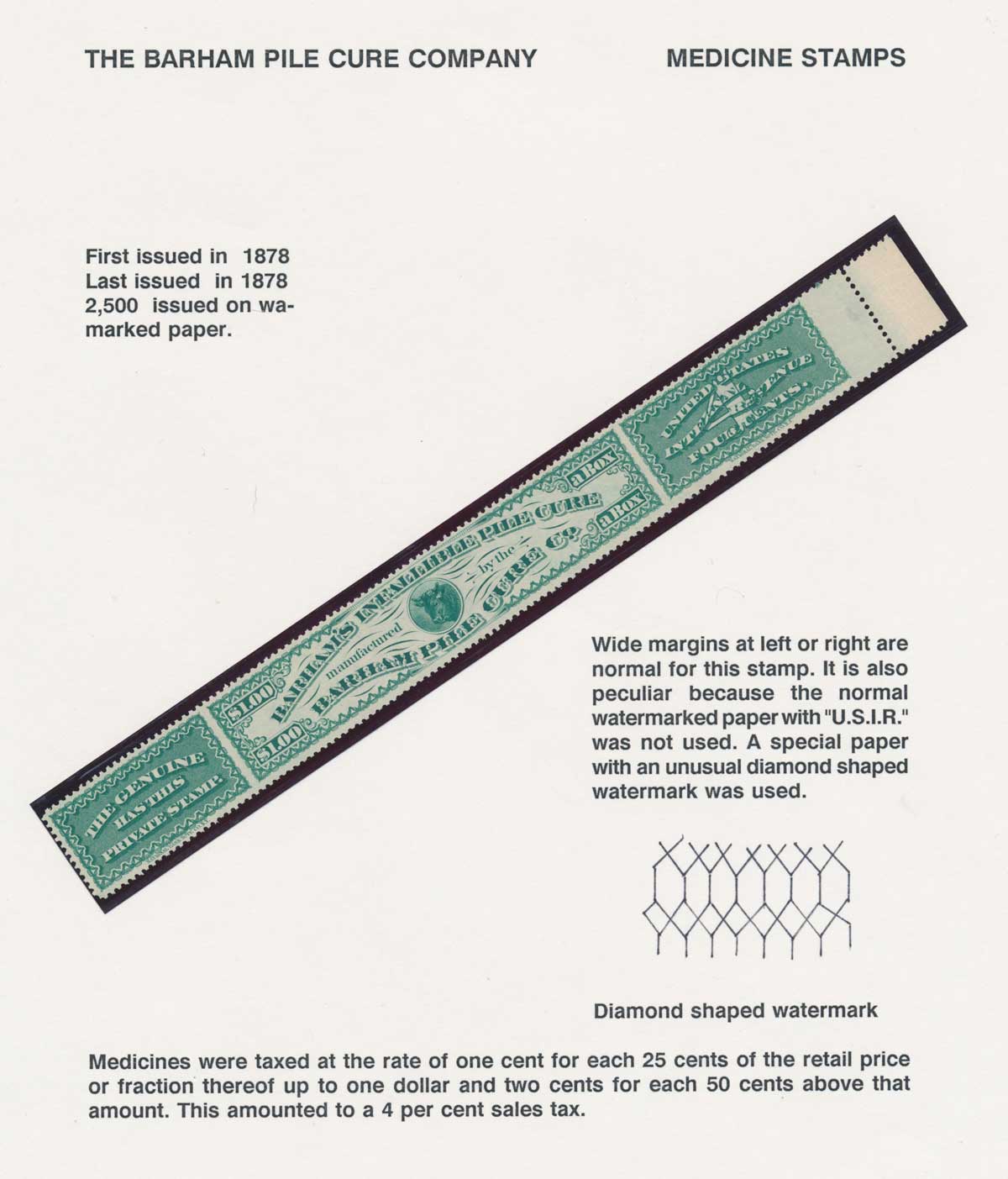
The Barhams Pile Cure almost always comes in EF condition, the company folded right after the stamps were printed and practically all were remaindered, including imprint strips of four and at least a couple of full sheets. So even though there were only 2500 issued it is easily found. |
|
Send note to Staff
|
|
|
Bedrock Of The Community
United States
10629 Posts |
|
|
I am familiar with that collection; it was formerly an exhibit and recently auctioned off. There was a lot of very fine material in it. |
|
Send note to Staff
|
|
|
Pillar Of The Community
United States
770 Posts |
|
|
Bart, do you know what auction? Seeing the collection I'd love to find out the hammer amount. |
|
Send note to Staff
|
|
|
Bedrock Of The Community
United States
10629 Posts |
|
|
Regency ORCOEXPO sale, $12,000. Several single item and small group lots also came out of that collection, including proofs, essays, and stamps. Unfortunately they are all over the place in that sale rather then in one section so one has to do a lot of searching in several sections to find them all. |
|
Send note to Staff
|
|
|
Bedrock Of The Community
United States
10629 Posts |
|
|
Replies: 85 / Views: 21,807 |
|