Stamp Community Family of Web Sites
Thousands of stamps, consistently graded, competitively priced and hundreds of in-depth blog posts to read


Stamp Community Forum
 
Username:
Password:
Save Password
Forgot your Password?

This page may contain links that result in small commissions to keep this free site up and running.

Welcome Guest! Registering and/or logging in will remove the anchor (bottom) ads. It's Free!

Distinguishing Between 255 And 712?

 
To participate in the forum you must log in or register.
Author Previous TopicReplies: 5 / Views: 2,233Next Topic  
Valued Member
United States
491 Posts
Posted 09/16/2014   6:41 pm  Show Profile Bookmark this topic Add JanS to your friends list Get a Link to this Message
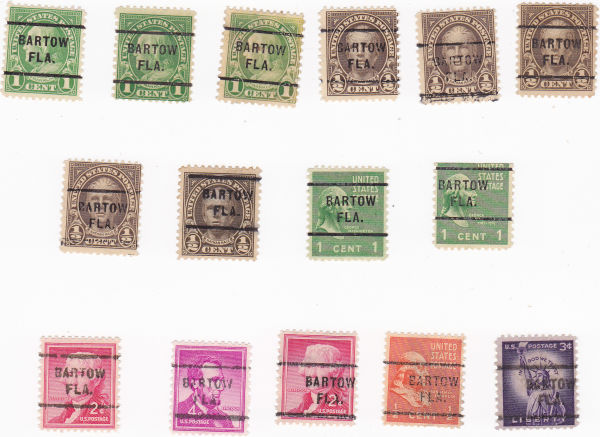
Can anyone give me some help regarding how to distinguish between Type 255 and Type 712?

I am looking at Bartow, FL, and the lettering looks identical, although catalog says:

a) 255 is 1.6mm between town and state

b) 712 is 1.8 mm between town and state

c) 712 is "narrow" letters

d) 712 is a metal hand stamp and may vary in width between the lines and in inking

However, my eyes can't distinguish between 1.6 and 1.8 (maybe they could if I had one I was sure of, but not without).

And while some of my examples look very sharp (therefore probably 255), some of them are fainter or rougher, which might mean they are 712 or might mean nothing at all.

And I can't see any difference in letter width.

Below, I am thinking top line = 255, bottom = 712 and middle = ??

Thanks!

Send note to Staff
Edited by JanS - 09/16/2014 6:49 pm

Pillar Of The Community
Guatemala
1500 Posts
Posted 09/16/2014   7:39 pm  Show Profile Bookmark this reply Add quigngt to your friends list  Get a Link to this Reply
From the info you have given, you'll need a quality mm measure such as is found on better perforation gauges but even most of those only measure by 1.0mm. A clear plastic gauge with extremely fine lines would be the easiest to use. There is only 0.2 mm difference which is so tiny that I think most of us would have difficulty detecting with the naked eye. The measurement is from the bottom of the letters of BARTOW and the top of the letters of FLA.
Send note to Staff  Go to Top of Page
Pillar Of The Community
United States
1614 Posts
Posted 09/16/2014   7:52 pm  Show Profile Bookmark this reply Add Mike33 to your friends list  Get a Link to this Reply
I wonder if you had some high resolution scans and some decent editing software like Photoshop. (I'm sure there's some free ones out there too), I'd bet you could superimpose one on top another until you found one larger than another
Send note to Staff  Go to Top of Page
Pillar Of The Community
United States
2942 Posts
Posted 09/16/2014   8:29 pm  Show Profile Bookmark this reply Add stampcrow to your friends list  Get a Link to this Reply
Looks like the "O" shows different. The "R" also. With some, it appears, the bottom half of the R looks more like the bottom of an h. Where others, it appears the right leg flairs to the right a little more. Looks more like the R typed here. Seeing that in the green 1 cent Washington's and the orange 1/2 cent Franklin.
Send note to Staff  Go to Top of Page
Bedrock Of The Community
United States
12128 Posts
Posted 09/16/2014   9:02 pm  Show Profile Bookmark this reply Add wt1 to your friends list  Get a Link to this Reply
Some constructive comments about identifying these two precancel types were made at this previous link, however, they are very close in appearance and can't often be told apart without some detailed measurements/comparisons with known examples:

https://goscf.com/t/27660
Send note to Staff  Go to Top of Page
Valued Member
United States
491 Posts
Posted 09/17/2014   01:12 am  Show Profile Bookmark this reply Add JanS to your friends list  Get a Link to this Reply
wt1 --

You are amazing. I *promise* I tried searching for any prior posts on this topic but something about me and the Search facility on this site doesn't gel. It whirred for about 5 minutes finding nothing, until I ended up shutting the web page and starting again. But how even more embarrassing that the prior plea for assistance on this subject was from ... me. Sometimes I feel like I'm going around in ever-diminishing circles with my precancels.

stampcrow --

I don't think I am seeing what you mention in the O, but I do see it on the R. Interesting thought to pursue with daylight and a magnifying glass.

Thanks to you all.

Thanks everyone.
Send note to Staff  Go to Top of Page
  Previous TopicReplies: 5 / Views: 2,233Next Topic  
 
To participate in the forum you must log in or register.

Go to Top of Page

Disclaimer: While a tremendous amount of effort goes into ensuring the accuracy of the information contained in this site, Stamp Community assumes no liability for errors. Copyright 2005 - 2026 Stamp Community Family - All rights reserved worldwide. Use of any images or content on this website without prior written permission of Stamp Community or the original lender is strictly prohibited.
Privacy Policy / Terms of Use    Advertise Here
Stamp Community Forum © 2007 - 2026 Stamp Community Forums
It took 0.13 seconds to lick this stamp. Powered By: Snitz Forums 2000 Version 3.4.05