|
This page may contain links that result in small commissions to keep this free site up and running.

Welcome Guest! Registering and/or logging in will remove the anchor (bottom) ads. It's Free!
To participate in the forum you must log in or register.
| Author |
 Replies: 6 / Views: 1,385 Replies: 6 / Views: 1,385 |
|
|
Rest in Peace
7742 Posts |
|
|
Hi guys How is anyone suppose to classify colours of old stamps when there is too many things that cause colour change... 1 - Age of stamp. 2 - Environmental deterioration. 3 - Colour shades. 4 - Sunlight. 5 - Etc...etc. I am posting about half of my Scott # 37 stamps to show you the colour range...In Unitrade they have these different shades.. 1 - Orange Red 2 - Rose 3 - Copper or Indian Red 4 - Red 5 - Dark Rose 6 - Dull Red How on earth are we expected to classify stamp colours..???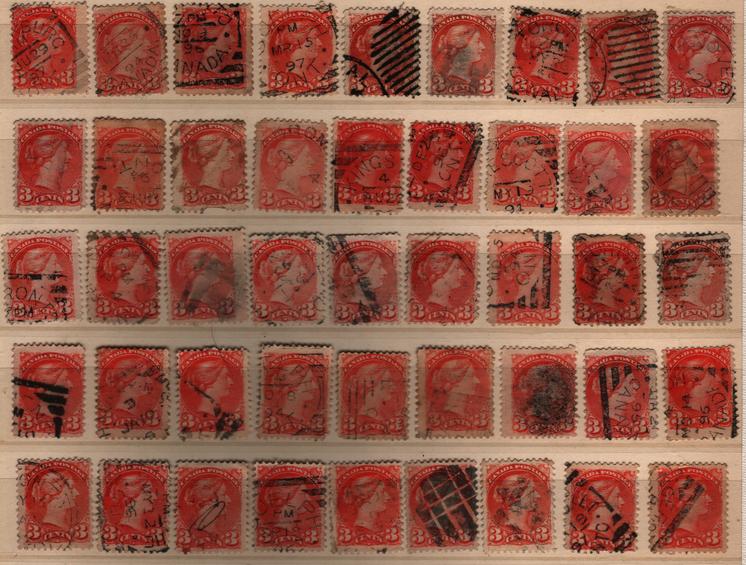 |
|
Send note to Staff
|
|
|
|
|
Pillar Of The Community
United States
725 Posts |
|
|
Hi Wert, I think you may have a mixture of #37 and #41. There is a nice guide in Unitrade that might help you sort these. You need to check perforations and guide dots. Then start sorting by shade. There will be variations in color because each batch of ink was mixed separately. The colors in the catalog are general colors for the printings and not specific for each shade. Try sorting by shade and guide dots and then perforations. I usually just group them this way. Good luck. |
Send note to Staff 
|
|
|
Rest in Peace
7742 Posts |
|
|
Thanks watermark...just through them in a organized pile..Could be some #41's like you said..Guess I better spend some time on them..eh..?...haha |
|
Send note to Staff
|
|
|
Moderator

United States
12330 Posts |
|
|
Childhood story #186
.
In the 'old days' I put myself through college by working at night in a textile mill in North Carolina. My jobs included running a machine called a dye beck which dyed large amounts of fabric; my job was to get the cloth dyed by cooking over a period of time. Each night I would have a different load of cloth which had to be loaded and then have the dye and other chemicals added. It was partly my responsibility to get the color/shade correct. I would cut small pieces of the cloth out and confer with a colorist. We would compare it with known color samples of cloth by eye. Depending on the shade, we would then added more dye to achieve the exact color match.
Many, many times this was a very difficult process. Dialing in the exact match was a real art and called for a very good 'color' eye. Some people simply never could do it properly. Many debates, and sometimes heated arguments, would occur with each party bringing in other people for their opinions. I am not sure I ever saw a situation where everyone agreed 100%. Of course they don't do this by 'eye' anymore, they use high end color calibrated optic analyzers which remove the subjectivity. It should be noted that there are often significant differences between men and women when comparing colors. (Men are often more color impaired in one way of another.)
Keep in mind that how we see color is greatly impacted by the way light reflects off the surface of the item. For example, when you go to the food produce section of the grocery store they use certain wave length light to make the apples look redder. At pet shops they use certain wave length lights to make the fish look brighter. When you pick a color out at the paint store it often look very different in the light conditions of your wall.
So if you are trying to resolve this issue this is what you are facing. First, you need complete control over the lighting conditions. Second you need a optical device that consistently delivers the exact same color data. And third, you need everyone to agree on a standardize color wheel/names. The device HAS to be constantly calibrated. This is particular hard with the 'light' source because so many things can affect the light intensity. Ambient light, age of the bulbs, power input can all change the light intensity. It is trickier than one might think when trying to determine an exact match with 64,000 (or greater) color shades that many computers can choose from. There are device which do exactly this, I have given you links to them before. So "all" you need to do is get every to buy the same expensive optical device, set up a international group to keep track of them all and keep them in calibration, and then get everyone to agree upon a color wheel standard using the same names.
Forget using home computers/scanners and different catalog color names. By the way, computers are great tools at many things, some are 'fun' like when you 'remove' a cancel. But sadly this is not ever going to be a legitimate way to identify a stamp. Why? The computer is simply 'averaging' the color pixel next to each other. If you have three pixels in a row next to each other, red pixel, unknown pixel, and another red pixel the computer software simply assumes that the missing pixel is also red. It does not 'see' anything, it assumes and averages. When our human eye than looks at what the computer did, it makes sense. But no one can ever say with 100% certainly that the unknown pixel was not really blue underneath that cancel.
So my friend, while I admire you determination to resolve this issue it is a very tall order and highly doubtful that you will be able to resolve this issue. Catalogs simply gave up by tossing a few color names under each stamp and let the hobbyists figure it out. Many, many listings make incorrect assumptions about color shades; but funny thing
many of us 'see' the rare color shades when more often than not they are not. Many hobbyists seem to be able to pick out subtle 'rare' color shades yet are unable to identify an obviously toned stamp or other flaw. So I guess we can say that wishful thinking (greed?) also influences how we see colors!
Don
|
|
Send note to Staff
|
| Edited by 51studebaker - 11/10/2014 10:55 am |
|
|
Rest in Peace
7742 Posts |
|
|
Don...My new found friend, and I mean that...Always...Always wait for your input and yes me using software programs that windows computer people do not know that even exists may be hope that may not come true..But I WILL continue to think out of the box, and maybe someday add to this great hobby, and help others classify...separate...etc. stamps. Remember they thought the Wright bros. and Alexander Bell were way out in left field at one time...  Robert BTW...Great story..Enjoyed it. |
|
Send note to Staff
|
| Edited by wert - 11/10/2014 3:38 pm |
|
|
Moderator
United States
12330 Posts |
|
|
Robert,
If you want a good set of 'color' eyes, find a woman. The theory is that women developed better color distinction and men have better movement distinction after many generations. (Men needing movement detection for hunting and women having better color detection for gathering the correct foods.) Most of the better colorists in the textile industry (in the old days) were the women but everyone can form their own opinions as to why. But without a doubt men have more color blindness than women in the general population. Well, color blindness is a misnomer. Very, very few people see only in black and white. A better description is color deficiency; where only certain colors are misinterpreted. This occurs in approximately 6%-7% (1 out of 12) of all men but in only 0.5% (1 out of 200) of all women.
I admire your persistence on this topic. There are indeed solutions at hand now, they are just not economically feasible. This makes this topic ripe for possible further solutions that could eventually give us the 'Wert color system'. So don't be discouraged, always think outside the box. Just do not become emotional invested in any one solution until you are absolutely sure it will work.
Don
|
|
Send note to Staff
|
|
|
Rest in Peace
7742 Posts |
|
| |
Replies: 6 / Views: 1,385 |
|
|
To participate in the forum you must log in or register. | |
Disclaimer: While a tremendous amount of effort goes into ensuring the accuracy of the information contained in this site, Stamp Community assumes no liability for errors. Copyright 2005 - 2026 Stamp Community Family - All rights reserved worldwide. Use of any images or content on this website without prior written permission of Stamp Community or the original lender is strictly prohibited.
Privacy Policy / Terms of Use Advertise Here |
| Stamp Community Forum |
© 2007 - 2026 Stamp Community Forums |
| It took 0.14 seconds to lick this stamp. |
 |
|
|
|


