| Author |
 Replies: 97 / Views: 31,996 Replies: 97 / Views: 31,996 |
|
|
|
Pillar Of The Community
Canada
5821 Posts |
|
|
Quote:
The paper tape is once dried, then moistened, printed and dried again, moistened again before the second pass and dried a third time. So this was basically wet printing and the paper was therefore not pregummed. |
Send note to Staff 
|
|
|
Valued Member
France
69 Posts |
|
|
Hello,
In France, since 1922 on the rotary printing machines, the paper is always pre gummed, either for typography, either intaglio TD3 or TD6. For intaglio, the paper is slightly moistened with a roll before printing like you can see on the right of the picture of the TD3 machine. |
|
Send note to Staff
|
|
|
Pillar Of The Community
Czech Republic
623 Posts |
|
|
Quote from lithograving on the King François I stamp: Of course, now I see it. For some reason I thought that the dark brown and dark green were combined to create black.
As this stamp was printed on the Chambon T.D. 6 press, there was no need to use the camaieu method to create black and, besides, it was more difficult to maintain the colour in hue with this method as Papy24 had explained.
Papy24 - On the other hand, with the Les tres riches heures du duc de Berry stamp, I had believed the direct intaglio inks included black besides brown and red.
Now that you pointed out things to us, I perceive the yellow among the direct intaglio colours. Can the blue of the indirect intaglio overlapping the brown of the direct intaglio produce the visual perception of the black? Oh yes, now I can see it looking at the right-hand arms of the first falconer on the right and of the lady in the middle. What a discovery! Thank you very much, Papy24!
Also, I am still perplexed about the shifts (décalages) of the red, rather strangely, in opposite directions, one to the left, the other to the right, creating a sort of veil on the falconers heads, which you explain as a result of a bad wiping of the plate cylinder.
I am aware of the fact that such complicated points are very difficult to explain in English using translator programmes but do you think you could discuss this stamp in French on your blog on a suitable occasion some other time, please? Thank you very much for anything you can do.
Florián |
|
Send note to Staff
|
| Edited by florian - 12/15/2014 10:02 am |
|
|
Valued Member
France
69 Posts |
|
|
Hello,
I think that is never "camaieu" in TD6. This is enough difficult to print, without adding more difficulty.
Shifts are also frequent in all directions, more and less, and explanations are very complex to give the good reason. It is so many reasons.
Bad wiping is also complex to explain.
This stamp had little defects, but it was considered good.
I have no collection and I have not photos or elements to show for explanation on my blog. I'm sorry. If I find, perhaps. |
|
Send note to Staff
|
|
|
Rest in Peace
Netherlands
963 Posts |
|
|
Valued Member
France
69 Posts |
|
|
Hello Galeoptix,
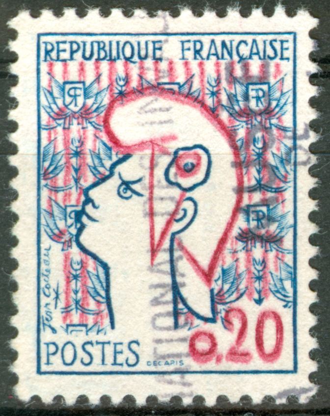
The first stamp in current use, printed in intaglio, and in 2 colors, indirect and direct. Drawn by Jean Cocteau, engraved by the master engraver Albert Decaris.
Two dies engraved, red indirect, blue direct intaglio. For the first red impression, the plate cylinder print a plastic cylinder which transfers its color on the paper, like in offset printing. It's probably a bad pressure between the two cylinders, with a deformation of the plastic cylinder and a bad transfer. It is not the wiping.
Many, many problems for this stamp. |
|
Send note to Staff
|
|
|
Pillar Of The Community
Canada
5821 Posts |
|
|
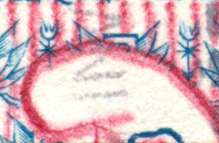
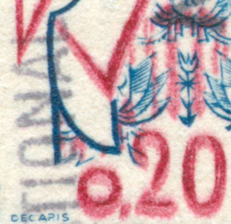
Every time I look at this Marianne stamp it's like seeing a 3D image without the glasses. France Scott 985  This has got to be one of the worst looking French stamps ever printed. Wonder if Cocteau or Decaris were happy with the results, not that this is a good design or a great job of engraving. I bet even Marianne, where ever she is probably said that's a terrible pic of me.  And why experiment with a 6 colour press and only print in two colours? |
|
Send note to Staff
|
| Edited by lithograving - 03/22/2018 9:08 pm |
|
|
Valued Member
France
69 Posts |
|
|
Hello,
This is probably due to the model designed by Cocteau.
It was not possible to perform intaglio other than using the indirect intaglio. The details in red and blue are too close and too mixed to be able to make carvings inking rollers, as the roundel.
With only two colors, one indirect, the other direct, there is no need for cutting. |
|
Send note to Staff
|
|
|
Pillar Of The Community
United Kingdom
1361 Posts |
|
|
This is a really interesting topic. I have a question regarding this 1960 Air MS760 #39. Would anyone know how the following would occur? This is how it should look with clear blue and green areas plus the outline so three colours.  However I have some of these where there appears to be only one colour plus the outline.   |
|
Send note to Staff
|
|
|
Valued Member
France
69 Posts |
|
|
Hello Anthony,
They are mistakes of ink.
This stamp needs 3 colors, so 3 inking rollers, so 3 inkwells.
On the printing machine TD3, greenish blue at the top, dark green in the middle, and olive-green at the lower level. I suppose because I was not there at this time.
These 3 colors seem almost the same color. When an inkwell is empty, it is possible to put an other color that it needs. And that is the result.
The sheets should have been removed, but not this time. |
|
Send note to Staff
|
|
|
Pillar Of The Community
7838 Posts |
|
|
Hi all! In reply to an email request from lithograving, here are images of some multicolor stamps issued by France, all of which I have previously posted in the Topical Collecting Forum. However, I'll have to work a bit to try to come up with images of the other stamps included in lithograving's request. Stay tuned.  - nethryk Here is an image of a Red Cross semi-postal stamp depicting a nurse, designed by André Spitz, engraved by Antonin Delzers, and issued by France on March 24, 1939 to commemorate the 75th anniversary of the founding of the Red Cross, Scott No. B81, Y&T No. 422. 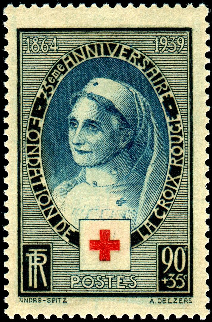 Here are images of the four stamps in a set issued by France on November 12, 1960 to publicize the study of bird migration and the protection of wildlife. These stamps were designed and engraved by Pierre Gandon, save the first one, which was engraved by Charles Mazelin, Scott Nos. 978-981, Y&T Nos. 1273-76. Northern Lapwing ( Vanellus vanellus),  Atlantic Puffin ( Fratercula arctica)  Eurasian Teal ( Anas crecca)  European Bee-eater ( Merops apiaster)  |
|
Send note to Staff
|
| Edited by nethryk - 12/16/2014 11:41 am |
|
|
Pillar Of The Community
United Kingdom
1361 Posts |
|
|
Many thanks Papy.
Maury list two 'unicoleur' varieties but I assumed these would be totally one colour only given the price listed. |
|
Send note to Staff
|
|
|
Valued Member
France
69 Posts |
|
|
Anthony, All stamps with errors colors I've seen are in two colors. There was also this variety.  Olive-green ink mixed with dark green. |
|
Send note to Staff
|
|
|
Pillar Of The Community
United Kingdom
1361 Posts |
|
|
Pillar Of The Community
Canada
5821 Posts |
|
|
I asked nethryk if he had these French stamps which represent
the first Chambon TD3 (Scott No. B81, Y&T No. 422) printing and
the first Chambon TD6 (Scott Nos. 978-981, Y&T Nos. 1273-76 )
Thank you nethryk for posting these superb scans.
Colour wise, for the 20c Northern Lapwing I only see 5 colours.
Indirect, light colours I see as yellow beige,red and grey (numeral& bellies of the 3 birds on the left).
Direct I see only two, Blue and black green.
30c Atlantic Puffin
Indirect, light blue
Direct, Black, red and green
|
|
Send note to Staff
|
|
|
Replies: 97 / Views: 31,996 |
|