| Author |
 Replies: 97 / Views: 31,997 Replies: 97 / Views: 31,997 |
|
|
|
Valued Member
France
69 Posts |
|
|
Pillar Of The Community
7838 Posts |
|
|
lithograving - You're welcome. I'm glad to help. Here are images of the other three multicolor stamps you requested. - nethryk Two semi-postal stamps designed by André Spitz, and issued by France on June 15, 1939 to benefit France's repopulation campaign, Scott Nos. B90 & B91, Y&T Nos. 440 & 441. Mother and children, engraved by Emile Henri Feltesse.  Mother and children, engraved by Jules Piel.  World map, Mercator Projection, highlighting French Overseas Departments and Territories, designed and engraved by Jules Piel, and issued by France on July 17, 1941, Scott No. B115, Y&T No. 503. Note: This specimen was printed on paper with a pre-existing horizontal crease about midway through the design.  |
Send note to Staff 
|
| Edited by nethryk - 12/16/2014 2:45 pm |
|
|
Pillar Of The Community
Canada
5821 Posts |
|
|
nethryk, again many thanks for showing us these early examples
of the TD3 press.
Scott states that the three colours for B90 are blue, green and
violet but I don't see the violet.
In the catalog the central vignette mother and children
appear in violet but here I see hardly any difference between the blue of the frame and
what appears to be blue in the vignette.
Scott B115 showing Frances possessions (colonies) I believe
was the last 3 colour French stamp issued until the mid fifties (1953)
Wonder why it took so long to get things rolling again
after the war.
nethryk, I just noticed another 1939 semi postal that was issued in 3 colours, Scott B92.
Would you also have that one by any chance?
|
|
Send note to Staff
|
|
|
Pillar Of The Community
Canada
5821 Posts |
|
|
I notice that on the last two bird stamps there are areas
where the colour is spotty/patchy.
Eurasian Teal 45c, most of the text, especially the red.
European Bee-eater 50c. the blue text, the wing tip of the male bird,
around the neck of the female bird and the G of Guepier.
Was this caused by ink not adhering to the paper, if so why not?
Or were the inkwells of the press running near empty?
|
|
Send note to Staff
|
|
|
Valued Member
France
69 Posts |
|
|
Hello Lithograving,
How difficult it is to explain when we did not do ourselves.
All explanations are possible. Make your choice.
Engraving of the cylinder, the ink rollers, ink (I don't think empty inkwell), wiping too strong, the paper not enough moistened, the pressure on the paper, and many others, sometimes both of them.
It is really difficult to say. Printers was learning to use those new printing presses and had many problems. |
|
Send note to Staff
|
|
|
Pillar Of The Community
Czech Republic
623 Posts |
|
|
Bonjour, Papy24,
I am sorry. Having to leave for another place yesterday morning, I was unable to post a reply.
Thank you for making me aware of the complexities involving the Les tres riches heures du duc de Berry stamp. Never mind. There are lots of hitherto unexplained issues about the printing of stamps in France raising keen interest among devotees here which you are explaining to us with great success as the increasing number of readers of these pages have been proving. Your participation in this forum is invaluable indeed. Thanks a lot.
Quote from your post of Yesterday 04:46 am: This is probably due to the model designed by Cocteau.
In an interview on p. 35 of the January 1962 issue of Le monde des philatélistes, answering the question "Quand le dessinateur est un autre artiste que le graveur, quel est le processus? / When the designer is an artist different from the engraver, what is the procedure?/" Albert Decaris replied "Le graveur s'efforce de reproduire aussi fidelement que possible, naturellement, la maquette du dessinateur. Quand je grave moi-meme mes propres maquettes, je fais tres attention de ne pas trop m'en écarter. / The engraver, of course, tries to reproduce as faithfully as possible the artist's design. When I engrave my own designs, I am very careful not to deviate from them too much./ - Interviewer: "Jean Cocteau a-t-il été content de la traduction de son oeuvre? / Was Jean Cocteau satisfied with the way you transposed his work?" - A.D.: "J'ai l'impression de ne pas l'avoir trahi. / I have the impression of not having betrayed him./" |
|
Send note to Staff
|
| Edited by florian - 12/17/2014 06:59 am |
|
|
Pillar Of The Community
7838 Posts |
|
|
lithograving - Da nada! And yes, I would.  Here is an image of a semi-postal (charity) stamp designed and engraved by Jules Piel after a painting entitled "The Letter" by French artist Jean-Honoré Fragonard (1732-1806), and issued by France on July 6, 1939 to benefit the Postal Museum, Scott No. B92, Y&T No. 446. Note: I previously posted this image on page 12 of the "Collecting by Engraver" thread in the Topical Stamp Collecting Forum. - nethryk  |
|
Send note to Staff
|
| Edited by nethryk - 12/17/2014 07:38 am |
|
|
Pillar Of The Community
Canada
5821 Posts |
|
|
nethryk,thanks again for posting another one of my requests. Looking at this stamp makes me wonder why the French Printer even bothered with 3 colours. The little bit of green and dark purple added to the predominantly dark brown do absolutely nothing for eye appeal. I would say it even detracts from the stamp which IMO would have looked better in just dark brown. I realize they were going through an experimental stage and the 1941 example Scott No. B115, looked OK but that was the last 3 colour stamp issued until 1951 when 2 were issued Scott 657 and Scott 664. One more thing about colour as listed in catalogs. For some reason Scott mentions the 3 colours of the first 3 stamps nethryk posted (B90, B91, B115) but B92 they list as multicolored. Is the catalog trying safe space? They didn't know which colours were used? They just don't care? |
|
Send note to Staff
|
|
|
Pillar Of The Community
United Kingdom
1361 Posts |
|
|
Hi Litho,
I don't tend to use Scott for France but the 2008 edition has B92 SP51 40c+ 60c brn, sep and pur.
SG has brown and purple, Y+T has brown-lilac, brown and sepia and Maury list everything but colour :) |
|
Send note to Staff
|
|
|
Pillar Of The Community
Canada
5821 Posts |
|
|
Hello Anthony
So in the Scott 2008 volume they list the colours and now
for the 2015 edition it is only multi.
I guess they are trying to save space.
Interesting that SG shows only two colours.
Makes me wonder how these catalogue editors
arrive at any of the details.
I always thought that they would get all the
production info from the various postal services.
Therefore the only problem I could see would be
in the translation.
To add to that list my old 1968 Michel Europa says
the colours are dkl'purpur/schwarzbraun/dkl'braun which
would make it dark purple/black brown/ dark brown.
I still see a bit of green in the R and F triangle and
up in the POSTES |
|
Send note to Staff
|
|
|
Rest in Peace
Netherlands
963 Posts |
|
|
"Makes me wonder how these catalogue editors arrive at any of the details.
I always thought that they would get all the production info from the various postal services."
I am keenly following the information the stamp magazine I write for since early 1983 on a monthly basis gets from the postal administration, and although at first I did get info even much earlier than I needed it, right now my own observations come first way ahead of whatever comes from the Dutch postal administration. And I always had to be careful and not blindly follow what was offered. As to the Dutch catalogues, we are gradually trying to fade out the mistakes that got there thanks to the "offical" information... |
|
Send note to Staff
|
| Edited by Galeoptix - 12/18/2014 05:35 am |
|
|
Pillar Of The Community
United Kingdom
895 Posts |
|
|
On a related note, for those with an interest, the current edition of Stamp Magazine (UK) has an illustrated feature on engravings by Pierre Gandon. |
|
Send note to Staff
|
|
|
Pillar Of The Community
Canada
5821 Posts |
|
|
Quote:
As to the Dutch catalogues, we are gradually trying to fade out the mistakes that got there thanks to the "offical" information...
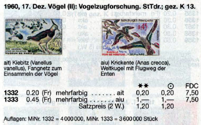
Something like this must have happened when Michel (Europa 1968) states that the 1960 multicolour engraved bird stamps(Scott Nos. 978-981) were a combination print komb.StTdr. und Odr. Maybe the errors occurred due to a faulty translation from the French to the German. I mentioned this Giorgio Leccese before http://www.dieproofs.it/english/pro...sta_eng.htmlIf you scroll down you will see this quote below : Quote:
For definitives since 1960 some French issues, mostly the large size Art stamps, have been printed in up to six colors.
Two dies are prepared by the engraver: one for direct-recess and one for offset-recess. No wonder the Michel editors were confused when they saw direct and indirect recess. Would someone with a recent Michel Südwesteuropa check and see if these errors were now corrected. |
|
Send note to Staff
|
| Edited by lithograving - 03/22/2018 9:35 pm |
|
|
Pillar Of The Community
Canada
5821 Posts |
|
|
Quote:
the current edition of Stamp Magazine (UK) has an illustrated feature on engravings by Pierre Gandon. Thanks Ringo. Sounds like something that would be of interest to us engraving fanatics, I wonder if it is available here in Canada. A few years ago the Chapters/Indigo bookstores did carry a glossy UK stamp magazine (cant remember if it was the Stamp Magazine) but they wanted something like $10 for a copy. No way. I asked at my local library to see if they could get this mag but they couldn't/wouldn't. My library though does have Linn's Stamp News Monthly magazine which sometimes has interesting articles. |
|
Send note to Staff
|
|
|
Valued Member
United Kingdom
313 Posts |
|
|
Replies: 97 / Views: 31,997 |
|