Stamp Community Family of Web Sites
Thousands of stamps, consistently graded, competitively priced and hundreds of in-depth blog posts to read


Stamp Community Forum
 
Username:
Password:
Save Password
Forgot your Password?

This page may contain links that result in small commissions to keep this free site up and running.

Welcome Guest! Registering and/or logging in will remove the anchor (bottom) ads. It's Free!

Pansies Issued March 2, 2015 - Traffic Lights

 
To participate in the forum you must log in or register.
Author Previous TopicReplies: 7 / Views: 1,755Next Topic  
Pillar Of The Community
Canada
1395 Posts
Posted 03/14/2015   5:41 pm  Show Profile Bookmark this topic Add BlackJag to your friends list Get a Link to this Message
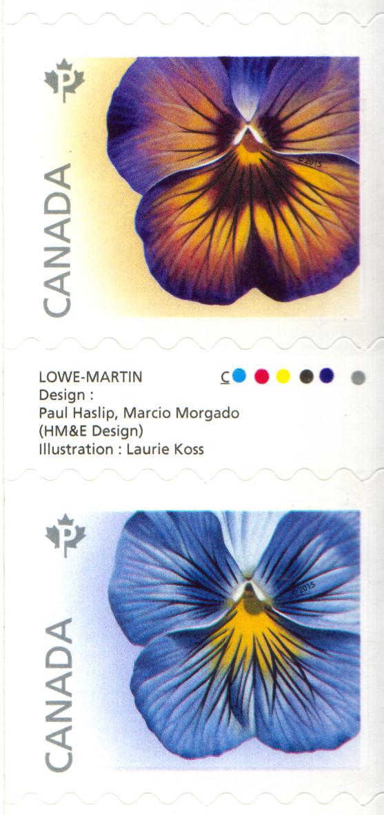
My roll of the recently issued Pansies shows the grey traffic light significantly apart from the other 5 colours.

Unless the grey "CANADA" and "Permanent logo" are offset from their correct positions on the stamp, I don't see any alignment problems other than the normal slight colour shifts. Or perhaps the entire image is shifted too far right leaving only he grey inscriptions in the correct location.

Do the grey inscriptions correspond with anyone else's coil stamps?

Send note to Staff

Rest in Peace
7742 Posts
Posted 03/14/2015   5:52 pm  Show Profile Bookmark this reply Add wert to your friends list  Get a Link to this Reply
BlackJag...I think you are correct to some extend..I am not sure but I think the traffic lights are aligned vertically on stamps..if they are the same distance apart, then there should be NO colour shift and by the look at your stamp the gray coloured "Canada" should be more to the LEFT..Just my opinion.

Robert
Send note to Staff  Go to Top of Page
Pillar Of The Community
United States
8956 Posts
Posted 03/14/2015   6:23 pm  Show Profile Bookmark this reply Add Petert4522 to your friends list  Get a Link to this Reply
I am by no means an expert on these, but it seems to me that the black or dark grey, underlined C is also misplaced! Too far to the right maybe?

Peter
Send note to Staff  Go to Top of Page
Pillar Of The Community
923 Posts
Posted 03/15/2015   2:35 pm  Show Profile Bookmark this reply Add sak to your friends list  Get a Link to this Reply
Yes, BlackJag. My inscription strip of four has the same feature.
Send note to Staff  Go to Top of Page
Rest in Peace
Canada
6750 Posts
Posted 03/16/2015   5:10 pm  Show Profile Bookmark this reply Add Puzzler to your friends list  Get a Link to this Reply
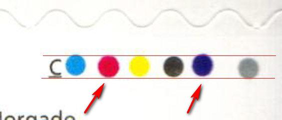
A lot of the dots are not lined up correctly, or the C.

I think the red and blue dots are over-sized also.


So wouldn't this show in he colours of the stamp also?

Is the souvenir sheet the same?

I miss the Post Office in winter and ice!
Send note to Staff  Go to Top of Page
Pillar Of The Community
Canada
1395 Posts
Posted 03/17/2015   1:35 pm  Show Profile Bookmark this reply Add BlackJag to your friends list  Get a Link to this Reply
RE: Puzzlers query - The misalignment of the traffic lights does show slight colour shifts in the stamps.

The larger blue traffic light does not appear to affect the stamp image. The red traffic light appears to me to be the same size as the others.

The souvenir sheet places the grey inscriptions across the bottom of the stamp with the traffic lights are properly aligned in my two examples, so is not comparable with the coil stamps.
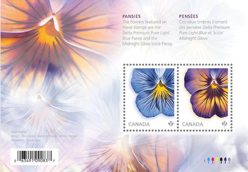


Does any one have a coil stamp with the flower image in a more centralized position with the grey inscriptions remaining in the same position as my example?

I should have checked this before. The Canada Post web site coil strip (below) is probably properly aligned and shows the grey inscriptions much closer to the left edge than mine. This does confirm that my roll has all stamps with the grey inscriptions shifted to the right. In mine, the inscriptions are closer to the second perforation (from the left) than Canada Post's which is closer to the first perforation and into the yellowish and bluish background colours left of the flowers.

Send note to Staff  Go to Top of Page
Edited by BlackJag - 03/17/2015 1:51 pm
Rest in Peace
7742 Posts
Posted 03/17/2015   1:42 pm  Show Profile Bookmark this reply Add wert to your friends list  Get a Link to this Reply
Here is the gentleman that designed that stamp..


Send note to Staff  Go to Top of Page
Rest in Peace
Canada
6750 Posts
Posted 03/17/2015   4:54 pm  Show Profile Bookmark this reply Add Puzzler to your friends list  Get a Link to this Reply

Quote:
The Canada Post web site coil strip (below) is probably properly aligned

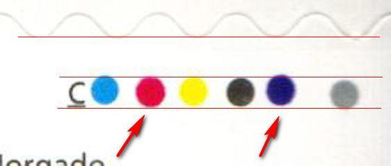
The Canada Post web site may have images that are from the design process and not from real printed stamps. Everything looks good in the design process. Reality gives us interesting stamps.


Here is a further image, showing another red line added by me under the perfs, in case the original image was mis-aligned in the first place.
Send note to Staff  Go to Top of Page
  Previous TopicReplies: 7 / Views: 1,755Next Topic  
 
To participate in the forum you must log in or register.

Go to Top of Page

Disclaimer: While a tremendous amount of effort goes into ensuring the accuracy of the information contained in this site, Stamp Community assumes no liability for errors. Copyright 2005 - 2026 Stamp Community Family - All rights reserved worldwide. Use of any images or content on this website without prior written permission of Stamp Community or the original lender is strictly prohibited.
Privacy Policy / Terms of Use    Advertise Here
Stamp Community Forum © 2007 - 2026 Stamp Community Forums
It took 0.16 seconds to lick this stamp. Powered By: Snitz Forums 2000 Version 3.4.05