| Author |
 Replies: 12 / Views: 1,820 Replies: 12 / Views: 1,820 |
|
|
Rest in Peace
7742 Posts |
|
|
Hi guys...Take a look at these Scott #218 and #219 from the same design/run..The Scott 218 stamp, the King seems to be looking off to the left..BUT..The Scott 219 on the right, the King seems to be looking straight at you...Am I seeing things, or is it there..?? Robert 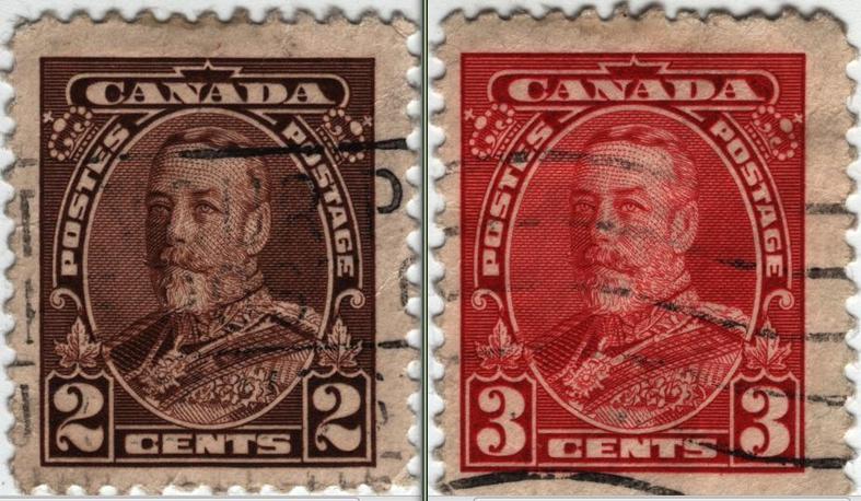 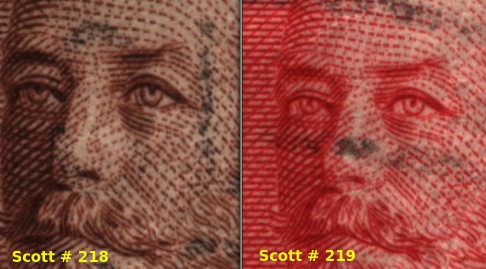 |
|
Send note to Staff
|
|
|
|
|
Pillar Of The Community
2013 Posts |
|
|
It's your cancel stamps that make it look like that, ( your 218 have black cancel around the eye. take mint copies and you will really see. |
Send note to Staff 
|
| Edited by area66 - 04/03/2015 8:32 pm |
|
|
Valued Member
Canada
215 Posts |
|
|
It might be the beer but #219 looks like he's looking for a fight. Seriously though it looks like two totally different designs on the eyes. The #219 is more defined. |
|
Send note to Staff
|
|
|
Pillar Of The Community
United States
7239 Posts |
|
|
In portraying faces, either by drawing or with photography, it doesn't take much of a change in lighting to make a person look completely different. People in advertising understand this, as the old 'before and after' ads show. In the case of George V, the inking is a little heavier on the 2 cent stamp, making the eyes seem to look to the left. The 3 cent stamp has less inking in the eyes, and they seem to look more toward the viewer. Interesting. |
|
Send note to Staff
|
|
|
Pillar Of The Community
United States
1947 Posts |
|
|
It is difficult to describe, but there is something different about them. The more you try to pin it down the harder it is to see the difference.
Inking? Cancel? Neither seems to adequately account for the difference. |
|
Send note to Staff
|
| Edited by rohumpy - 04/04/2015 06:12 am |
|
|
Valued Member
United States
132 Posts |
|
|
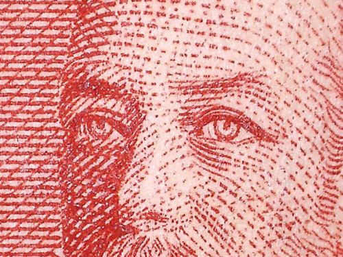
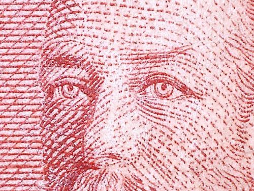
I think the difference is perhaps caused by the printing of the pupil, particularly in his left eye (the viewer's right). Looking at the enlarged scans, on the 2¢ stamp, the pupil is connected to the upper eyelid but on the 3¢ stamp, there is a small gap between the pupil and the eyelid. The difference isn't as great on his right eye. But on both eyes, the pupil is much more distinct on the 3¢ stamp than on the 2¢ stamp. |
|
Send note to Staff
|
|
|
Pillar Of The Community
United States
1114 Posts |
|
|
On 218 the eye on the right has a strong vertical line to the left of the pupil, on the 219 the line is very light, giving the impression that the pupil is centered, looking straight ahead. |
|
Send note to Staff
|
|
|
Rest in Peace
7742 Posts |
|
|
Ok guys....You have suggested everything...No one noticed the obvious..in stamps/paintings as in real life..when you draw or take a picture of some ones eyes, and they look oblong, that indicates you are looking at the side of person stareing not directly at you..If the eyes (pupils) are round, then you are looking straight at a person... Look at the right eye of #218 ad #219..You will see what I mean. DOES THAT MAKE SENSE..? Robert 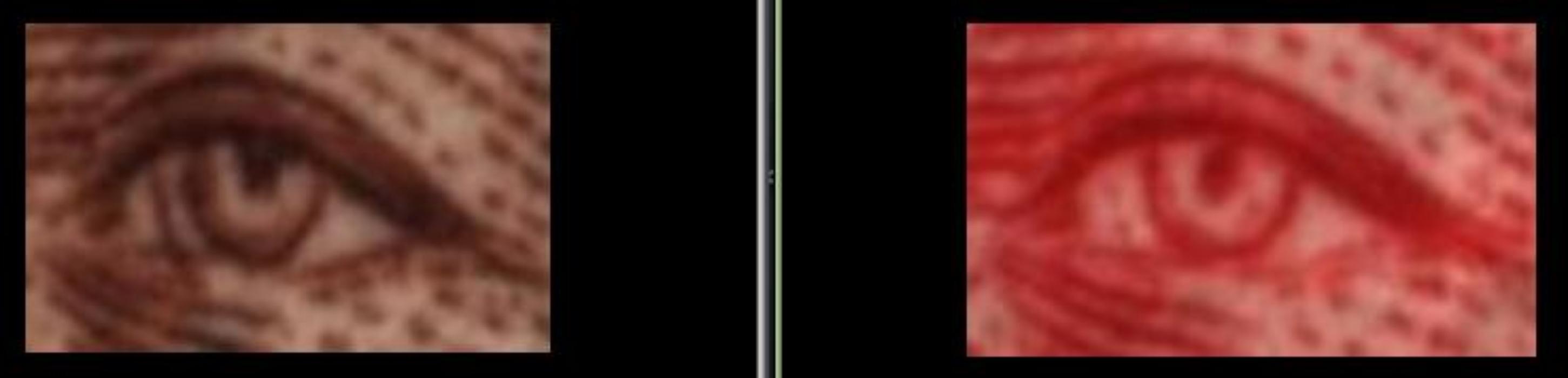 |
|
Send note to Staff
|
| Edited by wert - 04/04/2015 10:26 am |
|
|
Valued Member
Canada
66 Posts |
|
|
Is it just optical illusion??? It's look like the cancelation line in the eye of the 218 make the difference. |
|
Send note to Staff
|
|
|
Pillar Of The Community
Canada
1416 Posts |
|
|
Pillar Of The Community
Canada
1324 Posts |
|
|
Pillar Of The Community
United States
3277 Posts |
|
|
No one has mentioned that we're zoomed in much closer to 218 than we are to 219.
All four pupils are different shapes. On 218, his right pupil is the roundest of the four, his left is more a rectangle and more color around the iris.
On 219, his right pupil is comma shaped and the left is oval and slightly angled. |
|
Send note to Staff
|
|
|
Moderator

United States
5106 Posts |
|
| |
Replies: 12 / Views: 1,820 |
|




 Posted 04/03/2015 7:40 pm