| Author |
 Replies: 18 / Views: 4,488 Replies: 18 / Views: 4,488 |
|
Pillar Of The Community
United States
791 Posts |
|
|
Siegel's 1915 Rarities of the World is now posted on Stamp Auction Network and this item caught my attention for all the wrong reasons. 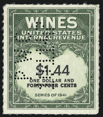 The description states that the first line is smaller and compares it to the RE198a. It even got a PF certificate. 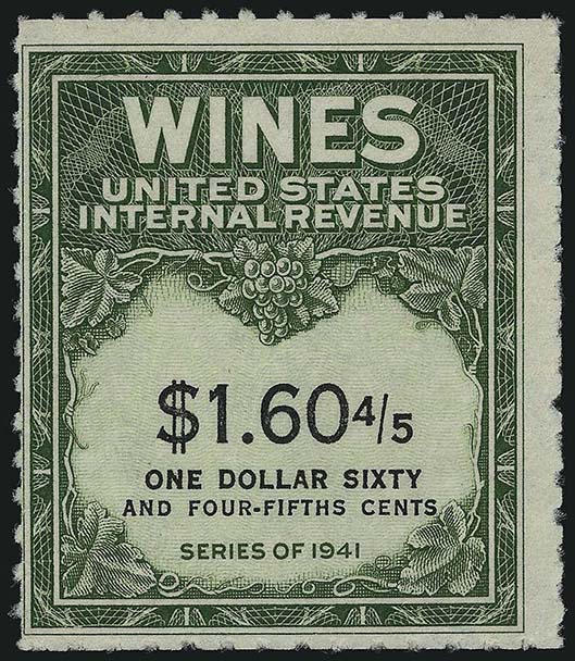 If this truly is as stated, not only would be first line be smaller type but consequently it would make the line shorter. Compared to the actual RE147 such is not the case: 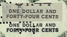 My personal opinion? I just simply think the second line was not correctly tamped down to be the same "type high" as the first line. http://en.wikipedia.org/wiki/Letterpress_printingComments? |
|
Send note to Staff
|
|
|
|
|
Pillar Of The Community
United States
6432 Posts |
|
|
I agree with your conclusions.
If you go to the Siegel website and download the high-resolution image and superimpose the top line on the bottom, you can defintely tell it is not a matter of one font being a larger size than the other.
1. The interior whitespace of the capital "O" in ONE and FORTY are the same size. This would not be the case if the fonts were of different size.
2. The interior whitespace in the capital R is larger in the smaller line than in the larger one. Again, this would not be the case if the typeset font were a different size.
In my opinion, it's a case of ink spreading on the bottom line, not a larger font size. It's an EFO at best, not a new variety.
The Philatelic Foundation really screwed the pooch on this one. |
Send note to Staff 
|
|
|
|
Pillar Of The Community
United States
791 Posts |
|
|
I'll bet dollars to donuts if you turn it over, the impression the second line makes is more pronounced than the first line.
|
|
Send note to Staff
|
|
|
Pillar Of The Community
United States
6432 Posts |
|
|
Bedrock Of The Community
United States
10605 Posts |
|
|
Everyone is entitled to an opinion. However it should be assumed that when the PF looks at a patient such as this one, there are a number of opinions requested and given, and that all of the options given here were considered and discussed at great length. Also that some high level technology was used as well. The idea of spreading ink was throughly discussed, as was the relative size of the letters and the spaces among other things. And 1typestter would lose both his dollars and his donuts. |
|
Send note to Staff
|
|
|
Pillar Of The Community
United States
6432 Posts |
|
|
Well, then we'll have to agree to disagree. I spent 12 years working in commercial offset printing, first in typesetting and then in prepress. In my opinion, the the effect is not indicative of a difference in typeface size but rather pressure and/or inking. As I said, EFO not variety.
As more than a few certificates prove over the years, the Philatelic Foundation is not infallible. None of the expertizers are. |
|
Send note to Staff
|
|
|
|
Bedrock Of The Community
United States
10605 Posts |
|
|
Since they examined the stamp in person and you only have looked at a scan, you have insufficient data to form an opinion despite your experience which is certainly valuable. And the group involved has a few hundred years of combined experience at looking at philatelic printing of all types. |
|
Send note to Staff
|
|
|
Pillar Of The Community
United States
791 Posts |
|
|
Revcollector, you are completely correct in that we are only looking at a scan. However, as I said earlier and revenuecollector will agree with me -- it is NOT physically possible that the LENGTH of the lines would match a common RE147.  Letterpress type in the early 1900's was only cast in full point sizes and in most cases in increments of 2 points -- 6 pt., 8 pt., 10 pt. etc. This is unlike today's typography where computers can set type in tenths and even hundreds of points. By the way, revenuecollector, I started typesetting in 1972 on an old Intertype machine. I think I have you beat!  |
|
Send note to Staff
|
| Edited by 1typesetter - 06/07/2015 08:42 am |
|
|
Pillar Of The Community
United States
6432 Posts |
|
|
Quote:
By the way, revenuecollector, I started typesetting in 1972 on an old Intertype machine. I think I have you beat! Most definitely. My first exposure to typesetting was in 1989 using TeX in a UNIX mainframe environment to produce textbooks, and Linotype L300 machines for paper and film output. In 1993 I moved to an environment that was hybrid, using hot metal type for certain items, and a mini-computer-based proprietary code-based typesetting system for the majority of textbooks, along with Windows 2.0 clients for previewing. I still remember doing daily and weekly backups on magnetic tape reels. I still do typesetting on certain projects, but it's all done with Adobe FrameMaker now. |
|
Send note to Staff
|
|
|
|
Valued Member
United States
207 Posts |
|
|
Well if we look at the deliveries for FY52, the only period when both the $1.44 stamp and the $1.60 4/5 stamp were in production at the same time. If you can have a the RE198b be a good variety then why not the newly discovered $1.44. Given all that was going on with the wines stamps at this time like the 3-L's error, I am not suprised that more mistakes don't show up. |
|
Send note to Staff
|
|
|
Bedrock Of The Community
United States
10605 Posts |
|
|
In the first place these stamps are from the 1950's, NOT the "early 1900's". And no one has claimed that the $1.44 and the $160 4/5 are the same error; in fact they are not.
The $1.44 error appears to be a case of a BOLD font having been used instead of a regular font. This would account for the size similarity but would still show up as clearly different. |
|
Send note to Staff
|
|
|
Bedrock Of The Community
United States
10605 Posts |
|
|
It should also be noted that there was a total of 92,865,750 of the $1.44 value printed over a 9 year span; finding a new discovery is not all that surprising given both the use and the low catalog value. Certainly no one was looking for one. |
|
Send note to Staff
|
|
|
Pillar Of The Community
United States
791 Posts |
|
|
$4000
revenuecollector, I'm sure you're thinking what I'm thinking.......... |
|
Send note to Staff
|
| Edited by 1typesetter - 06/26/2015 08:14 am |
|
|
Bedrock Of The Community
United States
10605 Posts |
|
|
I wasn't listening to the auction, so I don't know the opening or the number of bidders. Or where it went, phone, net, floor or book. |
|
Send note to Staff
|
|
|
Pillar Of The Community
United States
791 Posts |
|
|
Just checked the bidding log on SAN.
Went to an internet bidder. Don't know the opening. |
|
Send note to Staff
|
| Edited by 1typesetter - 06/26/2015 08:18 am |
|
|
Bedrock Of The Community
United States
10605 Posts |
|
|
It was estimated at $5000-$7000, so it is reasonable to assume that $4000 was the opening. |
|
Send note to Staff
|
|
|
Replies: 18 / Views: 4,488 |
|