| Author |
 Replies: 49 / Views: 9,389 Replies: 49 / Views: 9,389 |
|
Rest in Peace
7742 Posts |
|
|
Hi guys...Take look at this Scott 37 on this cover (1888)...Funny how second "8" in the cancel is smaller and looks like it is upside down..But what I was wondering about was the extra cancel over the name...was this usual back then to place an extra cancel..??? Robert 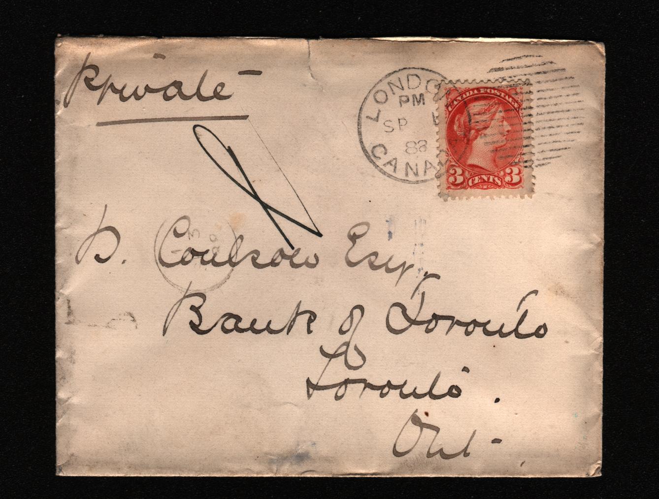 PERF. 12.2 X 12.2 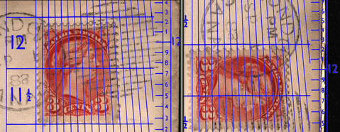 EXTRA CANCEL. 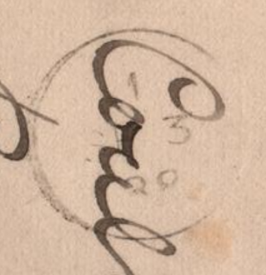 |
|
Send note to Staff
|
|
|
|
|
Pillar Of The Community
USA
646 Posts |
|
|
Pillar Of The Community
Canada
728 Posts |
|
|
I think this is a Letter Carrier's delivery handstamp. Notice that the date is SP 3, two days after the despatch date of SE 1. I do have examples of these in my collection. They are not common but nice to have. |
Send note to Staff 
|
|
|
Rest in Peace
7742 Posts |
|
|
Pillar Of The Community
603 Posts |
|
|
Valued Member
Canada
382 Posts |
|
|
Wert, it is more accurate to measure perfs from the valleys than the perf tips. Jimjung is spot on -- that is a carrier mark. Archerg is also correct that this is #41 (early), not #37. |
|
Send note to Staff
|
|
|
Rest in Peace
7742 Posts |
|
|
Thanks Garfield..I stand corrected...I will measure the tips from now on..Thanks again.
Robert
|
|
Send note to Staff
|
|
|
Pillar Of The Community
Canada
1415 Posts |
|
|
Rest in Peace
7742 Posts |
|
|
Rest in Peace
Canada
5701 Posts |
|
|
Garfield and Archerd, I am sure I see a position dot in the lower left (please confirm Robert) - wouldn't that make it a #37 |
|
Send note to Staff
|
|
|
|
Rest in Peace
7742 Posts |
|
|
BeeSee...That's what I was going on in the first place to identify it..It does have a position dot..That's why I thought originally it was a Scott #37. Robert 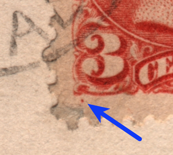 |
|
Send note to Staff
|
|
|
Rest in Peace
Canada
5701 Posts |
|
|
Rest in Peace
7742 Posts |
|
|
Hi BeeSee...Was talking to a stamp expert friend of mine last night..He said the dot if helpful, but not a true indicator of a 37..He said believe what gportch had said...Still confused...  Robert |
|
Send note to Staff
|
|
|
Pillar Of The Community
Canada
644 Posts |
|
|
The colour and especially the perforations are pretty conclusive that it is a 41.
The position dot is confusing, I agree, but I have seen the same on other 41's similar to yours. The lesson here is that the position dot is one clue, but not conclusive for identifying a 37 vs. a 41.
Paper, colour and especially perforations are the key. |
|
Send note to Staff
|
|
|
Rest in Peace
7742 Posts |
|
|
You are correct 3Dadeo...My stamp expert friend said COLOUR is the only true way to identify.
Robert |
|
Send note to Staff
|
|
|
Rest in Peace
Canada
5701 Posts |
|
|
Quote:
You are correct 3Dadeo...My stamp expert friend said COLOUR is the only true way to identify. The problem here is that it is impossible to determine the true colour by looking at the image. It is dependant on the original scan, and the monitor of the user. the colour sure looks different on my two monitors at the office side by side, and my phone. I see three different colours. |
|
Send note to Staff
|
|
|
|
Replies: 49 / Views: 9,389 |
|


