| Author |
 Replies: 23 / Views: 4,497 Replies: 23 / Views: 4,497 |
|
Pillar Of The Community
United States
6433 Posts |
|
|
16 1st issue U.S revenues with a combined catalog value of $7.95. The lot was listed with a Buy-It-Now cost of $15.99... so why did I purchase it at double catalog value? You may want to click on the image to view it at full size. Let's see what people see.  (Bart, please don't reply until the answer is revealed.)   |
|
Send note to Staff
|
|
| Edited by revenuecollector - 06/12/2016 5:25 pm |
|
|
|
|
Pillar Of The Community
United States
2423 Posts |
|
|
Hahaa! I know so little about revenues I would not even hazard a guess. |
Send note to Staff 
|
|
|
Valued Member
United States
161 Posts |
|
|
I know little to nothing about Revenues, however I think I see why you bought it for that much: There's a stamp near the middle with eyes, nostrils and mouth(?) drawn with ink. Am I right? |
|
Send note to Staff
|
|
|
Bedrock Of The Community
United States
10623 Posts |
|
|
That's all I see. Cute, not worth a whole lot to most collectors but the sort of oddity that certain dealers would ask a premium for. |
|
Send note to Staff
|
|
|
Pillar Of The Community
United States
8956 Posts |
|
|
I saw that too, but ignored it, It is not the blue paper one, is it?
Peter |
|
Send note to Staff
|
|
|
Pillar Of The Community
United States
867 Posts |
|
|
Not my area of expertise, but what is going on in the tablet of the upper left 5¢ Inland Exchange and the 2¢ Bank Check stamp to the right of the googly eyes noted by others? |
|
Send note to Staff
|
|
|
Pillar Of The Community
United States
6433 Posts |
|
|
The cute little doodle on George, while right up my alley, was not the primary reason for the purchase. In fact, I didn't even notice that cancel until a second look at the picture (insert embarrassed emoticon here).
No, there's one particular stamp that based on the image looked as if it might have potential. |
|
Send note to Staff
|
|
| Edited by revenuecollector - 06/12/2016 7:20 pm |
|
|
Bedrock Of The Community
United States
10623 Posts |
|
|
The second row second 2 cent USIR from the left MIGHT have something going on, or it might be heavy somewhat sloppy inking. The first 5 cent inland on the left might have a DT, but it looks like a wet print. Everything else looks ordinary to me. |
|
Send note to Staff
|
|
|
Pillar Of The Community
3859 Posts |
|
|
What's with the different looking "5's" on the upper left most stamp, especially with the white diamond dot under the bottom right side "5"? |
|
Send note to Staff
|
| Edited by jogil - 06/13/2016 08:09 am |
|
|
Bedrock Of The Community
United States
10623 Posts |
|
|
In order to print these issues clearly, the paper had to have a certain moisture content. I believe it was in the 8%-12% range. Too much produces a muddy print, and too little means the ink won't stick properly. The paper here was too wet. The white spot is simply a part of the result. |
|
Send note to Staff
|
|
|
Bedrock Of The Community
United States
10623 Posts |
|
|
The third stamp from the right in the second row is an example where the paper was too dry, a "dry print". |
|
Send note to Staff
|
|
|
Pillar Of The Community
3859 Posts |
|
|
Are these unintentional wet and dry printings any different than the intentional wet and dry printings such as those in the Liberty Series which were printed on different printing presses with different moisture content for the wet paper? |
|
Send note to Staff
|
|
|
Bedrock Of The Community
United States
10623 Posts |
|
|
They are different in that they produced poor results. These early revenues would have been considered "wet" printings using the wet/dry concept of later issues. As far as I know, all engraved stamps were wet printings until the dry printing method was created. |
|
Send note to Staff
|
|
|
Pillar Of The Community
United States
6433 Posts |
|
|
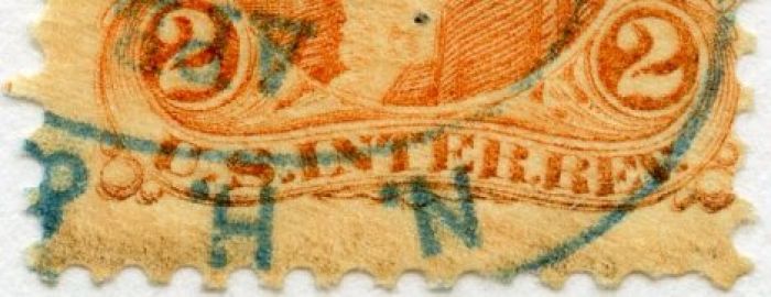
Bart hit on it. Looking at the auction image, there appeared to be something going on with the middle R15c. Below are those 3 stamps cropped from the image. The bottom lettering looked to possibly be more than just an inking anomaly. Additionally, compare the ornaments in the lower right corner with the stamps on either side. 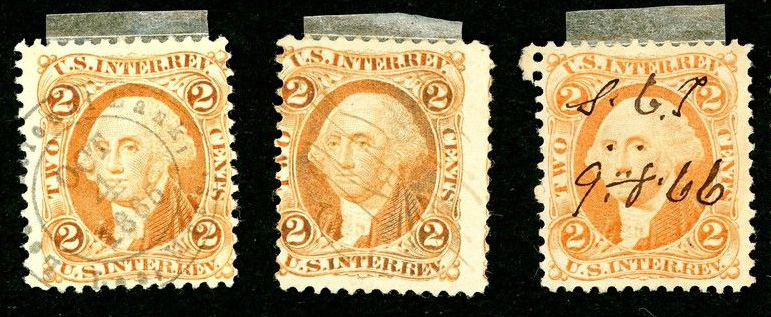 Here is my scan of the stamp in question. One of the more dramatic R15 double transfers I've encountered. Lettering across the bottom, outer scroll lines, and ornaments at center and right. 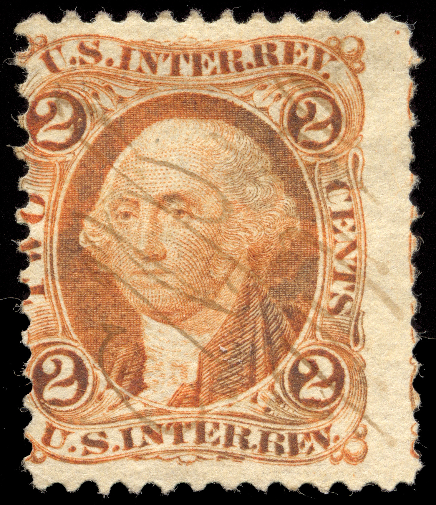 |
|
Send note to Staff
|
|
|
|
Pillar Of The Community

United States
1271 Posts |
|
|
Pillar Of The Community
United States
6433 Posts |
|
|
Close, but the E and V in REV are different. Would need to see a higher resolution image of yours to determine more.
R15c has a zillion DTs. |
|
Send note to Staff
|
|
|
|
Replies: 23 / Views: 4,497 |
|