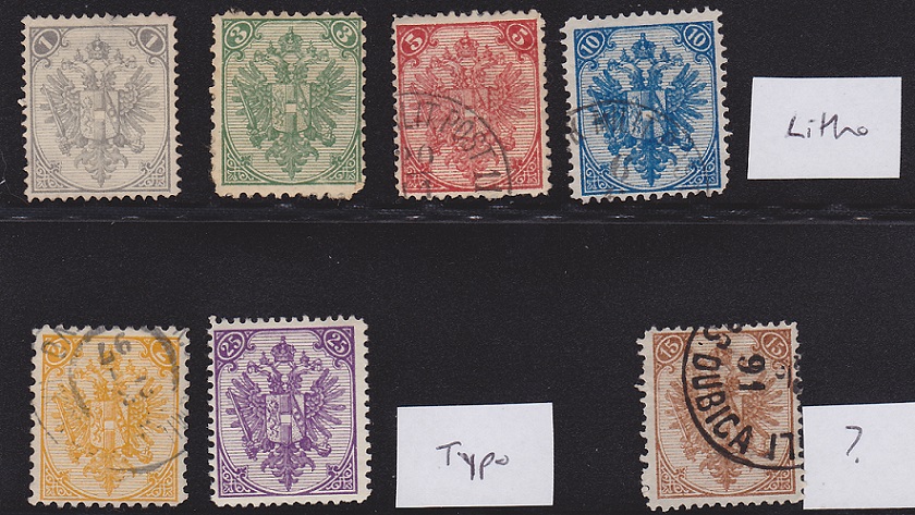
Caveat: I am only a student of these.
I find the differences marked, if you scan at a reasonable 600dpi
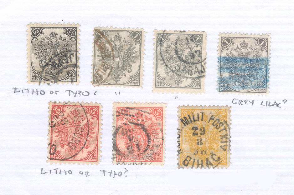
There is far more detail in the Lithography (as I see it)
I have no idea about "reprints" if they exist.
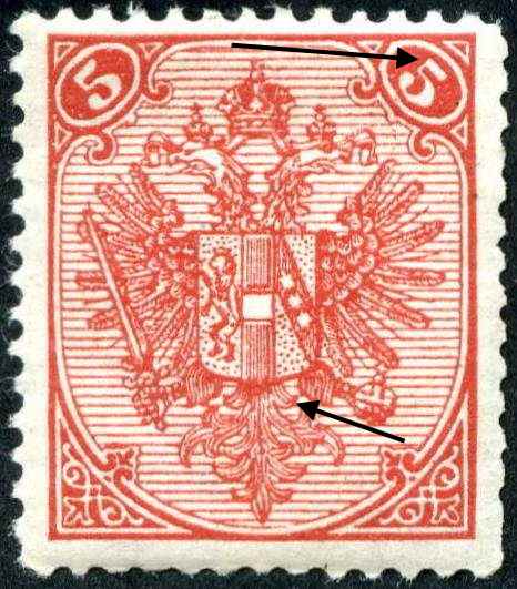
Here is a Toggle, with my estimation.
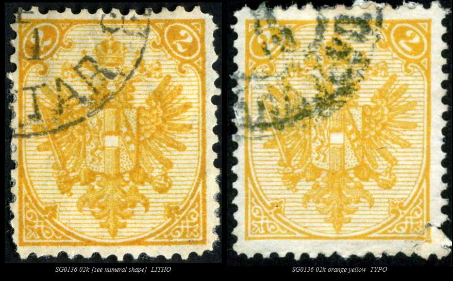
1. The top stroke of the "5" is markedly different
2. John's "eye" of the lion is correct...it moves
3. in the bottom feathers there are 2 lines in the typo and 3 in litho.
see what you think.
Sorry, SCF will not accept my GIF.
here are the images, toggle them with your mouse.
Re John's reference to the numeral "2" shape.