| Author |
 Replies: 69 / Views: 12,346 Replies: 69 / Views: 12,346 |
|
|
|
Pillar Of The Community
United States
937 Posts |
|
|
In no way am I trying to turn this into a competition. I just want to make some remarks. Gary, I see some differences between our stamps that seem to be more complexly different than a combination of worn/unworn and poorly inked/perfectly inked. - The eye: mine has "less lines" but has an overall more "eye" shaped shape. Especially one line in particular that is more than a semi-circle, which is not present on your stamp. To me (a relative newbie at this) it seems that the vertical very fine lines in yours seem to indicate a later recutting compared to all of the lines around it. Your stamp's six vertical shading lines seem to be the finest (i.e. most narrow) of both of our stamps. My stamp shows much more detail in all of the lines that are not anywhere near those six vertical lines, except mine's circular line that is an approximation of an iris. The lines outside of that group of six are relatively coarse in comparison on both of our stamps. Once again, not trying to start a pissing match. I want to highlight that I think that the difference between our stamps show a progression of change in the transfer roll if not just our plates. It will obviously take observation of more stamps of both plates to help make that determination. For consideration, here's a lineup of ours: 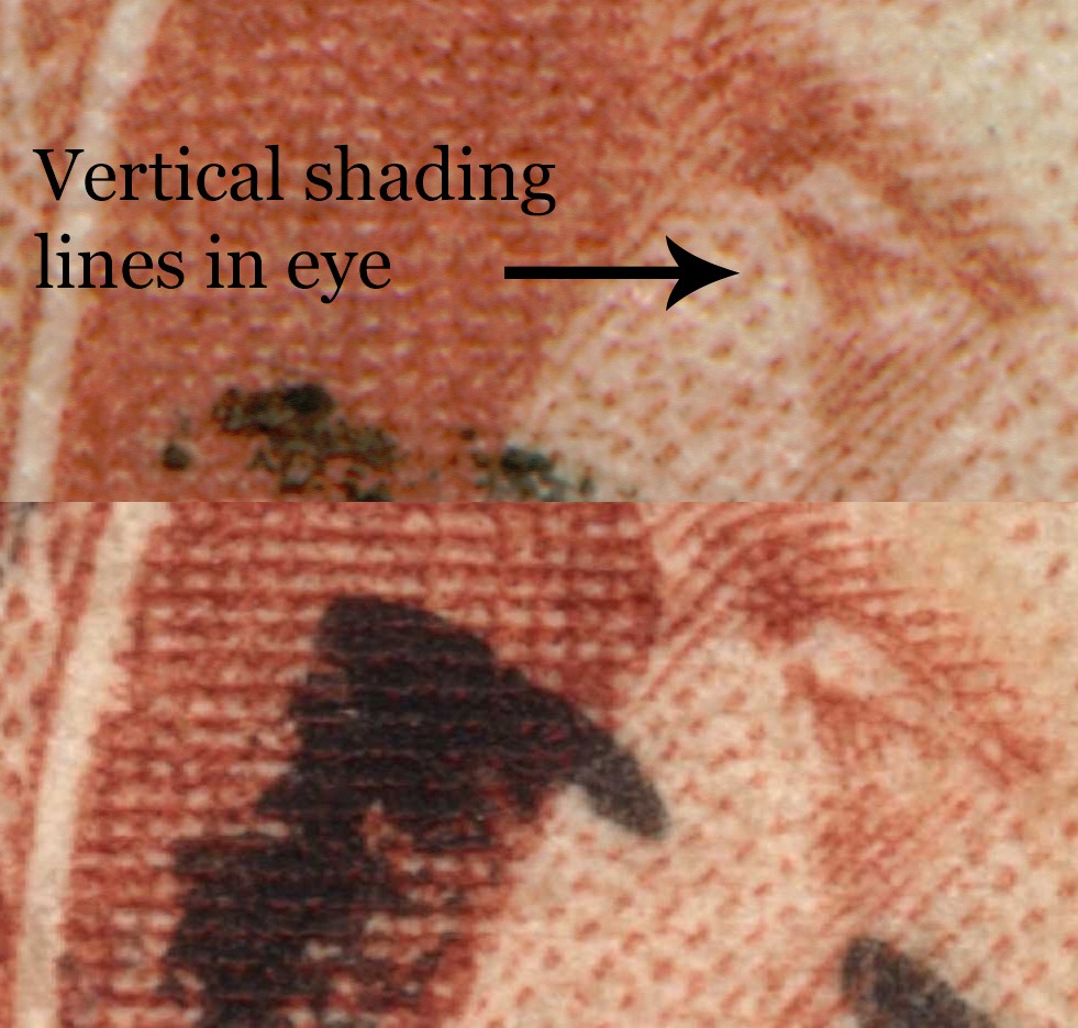 Perhaps I am off base. Regardless, I welcome all comments. |
Send note to Staff 
|
Ryan = HDNAC = DNA = HDC = Hysterical DNA Collector = Historical DNA Collector = me who just loves stamps :) |
| Edited by Historical DNA Collector - 07/25/2017 06:24 am |
|
|
Pillar Of The Community
United States
2943 Posts |
|
|
HDNA, a thought from another 'newbie', should you identify which relief these two stamps are? |
|
Send note to Staff
|
|
|
Pillar Of The Community
United States
937 Posts |
|
|
stampcrow,
Good question. Tomorrow I'll have some time to explore if that particular point is pertinent. Until then, my opinion is still that changes across a time differential are responsible for the differences.
My question should be easily answered with a small effort. I'll try my best on my end to do so when I have some spare time tomorrow. |
|
Send note to Staff
|
Ryan = HDNAC = DNA = HDC = Hysterical DNA Collector = Historical DNA Collector = me who just loves stamps :) |
|
|
Pillar Of The Community
United States
937 Posts |
|
|
At this time, I cannot make any definitive statements. I am away from my stamps and cannot easily find images to compare highly detailed examples. Without further research, I do not know if there is fine detail differences in the engraving of the eye on this issue between reliefs.
I stated that I thought that there is a difference among the two presented unperforated examples, but I cannot at this time back that up with any definitive source nor evidence from my own examples.
This does make me quite curious, so I will be looking into it in the future. If anyone has definitive knowledge to share concerning this subject, then I would love to hear your arguments. |
|
Send note to Staff
|
Ryan = HDNAC = DNA = HDC = Hysterical DNA Collector = Historical DNA Collector = me who just loves stamps :) |
| Edited by Historical DNA Collector - 07/27/2017 06:15 am |
|
|
Pillar Of The Community
United States
2226 Posts |
|
|
Ryan,
I think I see the semi-circle that you're seeing where the iris would be on your #10A. I'm also seeing a curved line in the lower-right third of the eyelid, and two more curved lines making up the upper folds of the eyelid. Very curious!
Yours also shows what I would call a more perfect inking of the cross-hatched lines that make up the dark background oval. That is, the lines are bold, and the un-inked voids in the cross-hatch are white.
Regarding the two specimens you pasted together above, it seems the yellowish rose red ink shows clearer fine lines (eyeball), but less clear thick lines (cross-hatch of background oval). I wonder if this could be due to how much pressure was used on the transfer roller for each impression, and possibly the amount of burnishing done. |
|
Send note to Staff
|
|
|
Pillar Of The Community
United States
937 Posts |
|
|
Gary,
I agree with all of your observations. My previous statements were a bit cryptic and at very least confusing. My tiredness lead to difficult to understand explanations.
"Regarding the two specimens you pasted together above, it seems the yellowish rose red ink shows clearer fine lines (eyeball), but less clear thick lines (cross-hatch of background oval). I wonder if this could be due to how much pressure was used on the transfer roller for each impression, and possibly the amount of burnishing done."
I agree that these characteristics are what should be focused upon for the next step in understanding these phenomenons.
My knowledge of specifics pales in comparison to everyone else in this thread. Regardless, I'll give this problem my attention as often as I can.
Until a time where we have full understanding, I urge every collector of this issue to find vertical (or any) artifacts in the lower line of the lower text block.
Gary, I have an "off the cuff" hypothesis that the lowest horizontal line of the lower text block was initially intended to be conjoined. The artifacts that we are seeing could be the result of an abortion of such an intended design change.
Comparison to essays could be invaluable. Maybe I can find some.
Any ideas are welcome,
Ryan |
|
Send note to Staff
|
Ryan = HDNAC = DNA = HDC = Hysterical DNA Collector = Historical DNA Collector = me who just loves stamps :) |
|
|
Pillar Of The Community
United States
937 Posts |
|
|
Here we are again, me posting when I am very tired. Grain of salt and all...
Gary, I think that at least some of the observed differences between thick and thin lines might be attributed to differences in our scanners. Mine has an optical resolution of 1200 dpi. You state that your scans are 4800 dpi. In my experience, the upper dpi specification of a scanner is usually twice its optical resolution. Firmware/software has a hand in it, but I'll bet that your scanner has 2400 dpi optical resolution, compared to mine at 1200 dpi. I believe that we are at the fine edge of comparison where it is necessary that we eliminate technical differences that are probably clouding our visual comparisons.
I will finally have some time to give all of this stuff further thought this weekend. Regardless, interesting discourse. Thanks. |
|
Send note to Staff
|
Ryan = HDNAC = DNA = HDC = Hysterical DNA Collector = Historical DNA Collector = me who just loves stamps :) |
|
|
Moderator

United States
12330 Posts |
|
|
Hi Ryan,
A scanned image with a scanner done at an optical resolution of 2400 dpi will often deliver less sharpness than a scanner with an optical resolution of 1200 dpi.
Geek Speak...
Technically, they cannot cram tiny CCD cells into the same space as a typical array. So instead they use the same sized cells in two staggered rows in the chip (typically a HyperCCD or MatrixCCD). This means that each scan line is made up of both rows of the CCD and then merged; resulting in some loss of fine detail.
The point...
As you mention, you guys are working very close to the edge of the technology. As such, we should define and communicate the technical specs of the images that get posted. When we want to compare images from disparate sources at a minimum we should be striving to match the specifications.
If person A has a scanner with an optical resolution of 2400 dpi and person B has a scanner with an optical resolution of 1200, then both users should scan at 1200 dpi. And pushing scans beyond the native optical resolution means you are now into an area where you are actually comparing the quality of the algorithms in the software*. And lastly, no one should not be 'enhancing' their images or in any other way applying software without communicating what has been done. (The guys over in the Canadian section are now using software to 'remove cancels' to find details!?! That is like having an image of an incomplete jigsaw puzzle, asking the software to guess the missing pieces, and then putting stock in whatever the software has guessed.)
If we were just posting images on our last vacation then much of the above doesn't matter. But if folks are going to get into a detailed analysis levels similar to the Zapruder film then efforts should be made to eliminate as many of the technical variables as possible.
Don
*For example, the software written for an Epson scanner differs from the software written for a Fujitsu scanner. So if you assume that both scanners use identical hardware (they don't), you can still get significant differences between the two scanned stamp images based only on the software deltas. |
|
Send note to Staff
|
|
|
Pillar Of The Community
United States
2226 Posts |
|
|
Ryan and Don,
Some good points and technical issues to think about.
I use an Epson Perfection V370 Photo Scanner which, according to the specs, has an optical resolution of 4800 x 9600 DPI. When I put a stamp on the scanner, I typically scan it at multiple resolutions for multiple possible uses. After scanning, I always adjust the color range to bring it closer to the true color of the stamp. I'll try to compare scans of the same stamp at different resolutions today. |
|
Send note to Staff
|
|
|
Pillar Of The Community
United States
2226 Posts |
|
|
Among my scans, here is the stamp with the clearest detail in the vertical shading lines (six lines by my count) in the eyeball. Overlaid are 4800, 2400, and 1200 DPI scans of the same stamp. To me, the vertical shading lines in the eye are just as discernible in the 2400 DPI scan as in the 4800 DPI scan. I could even say these lines are just as discernible in the 1200 DPI scan, but I need to get closer to the monitor to count them. Regarding the background oval in front of Washington's brow, the 2400 and 1200 DPI scans may most clearly show the un-inked voids within the cross-hatches. The 4800 DPI image seems to be blurred in comparison, maybe due to scanner software algorithms as Don mentioned. I'd appreciate reading what others' perceptions of this trio are. I still want to image this stamp with a DSLR camera!  |
|
Send note to Staff
|
|
|
Pillar Of The Community
United States
2226 Posts |
|
|
Here's another yellowish rose red that I just plated as 82R8, and uploaded to the Stamp Smarter plating database. It appears to show one line recut along the right side of the upper-right diamond block. The line connecting the upper-right triangle to the corner of the upper-right diamond block is common, but I haven't seen it extend up past the right point of the diamond. Any thoughts on whether this diagnostic is on the original die but not typically seen on printings?   |
|
Send note to Staff
|
|
|
Pillar Of The Community
United States
937 Posts |
|
|
In the little time available to me to research this topic, I found this #11 that appears to have blank areas and vertical lines to the left of the foot of the T in THREE.  The site the image came from: http://riversidestamps.com/ThinkItsA10.shtmlThat very much has captivated my curiosity. That #11 doesn't seem to be extraordinarily inked such that extreme detail would be highlighted. It is inked such that a high level of detail has been achieved, but it does not seem by itself that those qualities have lead to such detail that the "T" tail would be unique to produced stamps that are inked such that they show more detail than average. So far, I can only suppose that the "tail" on the "T" is due to a less viscous ink and perhaps combined with a more aggressive wiping of the plate prior to impression. This and my "tail" stamp seem to exhibit an uncommon state. If and when I get the time, I'll look into it. Please feel free to look into it under your own research with full support from myself in providing you with what I have found so far. Cheers, Ryan |
|
Send note to Staff
|
Ryan = HDNAC = DNA = HDC = Hysterical DNA Collector = Historical DNA Collector = me who just loves stamps :) |
|
|
Pillar Of The Community
United States
2943 Posts |
|
|
DNA, that is not a #11.
More likely a # 10A.
If I remember correctly the few stamps that I have found with the "vertical lines in the foot of the T" are Orange Brown stamps.
I'm at work now, so I'm limited in my response.
|
|
Send note to Staff
|
|
|
Valued Member
213 Posts |
|
|
Classic Coins has hit upon a very important point, there is curious linkage between the early 1851 printings in OB and the RR printings of 1856. The old theory that "orange browns are known for their rich ink quality" is unfortunately outmoded.
Lets conduct a test argument; Under the "ink theory," the superior printings of 1856 should be due to rose red being "richer" than all others of the period. However, nobody is saying that. Nor were the plates used in 1856 considered "new". So, how come the 1856 RR impressions are so superior to others of the period? Hint, it's the same reason the '51 OB printings were so much better.
Most of you know what I'm going to say already--the answer lies with the paper. Well, not the paper per-se, because the type of paper was not changed. Rather, it was the paper finish.
In 1851, the paper mill sent a batch of "plated" paper, which were individually smoothed by inserting between sheets of zinc and then pressed between heavy metal rollers. This produced a very smooth finish that resulted in extremely fine impressions. Unfortunately, "plate paper" is roughly 10x the cost of traditional "press paper," and so was quickly dropped after the initial printings of June and July of 1851.
As far as the 1856 printings are concerned, a new plant manager, Charles Steel. Steel, was hired in 1855. His task was to improve the state of the stamps which had gradually fallen into decline. According to information supplied by the Smithsonian, Mr. Steel sought to re-introduce plate paper, and that's what resulted in the '56 RR printings.
In these cases, the ink has much less impact on impression quality than the paper. One could take almost any ink used on the 3-cent 1851 and produce superior impressions, provided that plate paper is used.
Questions? Comments?
|
|
Send note to Staff
|
|
|
Pillar Of The Community
United States
2226 Posts |
|
|
AJ, thanks for the interesting information on "plate paper." This is very helpful to this discussion, I think, and helpful to my studies on this issue. |
|
Send note to Staff
|
|
|
Replies: 69 / Views: 12,346 |
|


