| Author |
 Replies: 13 / Views: 2,344 Replies: 13 / Views: 2,344 |
|
|
Valued Member
168 Posts |
|
|
|
|
Pillar Of The Community
United States
3167 Posts |
|
|
Valued Member
United States
249 Posts |
|
|
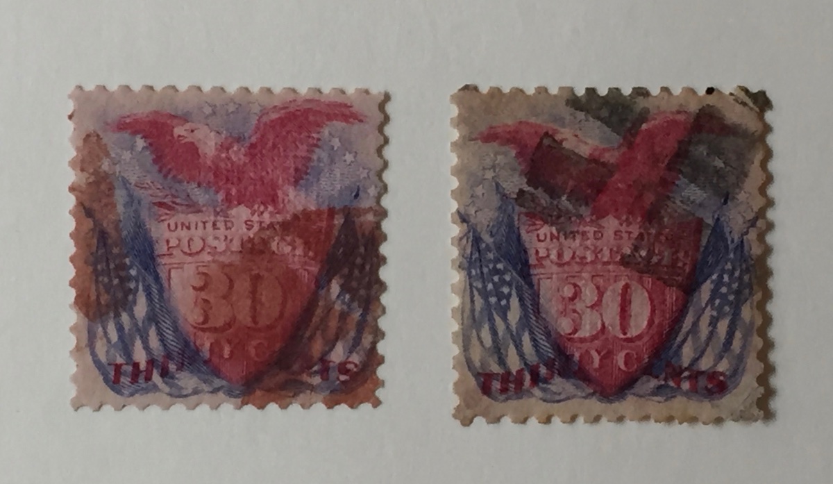
The left one. You can see the design better. The lighter postmark makes it more appealing to me.
Robert |
Send note to Staff 
|
|
|
Pillar Of The Community
1151 Posts |
|
|
Pillar Of The Community
United States
3489 Posts |
|
|
I agree, I'd prefer the left one as well.
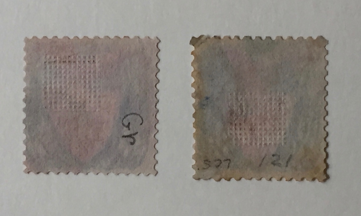
Caveat-I haven't lined up the perfs on either to check for any potential reperf.
A 121 will probably be on my shopping list someday as well. Good luck. |
|
Send note to Staff
|
|
|
Pillar Of The Community
1151 Posts |
|
|
Valued Member
168 Posts |
|
|
Pillar Of The Community
United States
1566 Posts |
|
|
Pillar Of The Community
United States
6433 Posts |
|
|
Valued Member
97 Posts |
|
|
It's a close call. At first glance, the crude reperf at the top of the right one stood out terribly, so I was leaning towards the left one. But the more I looked at the left one the less I liked it. The perfs cut into the design at right and I'm pretty sure now that it is reperfed on the right and maybe elsewhere, leading to narrow margins all around. The cancel may be lighter than the one on the right, but it is indistinct, not attractive at all. So now I think I'd go with the one on the right until I could replace it with a sound stamp.
My first 121 was a space filler, worse than either of these. But I like the 1869 issue, so eventually replaced it with a pretty decent copy. My 90 cent is still a very bad space filler, but the set is complete! And I got a nice set of card proofs that I take out from time to time and stare at. If you like this issue, check out Michael Lawrence's book on Ten-Cent 1869 Covers. |
|
Send note to Staff
|
|
|
Bedrock Of The Community
United States
10629 Posts |
|
|
Both stamps appear reperfed on two sides. The left stamp is very small, but the red cancel and better overall appearance make it the better of these two. However neither is a really desirable example; if I were looking I would take neither. |
|
Send note to Staff
|
|
|
Pillar Of The Community
United States
517 Posts |
|
|
Valued Member
United States
64 Posts |
|
|
I would take the one on the right. Centering better and I like the cancel even though its a little dark. |
|
Send note to Staff
|
|
|
Pillar Of The Community
United States
4092 Posts |
|
| |
Replies: 13 / Views: 2,344 |
|