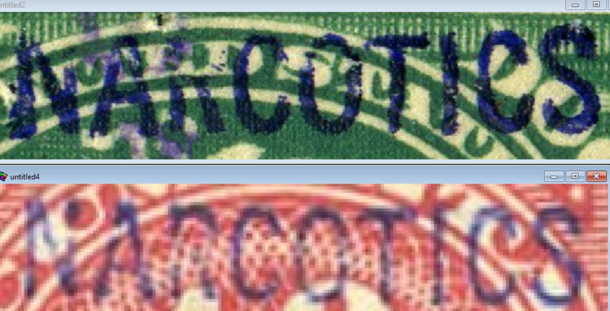
Clearly different to me, too. Going by the top overprint: - "A" crossbar is higher than the other - "R" loop is proportionately smaller with a longer right leg to "R" - "C" has a rounded left side - similarly, "O" is much more rounded on both sides - "T" actually matches very well - "S" inside loops are well rounded vs. squared off inside loops on the other, per John. Top of "S" has a serif, looks like
Doubt the differences come from a harder strike on one and not the other. They'd be much closer in shape overall.
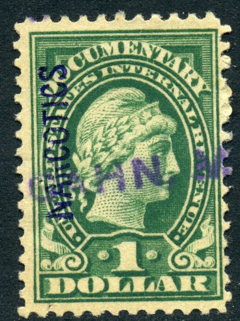
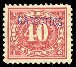
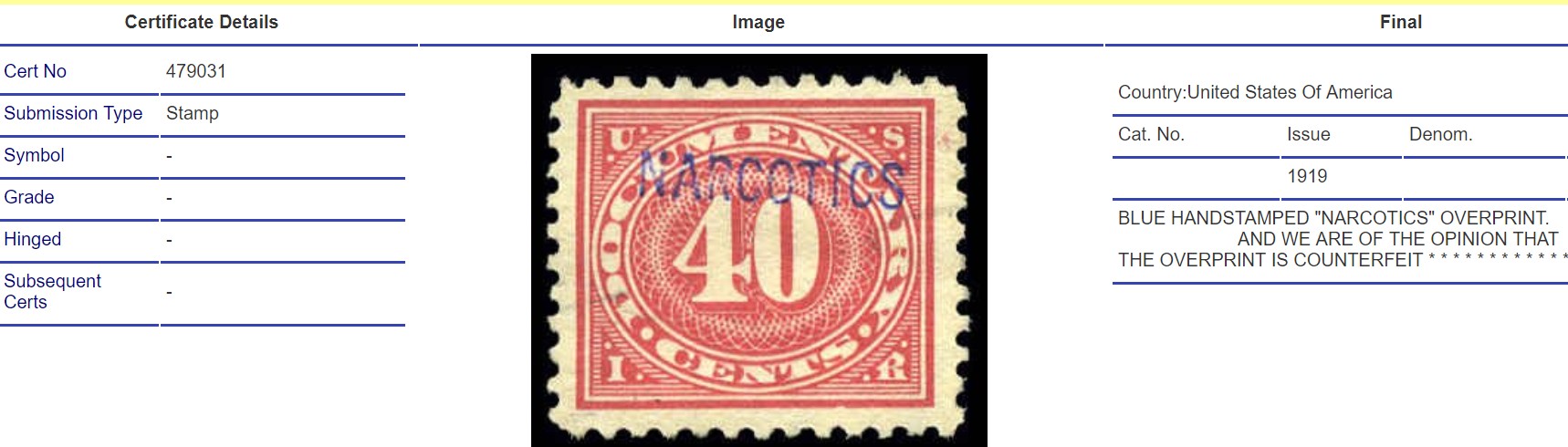
I wrote to the person who listed the $1 with NARCOTICS handstamp. I am quite sure that I had seen this particular example previously. The fresh appearance of the handstamp and the typical documentary cancel just look wrong to me. He delisted it right after I wrote to him with these objections. He also delisted two other narcotic listings, a 40¢ and an RJA1 due to my correspondence with him.
Disclaimer: While a tremendous amount of effort goes into ensuring the accuracy of the information contained in this site, Stamp Community assumes no liability for errors. Copyright 2005 - 2026 Stamp Community Family - All rights reserved worldwide. Use of any images or content on this website without prior written permission of Stamp Community or the original lender is strictly prohibited. Privacy Policy / Terms of UseAdvertise Here