| Author |
 Replies: 13 / Views: 1,658 Replies: 13 / Views: 1,658 |
|
|
Valued Member
168 Posts |
|
|
I thought I'd try my hand at designing my own album page to see how it came out. The top picture is my page the bottom picture is a Steiner page for comparison. I welcome thoughts and suggestions on how it looks and how it could be improved. Thanks. 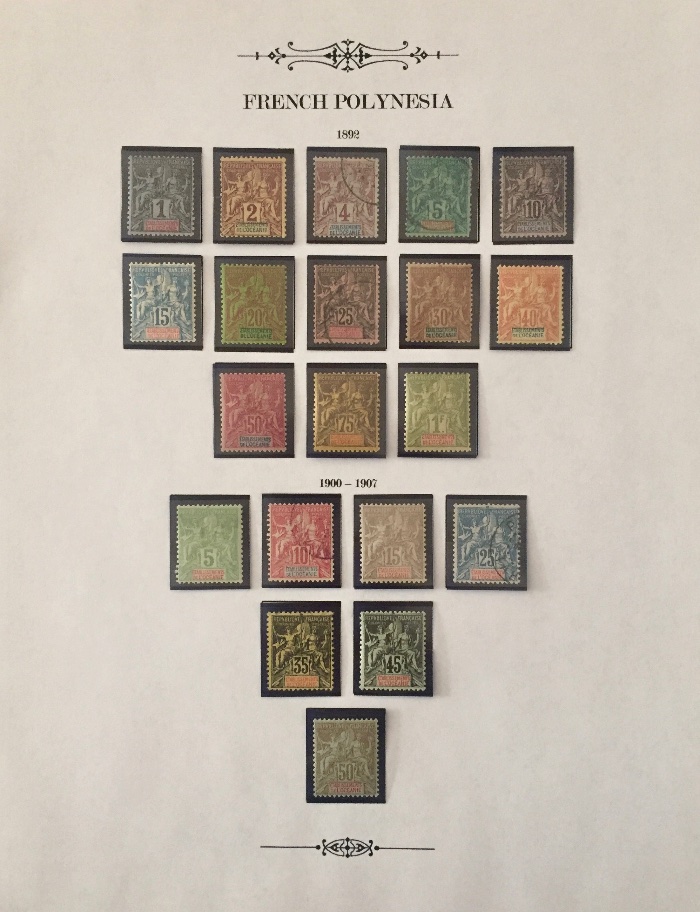 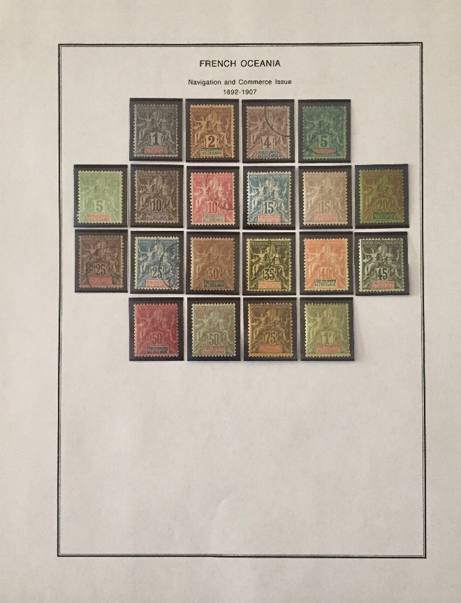 *** Moved by Staff to a more appropriate forum. *** *** Moved by Staff to a more appropriate forum. *** |
|
Send note to Staff
|
|
|
|
|
Pillar Of The Community
United Kingdom
8581 Posts |
|
|
Very art nouveau! Gets the fin de siècle feel to match the stamps. Yours also shows the advantages of escaping the functional approach of Steiner and similar printed leaves - the Steiner really has no concern for design at all. One suggestion - ye olde album providers would have mentioned the desirability of avoiding a top-heavy page, with a graduated widening as you go down the leaf. |
Send note to Staff 
|
|
|
Pillar Of The Community
United States
8956 Posts |
|
|
Mount-this, looks great to me. But the most important thing is how do you like it yourself?
Your page ( to me ) looks better than the Steiner - on the latter all stamps are bunched together on top and no stamps on the bottom. It would look better if the set was spread out a bit in my opinion,
Peter |
|
Send note to Staff
|
|
|
Valued Member
Canada
437 Posts |
|
|
I agree with Peter, your layout with the stamps spread out looks far nicer than all bunched together at the top.
I also prefer your "French Polynesia" in the larger serif font.
I like the ornamentation you have placed at the bottom of the page, but for me the ornamentation at the top is a little too much.
As for borders, some days I prefer them, others I don't, but of course they wouldn't work combined with the ornamentation.
Clive
|
|
Send note to Staff
|
|
|
Moderator

United States
4788 Posts |
|
|
Valued Member
United States
173 Posts |
|
|
Concur with others that your layout and spacing is an improvement. I also like your separation of date ranges. If it were me, I also would have included the name of the issue but all of this is matter of personal preference as PeterT aptly notes. |
|
Send note to Staff
|
|
|
Valued Member
168 Posts |
|
|
Thanks for all the feedback. I think it looks better than the Steiner page. There's a lot that I don't like about Steiner pages, but his lack of a thoughtful layout is my biggest complaint. As for my page, I think the ornaments look good with the older issues, but I could see dropping them just to have a cleaner look that would work well across all time periods. I like the font on my page a lot more than on the Steiner. It really didn't take very long to design this page, but building my own pages for several countries would certainly be a time consuming endeavor. I don't like the limitation of 8.5 x 11 sized paper. Does anyone know where I could find 9 x 12 card stock? |
|
Send note to Staff
|
| Edited by Mount-this - 01/16/2018 3:40 pm |
|
|
Valued Member
United States
132 Posts |
|
|
I also agree your page looks much better. I like the suggestion to add the issue description.
I've been using Strathmore art paper for 25+ years for both album and exhibit pages. It comes in 9" x 12" size. For album pages (with only stamps), I use "Sketch" paper, 50 lbs. For pages that include a cover(s) and for all exhibit pages, I use "Drawing", 70 lbs. The paper looks identical; the only difference is the weight. These are the Strathmore papers that come with yellow cover sheets; there are other varieties but I've not used them. I have to cut the paper down to 8½" x 11" but that's not been a problem with a paper cutter. One of the big advantages using Strathmore paper is that it is available in sizes up to 11" x 17". In some of my exhibits, I have occasional oversized pages (up to 11" x 17"). With the larger sizes of "Drawing" available, I have no problem matching paper for different size pages.
Another great advantage in using Strathmore paper is that it's available nationwide. I've been using it for 25+ years. I know exhibitors who have encountered problems matching paper over the extended life of an exhibit. One of my exhibits is 18 years old and I've never had a problem matching paper when I've added new material. For my needs, Strathmore has been an excellent product. I'm totally satisfied with my use of it. Of course, other's mileage may vary! |
|
Send note to Staff
|
|
|
Valued Member
168 Posts |
|
|
Valued Member
Canada
437 Posts |
|
|
Quote:
I think the ornaments look good with the older issues, but I could see dropping them just to have a cleaner look that would work well across all time periods. I like the font on my page a lot more than on the Steiner. It really didn't take very long to design this page, but building my own pages for several countries would certainly be a time consuming endeavor. You don't mention what software you used to create your pages, but if your are going to be building more pages in the future you could give AlbumEasy a try. Some people find that they are very productive with it, yet others hate it. Unsurprisingly I am in the former camp :) AlbumEasy does not support the ornamentation, but does allow you to include borders, or not, use almost any font on your computer and generate pages on any sized paper that your printer will support. Clive |
|
Send note to Staff
|
|
|
Valued Member
168 Posts |
|
|
I didn't use any fancy software. The ornaments are just images that I put in the header and footer of a Word document. I arranged the boxes for the stamps in Power Pointless and cut and pasted them into the word document. I'll check out AlbumEasy. |
|
Send note to Staff
|
| Edited by Mount-this - 01/16/2018 5:02 pm |
|
|
Valued Member
United States
191 Posts |
|
|
Great page!
To avoid the top heavy appearance noted by some of the members, the widest line of stamps should be at about the middle of the top half of the page.
With your page try using 4 rows for the 1892 issue:
Top row of 3 stamps
Next rows 5 stamps, 3 stamps, 2 stamps
For the 1900 to 1907 issues, use 2 rows:
4 stamps then 3 stamps
Rather than remounting, first try out this format using empty mounts on a page.
Also consider using two pages, especially if you add write-ups as has been suggested.
|
|
Send note to Staff
|
|
|
Pillar Of The Community
United States
611 Posts |
|
|
Just a quick example of a possibility, stamps rearranged and border added.  |
|
Send note to Staff
|
|
|
Pillar Of The Community
1328 Posts |
|
|
That's a very handsome page. I like it a lot. My own inclination would be to include a border since borders give the page a more complete look. Your second version is even better.
The larger font (compared to Steiner) in a much better type face is very pleasing. Steiner uses intentionally, I imagine, a very plain font so as to appeal to more people, but they're much too plain (and small) for my taste.
The ornamentation is very appealing to me. You might experiment with corner ornaments instead just to see how you like them. Scott's Specialty pages use corner ornaments, for example. Not necessarily better, but just different, and what you have here is really very good, both top and bottom.
I'd like to see some identifying information. There's nothing wrong with pages with stamps and only dates, but as collectors we want to know the name of the issue (if it has one), the perf size, paper type, overprints, and so on where relevant. Not all of this about every issue, of course. It would make the pages more interesting to me to know what I'm looking at.
I suppose you're printing these in 8.5 x 11" but they would look even more handsome in a larger, more traditional album page size. Nice work. |
|
Send note to Staff
|
|
| |
Replies: 13 / Views: 1,658 |
|


