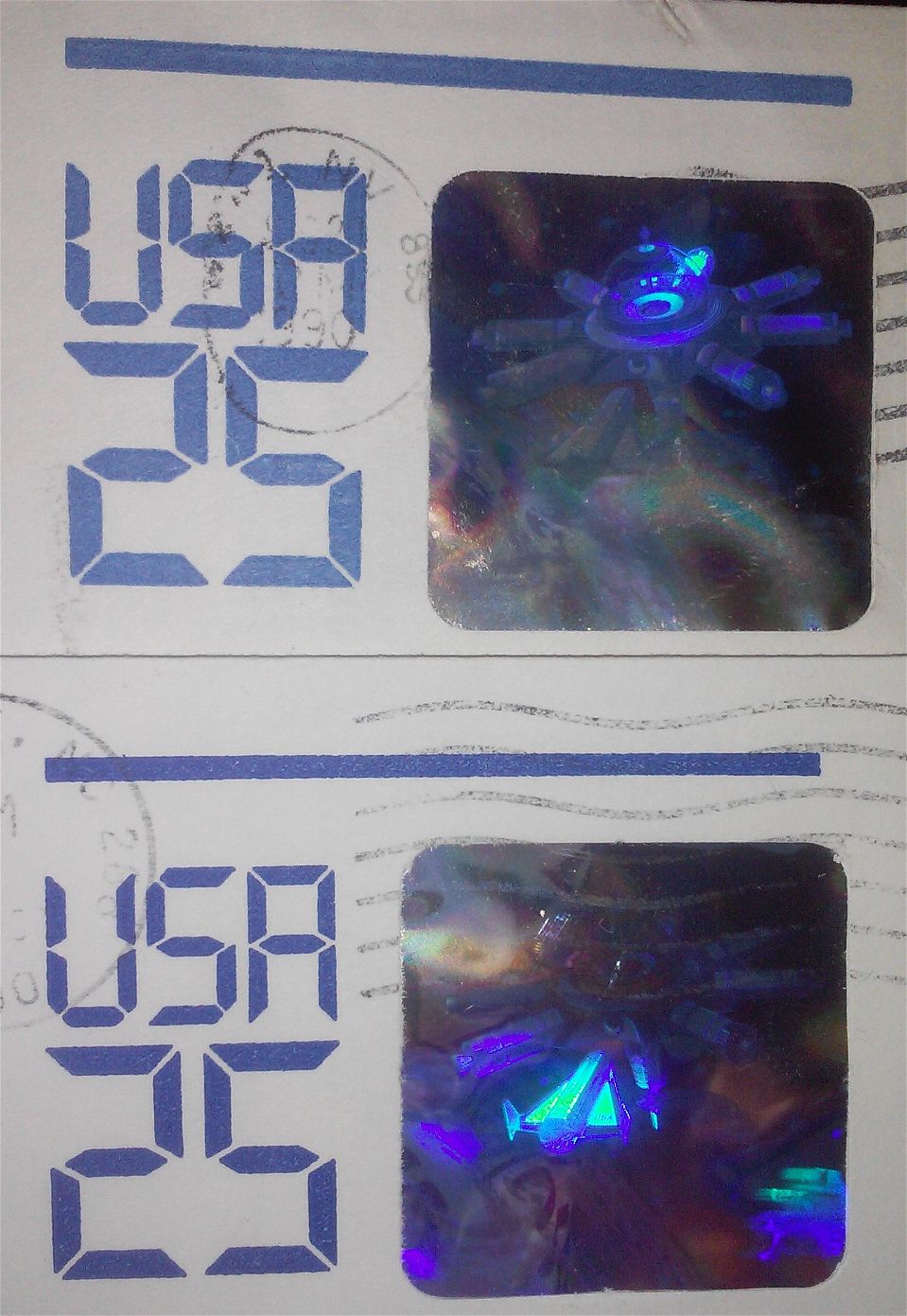
I have attached 2 envelopes of Scott U617. But as you can see the colors are different and the one die seems smaller than the other. Thoughts? The die lettering and line at top is 1/2 mil smaller than the light blue envelope.
Typical color range variation. That, and the wear on the rubber plates creates a squishy appearance to the lettering.
What is odd, is the wide line across the top of the indicium not extending around to the back side of the envelope. That was used as an anti-counterfeit measure when embossing was dropped. See U625, with the same basic design, but with the line wrapping around to the back.
The hologram was considered enough anti-counterfeit measure. At the time this (and the few other US holograph envelopes) were produced, holographs were difficult and expensive.
Disclaimer: While a tremendous amount of effort goes into ensuring the accuracy of the information contained in this site, Stamp Community assumes no liability for errors. Copyright 2005 - 2026 Stamp Community Family - All rights reserved worldwide. Use of any images or content on this website without prior written permission of Stamp Community or the original lender is strictly prohibited. Privacy Policy / Terms of UseAdvertise Here