| Author |
 Replies: 304 / Views: 35,398 Replies: 304 / Views: 35,398 |
|
|
|
Pillar Of The Community

United States
1818 Posts |
|
|
Valued Member
Norway
450 Posts |
|
|
Position 91L4, Scott #19, Type Ia. Without getting another mortgage on the house, I decided that this is about the nicest #19 that I could afford. The centering is much better than many I've looked at, and the 1981 PF cert mentions only a light right lower corner crease. I'm not sure why the short perfs on the bottom weren't mentioned, but I guess small faults were just more accepted back then.  |
Send note to Staff 
|
|
|
Pillar Of The Community
United States
2555 Posts |
|
|
I would be prepared for the PF to be FAR less generous the next time around. |
|
Send note to Staff
|
|
|
Pillar Of The Community
United States
2555 Posts |
|
|
Here is a fun (and rare) item that just came in today. Position 81-83R4, Type 1c-1c-III, Scott #19b-19b-21. Position 81 has the curl on shoulder. 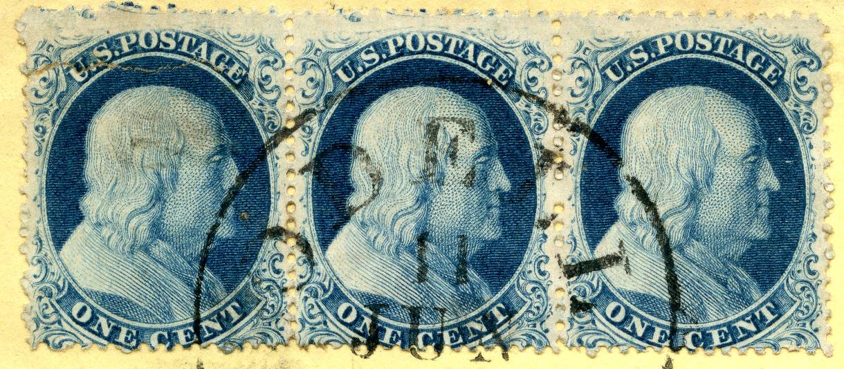 |
|
Send note to Staff
|
|
|
Valued Member
Norway
450 Posts |
|
|
sinclair2010 - That is an interesting (and rare) strip, and it's a great position piece to own.
As for my #19 - I know the bottom perfs are pretty bad, but this is a stamp that I judge on a relative scale, and I didn't think it was THAT bad. So many of these have so much of the plumes cut off that you can hardly recognize them as #19's. I'm still debating, though, whether I want to keep it. |
|
Send note to Staff
|
|
|
Pillar Of The Community
United States
2555 Posts |
|
|
Widglo46, I sent you an email but just so you and everyone else realizes, I wasn't trying to disparage your stamp or make any attempt at quantifying how good or bad the stamp is. |
|
Send note to Staff
|
|
|
Pillar Of The Community
United States
3487 Posts |
|
|
A #19 with the full design mostly showing is a scarce item, and certainly worth having. Usually the design is cut into by the perforations. |
|
Send note to Staff
|
|
|
Pillar Of The Community
United States
3487 Posts |
|
|
The strip of 3 is a nice printing. It would have been interesting to see what the bottom(s) of the designs looked like on this printing. |
|
Send note to Staff
|
|
|
Pillar Of The Community
United States
6661 Posts |
|
|
Valued Member
Norway
450 Posts |
|
|
stallzer - That's a very nice "E" relief. I see from the auction sale that it was listed as 84L4 and ex. Celler; that probably says enough, but I still wonder how he plated it. I know that many of the "E" reliefs have a prominent interstitial mark in the middle of the right margin; it seems to look and behave almost like a curl, because it varies quite a bit from one "E" position to the next. I just noticed that the mark on your stamp is almost identical to Doporto's 42L4. I couldn't find another example of 84L4 - maybe there is one on StampSmarter.org, but for some reason, I can't get into the site right now . The first image is a crop from your stamp, and the second is from Doporto's site. What are your thoughts? 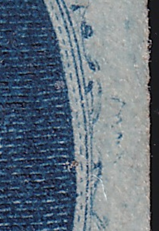 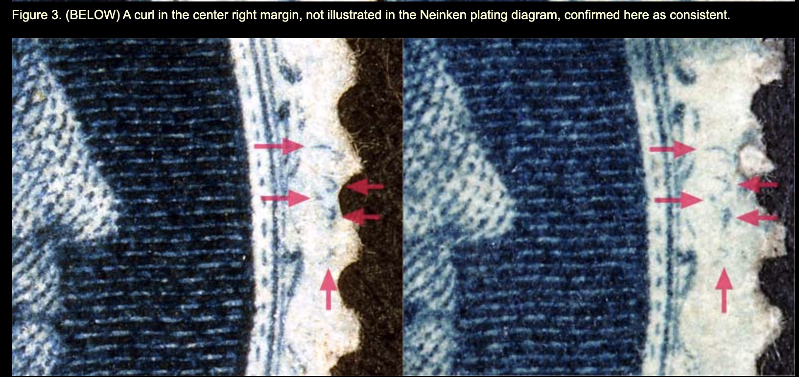 |
|
Send note to Staff
|
|
|
Pillar Of The Community
United States
3487 Posts |
|
|
I would want to see all of the reference material - i.e. 84L4 and most E reliefs, before drawing a conclusion. I don't see the dot inside the LL plume, which Doporto describes as consistent - although I've learned never to draw quick conclusions about a plate 4 stamp. I also cannot make out the horizontal plate scratch running towards the T of cent.
njs is now the plate 4 expert, and I would hope that he can jump in here and comment.
|
|
Send note to Staff
|
|
|
Pillar Of The Community
United States
6661 Posts |
|
|
Thanks guys. Yes, this is an ex-Celler piece from the Rumsey auction and came with a fresh 2022 PF cert. I'll post it later when I get home from work. |
|
Send note to Staff
|
| Edited by stallzer - 05/06/2022 12:42 pm |
|
|
Valued Member
United States
103 Posts |
|
|
Thanks Tex, but I am not a plate 4 expert. We will have to rely on the consensus of our group's opinion.
The squiggles at right are irrelevant as they appear on many E relief stamps so it must have been on the transfer roll for that relief.
The stamp is not 42L which has a less complete left plume at left. Also, the spacing and alignment at right eliminates 42L.
The completeness of the left side matches 84L. The spacing and alignment at right is good. There is faint diagonal scratch above the S and P of Postage.
Dick had this one right.
|
|
Send note to Staff
|
|
|
Valued Member
Norway
450 Posts |
|
|
njs900 - Thanks for the explanation. If you have a diagram of the spacing and alignment of the Plate 4 stamps, it would be great to see that. The same goes for Plate 3. Neinken included these diagrams in his book for Plates 1 and 2, but I've never seen them for plates 3 and 4. |
|
Send note to Staff
|
|
|
Rest in Peace
United States
205 Posts |
|
|
87L4 - I once owned a very nice used copy that appeared to be a Type 1c. The perforations were place exactly where breaks in the ornaments would have been, creating the illusion of having nearly full plumes and scrolls. However, the stamp did not cert as a #19b nor even as a #22. Both the PF and PSE certified the stamp as a #20, Type II from position 87L4 with a complete top line. See PF cert 537399. Do any of you know of any other E reliefs that produced Type II stamps on Plate 4, or any other location of Type II stamps other than the top row?  |
|
Send note to Staff
|
|
|
Replies: 304 / Views: 35,398 |
|


