| Author |
 Replies: 12 / Views: 1,224 Replies: 12 / Views: 1,224 |
|
|
Pillar Of The Community
United States
1162 Posts |
|
|
I submit, for your viewing pleasure, my recently obtained USA 1851 12-cent corner margin copy! It has some small thins, but it makes a beautiful position piece. Now if I only knew WHICH position. I believe (ha-ha) I have narrowed it down to two positions. Can any of you narrow it down? Is this from the left pane, or the right? No interpane line is visible at left. There is a guide dot at upper right. Are the 'dots' in the left margin, down by the numeral of the date, parts of the cancel or are they plate markings? The shape of the centers of the rosettes are also significantly non-round. The scan is 600 dpi, the max for my scanner. Any comments would be greatly appreciated! 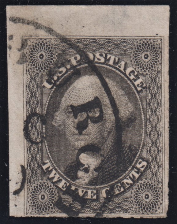 |
|
Send note to Staff
|
|
|
|
|
Valued Member
United Kingdom
50 Posts |
|
|
What an acquisition! Wow I bet that's going to take pride of place in your collection. Looking at it, my gut says the right pane but I absolutely wouldn't take my word on that.  |
Send note to Staff 
|
|
|
Pillar Of The Community
United States
1162 Posts |
|
|
After further searching, I found a copy of Neinken's book on this issue and I can see that there are obvious differences between 1L1 and 1R1. The most marked difference is the position of the guide dot at upper right. My stamp's guide dot, clearly, shows the stamp position to be 1R1. There appears to be not enough of the left margin to show the interpane line. Other characteristics of this position (guide dot at UL, in the margin, and a short line in the left margin, plus some slight irregularities in the left outer line near the top, all appear to be somewhat obscured by this stamp's cancellation. Anyway, appears to be position 1R1. Oh, and the 'dots' in the left margin, that I asked about, all appear to be cancelling ink, based on Neinken's illustration.
Any further comments are more than welcome! |
|
Send note to Staff
|
|
|
Pillar Of The Community
United States
1162 Posts |
|
|
Thank you, JamesFarrow, for your reply. I've always liked the 1851 12-Center. I particularly like it when it has a colorful cancel to add a little color to a black-and-white stamp, so often cancelled in black. Here's another example from my collection, which I think is more spectacular than the corner-margin copy. This was scanned at lower resolution, and is in the bank, so I cannot give you a close-up. 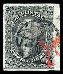 |
|
Send note to Staff
|
|
|
Valued Member
United States
283 Posts |
|
|
Bedrock Of The Community
12775 Posts |
|
|
I love the 17. It has a lot going for it. There are always quite a few around to choose from, the cancel possibilities are many, it is an inexpensive issue relative to many of its neighbors etc.. Very nice indeed. |
|
Send note to Staff
|
|
|
Pillar Of The Community
1367 Posts |
|
|
I can't answer your questions, but I'm enjoying looking at that pretty stamp with its side margins. |
|
Send note to Staff
|
|
|
Pillar Of The Community
United States
3532 Posts |
|
|
The twelve cent stamp is a great stamp to study and collect.
The copies that you posted are terrific.
Regarding the red cancel on the second stamp - I agree that its quite tempting to assume that its a '19', for a transatlantic mailing by British Packet - 24c with 19c credit to Britain. Many pairs of 12c stamps were used that way.
I'm unable, however, to quickly match what I see to any known '19' fonts so far. Also, the almost 'paint' style appearance of this red makes me wonder if its something else instead.
Regardless, its a very nice item. |
|
Send note to Staff
|
|
|
Rest in Peace
United States
920 Posts |
|
|
Beautiful margins on both. IMO the only thing nicer would have been the inclusion of the bordering stamps outside border. I too have been a fan of both #17 and it's cousin #36. Recently acquired this trans-Atlantic cover with a pair if #36's. The 24c rate covered: 5c - US inland post 16c - transatlantic packet postage 3c - British inland post 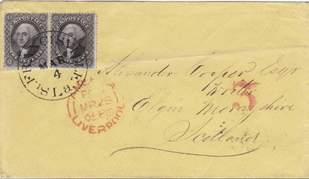 No 'red 19's' txstamp...sorry. |
|
Send note to Staff
|
|
|
Pillar Of The Community
United States
1162 Posts |
|
|
NICE cover!! Thanks for sharing. It always amazes me to see covers over 150 years old --- who (at the time) ever thought they would be worth saving? |
|
Send note to Staff
|
|
|
Pillar Of The Community
United States
3532 Posts |
|
|
I pulled this cover with a '19' out, and scanned it for comparison - 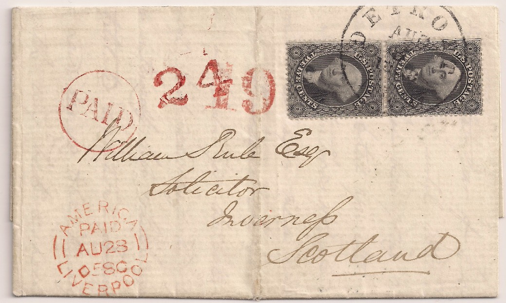 As was previously alluded to, it cost 24c to mail a letter to Britain in this time. The rate breakdown was also posted above. The cover I just posted shows the '19' which indicates a 19c credit to Britain for carriage via a British owned packet (16c), plus the 3c British inland postage. The cover previously posted, showed a '3' which indicated credit only for British inland postage. This implies that that cover was carried via American packet, and the US retained that part of the postage. This cover is franked with a pair of Scott #36's. |
|
Send note to Staff
|
|
|
Pillar Of The Community
United States
3532 Posts |
|
|
The point I was originally making, was that the 19 on the cover I just posted, which is similar to numerous other 19's, does not appear to resemble the red cancel on the nice #17 posted earlier. |
|
Send note to Staff
|
|
|
Pillar Of The Community
United States
2555 Posts |
|
| |
Replies: 12 / Views: 1,224 |
|




 Posted 11/03/2018 4:54 pm


