| Author |
 Replies: 28 / Views: 3,312 Replies: 28 / Views: 3,312 |
|
Pillar Of The Community
United States
811 Posts |
|
|
|
|
Pillar Of The Community
6361 Posts |
|
|
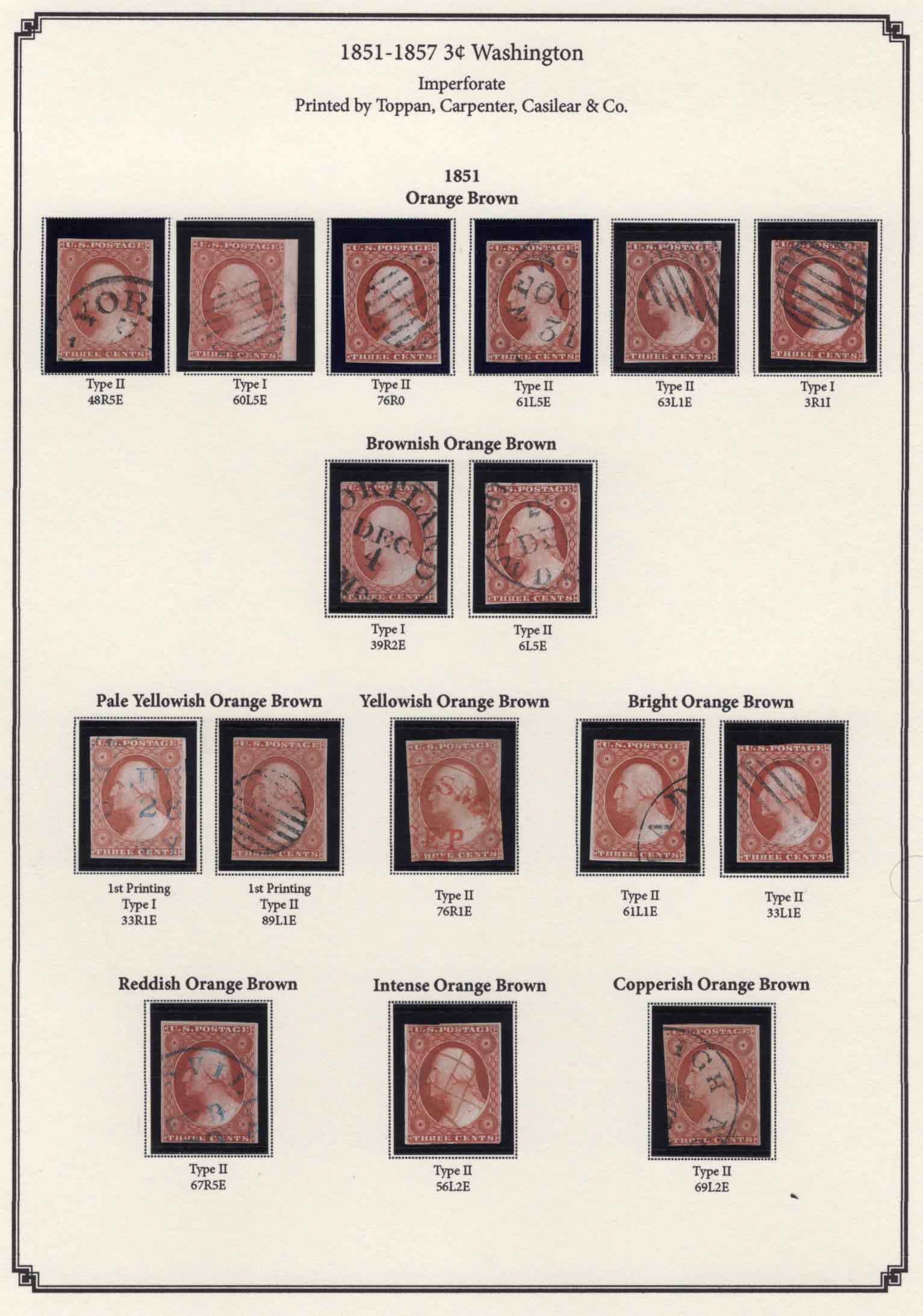
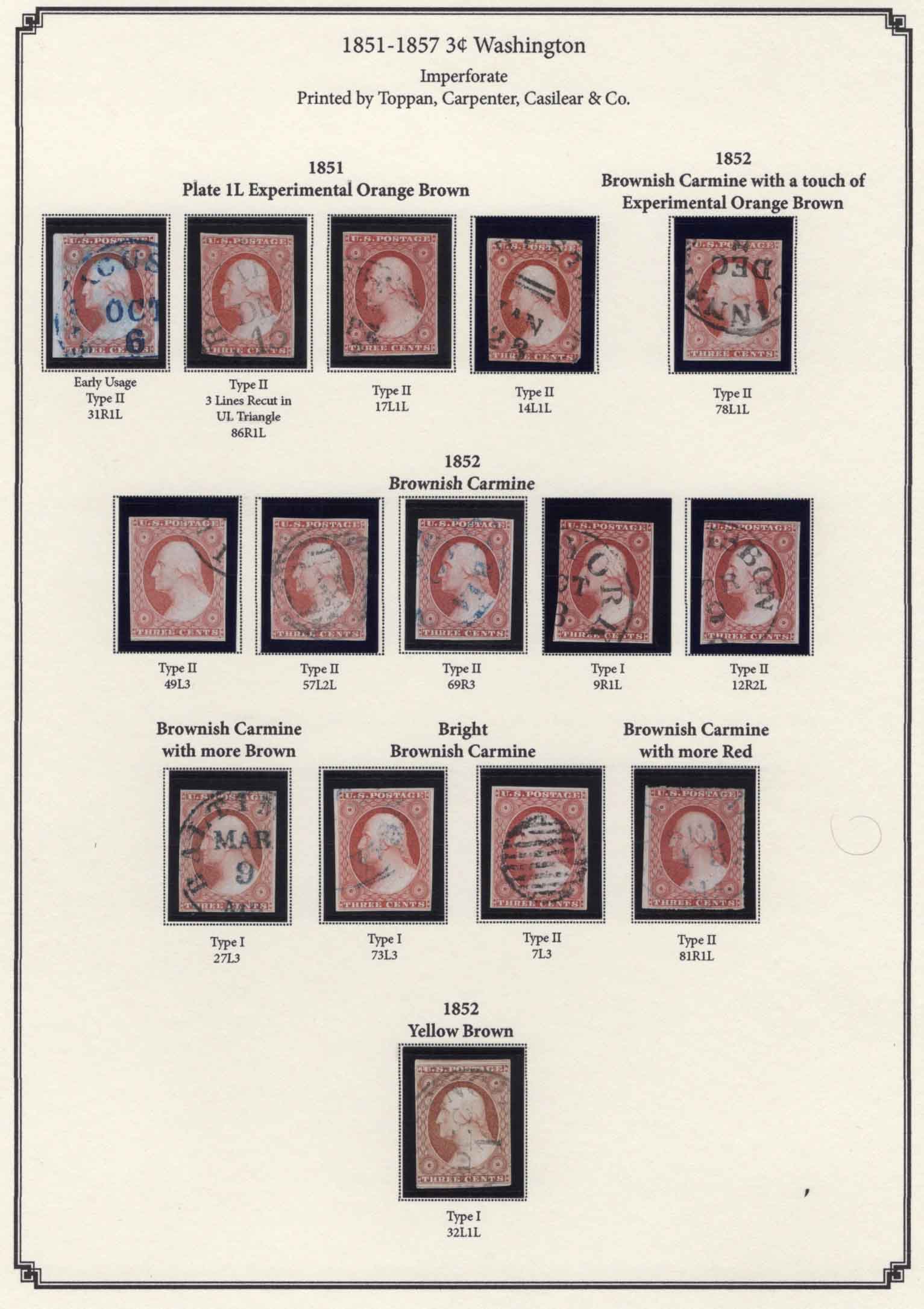
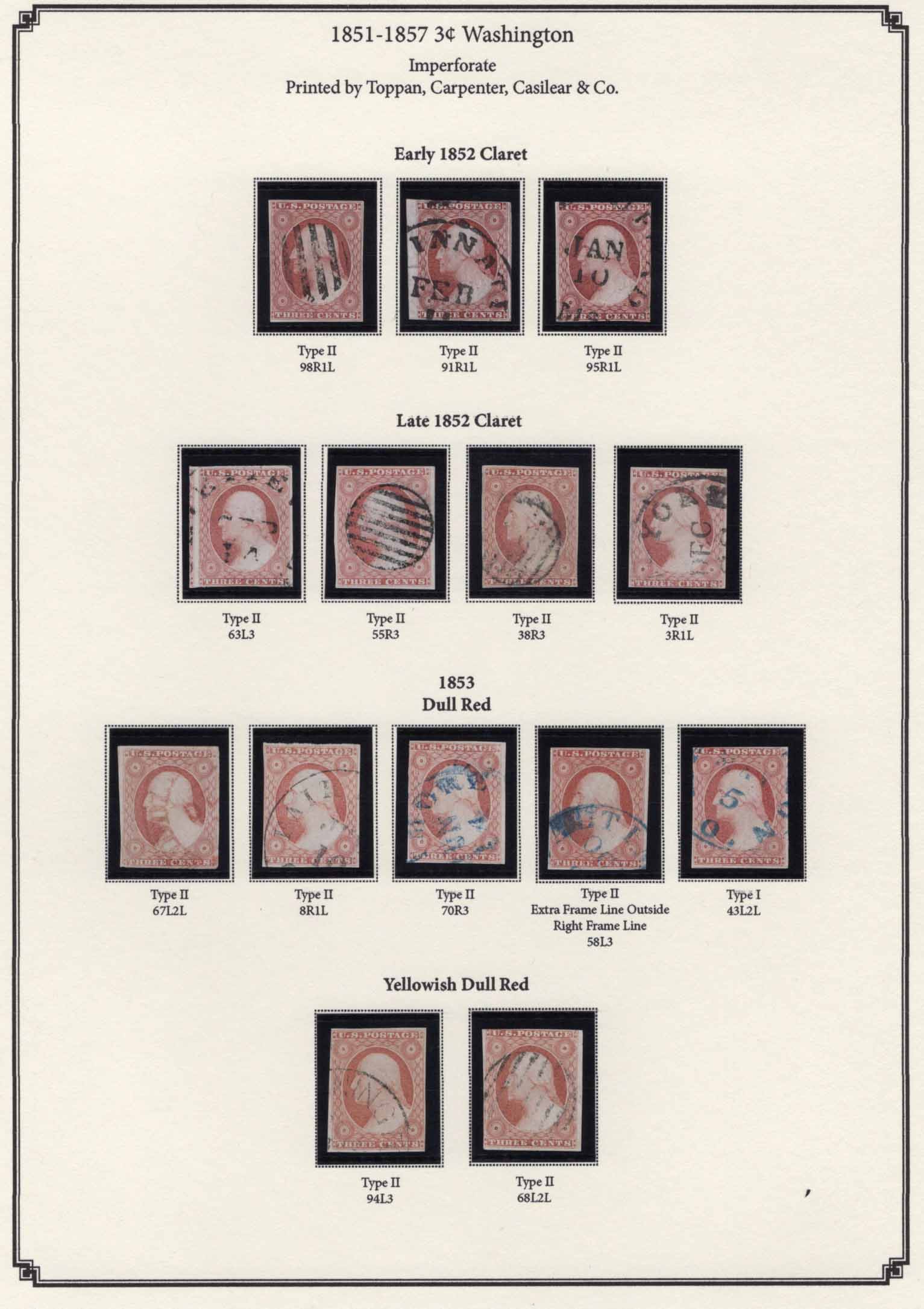
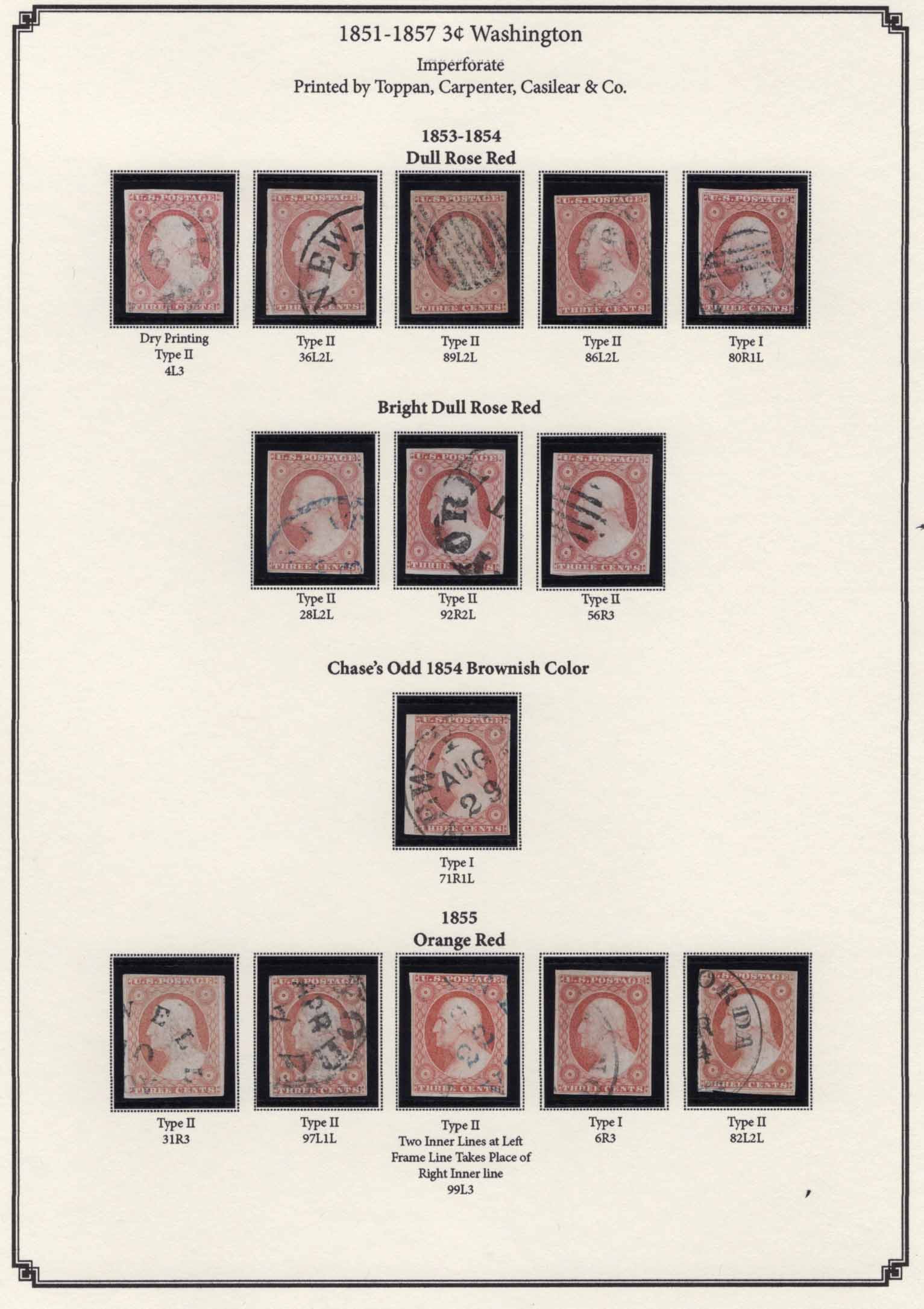
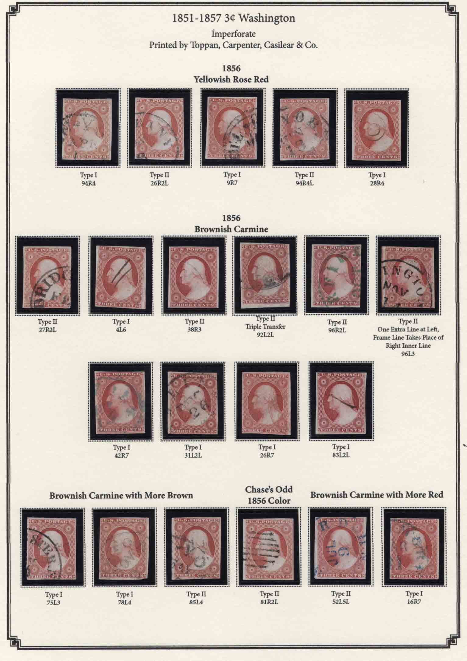
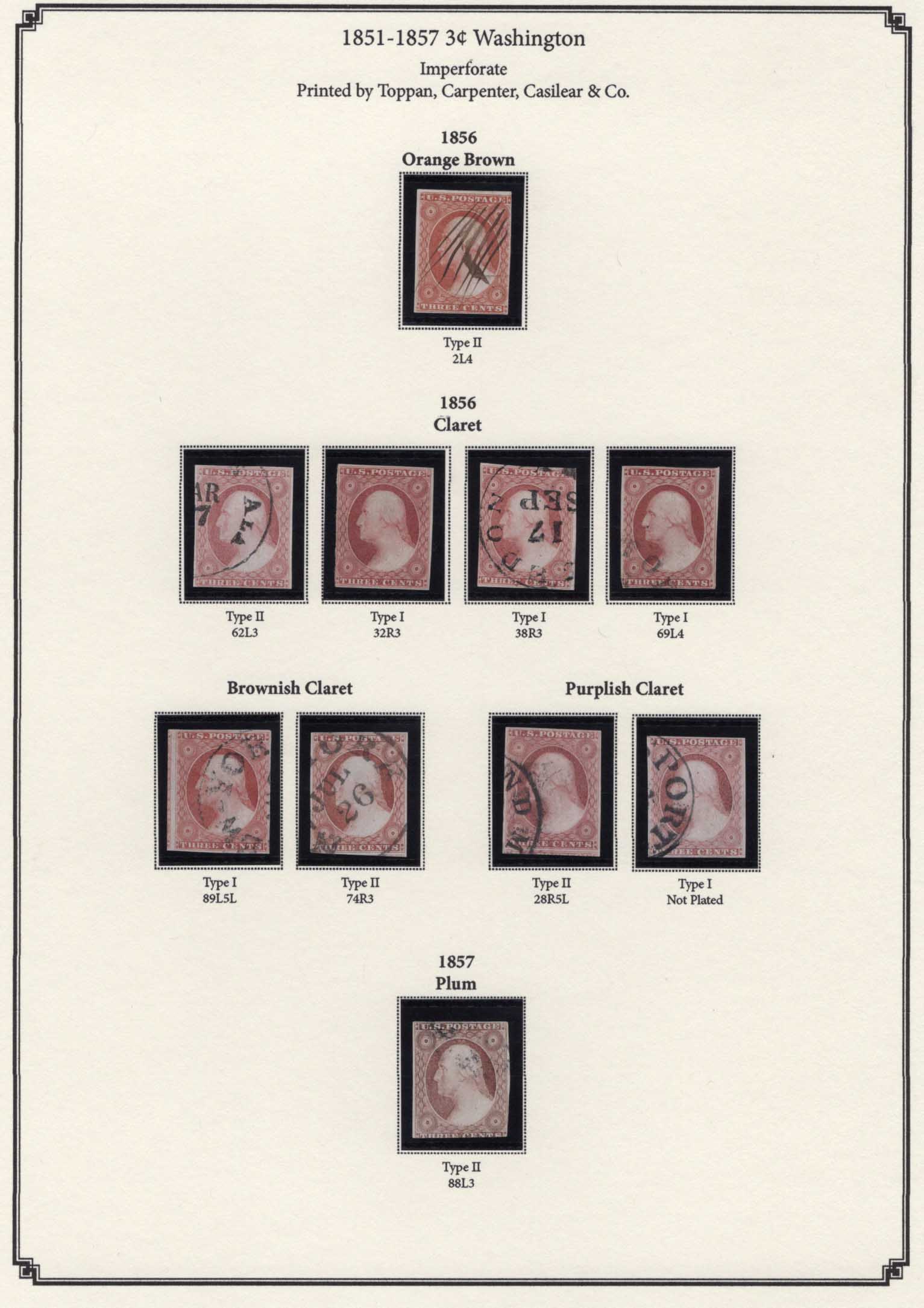
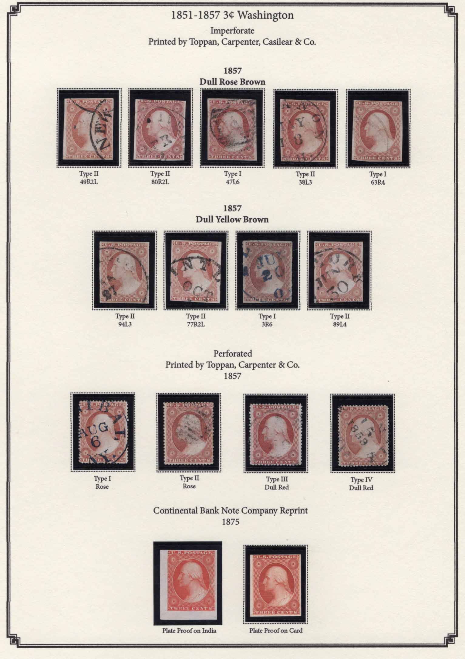
I am puzzled by one feature of the mounting. When I look at a particular grouping in a line, I see no rhyme or reason to the order in which the individual stamps appear. Just looking at the very first line, the 1851 orange brown, they are not by type or plate or any other discernible feature. Am I missing something? |
Send note to Staff 
|
|
|
Pillar Of The Community
United States
811 Posts |
|
|
They are mounted lighter to darker. The colors do not come through very will with the low-quality <200kb scans, but I think you can still tell that the stamps on the left of a group are lighter than the ones on the right (at least for most of the groupings). The types and plates are incidental, but I did want to show some interesting recutting varieties. I also went out of my way to get some interesting cancels. |
|
Send note to Staff
|
|
|
Pillar Of The Community
1375 Posts |
|
|
Thank you very much for sharing this. It is very interesting to see your color study, also because there are not many examples like this available in the internet (articles, auction sales, websites). But yes, it's not really easy to get an idea of the colors with the SCF 200KB size. Maybe there will a way to show your images on an image host site and link them here? But another question: are there some stamps where you are note sure about the colors and that are not certified and have not old signature on the back? Just to know. |
|
Send note to Staff
|
|
|
Bedrock Of The Community
Australia
38679 Posts |
|
|
I am ignorant of the finer points of US philately,
however that presentation is a real delight to view, for me.
Philately towards the highest level.
Well done.
Care to share how long it has taken you, to this stage?
|
|
Send note to Staff
|
| Edited by rod222 - 11/17/2019 05:10 am |
|
|
Pillar Of The Community

United States
1773 Posts |
|
|
Valued Member
United States
233 Posts |
|
|
Valued Member

United States
356 Posts |
|
|
I too think the presentation is fantastic. Thank you for sharing and it should inspire others to post there stamps. I will reorder some of mine and put them up for comments. |
|
Send note to Staff
|
|
|
Bedrock Of The Community
12721 Posts |
|
|
The most amazing thing is that the PF concurred on all of the shades. Awesome! |
|
Send note to Staff
|
|
|
Pillar Of The Community
6361 Posts |
|
|
Philazilla, Agreed, the light to dark did not immediately come across. It might be good to have some short introductory text explaining the hows and whys of all these colors and the subtleties of the light to dark arrangement. And yes, because everyone sees color differently, I agree with the direction stamperix is going, I would indicate the certificates somehow (a small dot?) and the items with connections to Chase or Amonette (perhaps something as simple as ex-C or ex-A). |
|
Send note to Staff
|
|
|
Pillar Of The Community
United States
811 Posts |
|
|
I'm about as confident as I can be on the colors. 90%+ of these stamps were color-identified by Amonette or Chase. Chase being the original expert on this stamp, and Amonette being his #1 student, and one of only a couple recognized "color experts" in US philately. The stamps that are not straight from Amonette or Chase collections, are either common colors or have a PF certificate. All the rarer shades have 2019 PF certificates. All (but one) are plated, and the plates match to known colors of the stamps. There may be a mistake or two, but a more likely problem than mis-identified shades is that some of them are not ideal copies of the particular shades. The Intense OB is a bad stamp with an altered pen cancel. The "early use" EOB has an overpowering blue cancel. A couple others are muddy or dry printings which can alter the apparent shade.
This has taken about a year to assemble. I bought the Amonette-identified stamps from two different collectors/sellers (I bid on, but did not win the Amonette color study that came up at auction a couple months ago - it went for stupid money). I bought several other shade collections and interesting individual stamps that did not have any kind of provenance for material to compare.
I make my own pages with Adobe InDesign.
If Don thinks these pages would be a fit for stampsmarter, I could provide higher-resolution scans, and details (provenance, certs) on each stamp. It is unlikely that I would put up a website myself for these.
|
|
Send note to Staff
|
|
|
Pillar Of The Community
United States
3527 Posts |
|
|
Very nice. You've obviously learned a lot about the stamp from this exercise.
I also had a plate 2L and 3 orange brown.
Those are tough to come by. My 2L was on cover and I want to say it was mid 52, but my memory fails me a bit here.
To use these as a color reference you "might" have to pull them out of the mounts from time to time to avoid interference from the mount for the color. That was why Bill used hinges. Very nice to see your collection. |
|
Send note to Staff
|
|
|
Pillar Of The Community
United States
811 Posts |
|
|
One of the challenges with assembling a collection like this is keeping track of the stamps and staying organized, since the stamps all look the same. Here's what I did: I made copies of each stamp along with any accompanying notes for a hard copy. I made a hi-resolution scan of each stamp and gave each one an index number. I tracked the details of each stamp in a spreadsheet. I sorted the stamps on vario pages, each with a stamp-sized accompanying tag identifying the index number, plate position (or relief and other info if not het plated) and color or tentative color. I can't imagine trying to plate these stamps without high-resolution scans. I can imagine Chase squinting through a magnifying glass for hours a day - not a fun thing to do.
One thing I realized early is that scanning on a white vs black background makes a big difference in the scanned color. I redid all my scans on white backgrounds, but the stamps are mounted with black mounts, making them look slightly darker and less bright than they would on white. I can see why Bill used hinges. |
|
Send note to Staff
|
|
|
Valued Member
United States
55 Posts |
|
|
Pillar Of The Community
United States
811 Posts |
|
|
Any thoughts on slipping a piece of white paper behind the stamps? I could also switch to clear mounts either on white pages or white cut-out backgrounds. |
|
Send note to Staff
|
|
|
Valued Member
224 Posts |
|
|
What a beautiful set of stamps! Nice work. My preference is for black mounts, but it might be worth experimenting with slips of white paper behind the stamps. Might provide an additional layer of framing for the stamps. Anyway, whatever you decide, thanks so much for sharing this with us! |
|
Send note to Staff
|
|
|
Replies: 28 / Views: 3,312 |
|




 Posted 11/16/2019 11:35 pm