Good job.
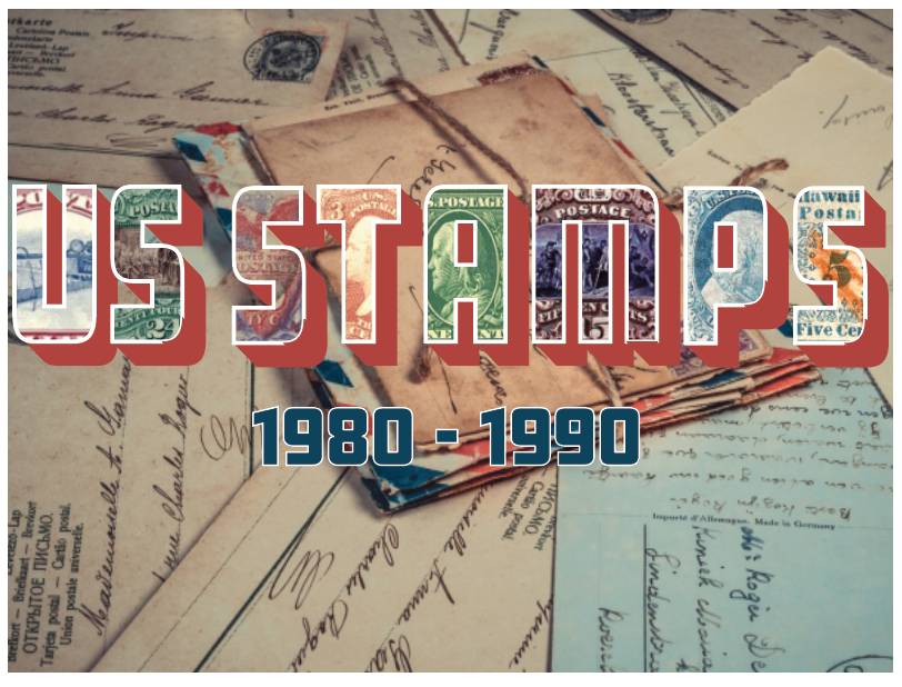
A suggestion to try...if you make the background a bit opaque, your title will 'pop' a bit more. With the background this vivid, the text tends to get lost. You can do this by starting with a black background. Add the postal history as a new layer on top of this and set its opacity to about 66%. Then add your text as a third layer on top of it all.
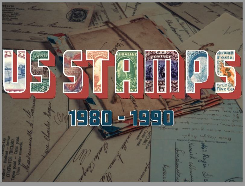
This would give you an image that looks something like this
If you want a lighter background, start with a white or grey layer. Then when you make the postal history layer opaque, it will still fade it but to the lighter side. Your text will still 'pop'.
Using this layered technique also gives the graphic a bit more depth.
Don