| Author |
 Replies: 103 / Views: 16,662 Replies: 103 / Views: 16,662 |
|
|
|
Pillar Of The Community
Australia
3547 Posts |
|
|
Quote:
kishengarh looks good
j k doesnt even look properly printed
I agree: the Kishangarh is so horrible, it's really rather good  It's rather hard to find well-printed Jammu, but this one certainly wasn't one of their better efforts  |
Send note to Staff 
|
|
|
Valued Member
Canada
151 Posts |
|
|
Pillar Of The Community
2664 Posts |
|
|
B C there wasnt ever a future for used stamps. have you been talking to the rodster or Kirk. move over to indian states and ull become rich :) |
|
Send note to Staff
|
|
|
Bedrock Of The Community
Australia
38679 Posts |
|
|
Constellation cruiser Lost your apostrophe key ? We like the emmissions that have done a hard week's work, none of the pristine unwashed for us. There's beauty in the wrinkled and the downtrodden, nothing quite like the allure of a short perf. |
|
Send note to Staff
|
|
|
Pillar Of The Community
Australia
3547 Posts |
|
|
Quite right, Young Rodney. Gibbons rates this used single Barwani SG 17  more highly than this unused (they didn't bother with silly old gum) sheet 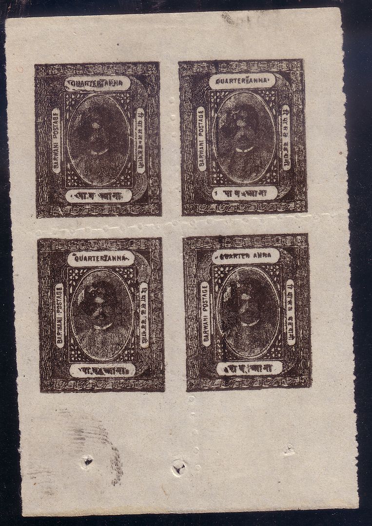 and so do I. Not that I'm going to dispose of the sheet. |
|
Send note to Staff
|
|
|
Pillar Of The Community
Australia
2027 Posts |
|
|
Pillar Of The Community
Australia
3547 Posts |
|
|
How could I? The printer has applied his fingerprint as a guarantee ... |
|
Send note to Staff
|
|
|
Pillar Of The Community
Australia
3547 Posts |
|
|
In 1905, Gibbons Stamp Weekly polled its readers on the twelve ugliest stamps ever. I'm proud to report that Bundi SG 1 came out at No. 1. Bundi SG 1 is a little rich for my blood (weighing in at £14,000 mint) but SG 2a is pretty similar  In third place was Jhalawar SG 2  which I find frankly incredible. There must have been some dirty work at the crossroads. Number 4 was Soruth SG 1  Not in pristine condition, I admit ... Number 5 was the first type of Bamra  (SG 1) Number 6 was Bhor, SG 2  Number 8 was my old friend Maharaja Sardul Singh of Kishangarh  and bringing up the rear, in twelfth place, Bhor SG 1  Well, all I can say is: The past is another country. They do things differently there. |
|
Send note to Staff
|
|
|
Bedrock Of The Community
Australia
38679 Posts |
|
|
Tony, please download the FREE Google picasa. Your stamps are giving me rotational seasickness You need aligning badly. |
|
Send note to Staff
|
|
|
Pillar Of The Community
Australia
3547 Posts |
|
|
Rodney, you old fusspot: these stamps were printed in days before centring was all the fashion. The stamps, overall, are straight. The slightly skewed impressions are part of their rakish charm. |
|
Send note to Staff
|
|
|
Pillar Of The Community
2664 Posts |
|
|
firstly SG is blind to call those stamps ugly. they are worse than pcgs and ngc combined together. ruffians
secondly rod is going to give away his mnh collection to spock since he cant bear to see stamps that have not been used
Tony witht hat much money ont he line ia m going to spend a wee bit time and some money picking these up fromt he local flea market equivalent |
|
Send note to Staff
|
|
|
Pillar Of The Community
Australia
4031 Posts |
|
|
 I do not believe these stamps were issued in different shades. Hot water fading maybe? What can you do with them? |
|
Send note to Staff
|
|
|
Pillar Of The Community
Australia
2027 Posts |
|
|
I'd say the red component of the stamps has been sun-faded. Red is always the first to go. |
|
Send note to Staff
|
|
|
Valued Member
United States
131 Posts |
|
|
Anybody have a scan of the ugly pink Belgium stamp with the king that looks like Buddy Holly? The pink one has always made my eyes cross |
|
Send note to Staff
|
|
|
Bedrock Of The Community
Australia
38679 Posts |
|
|
Here you are Dave: 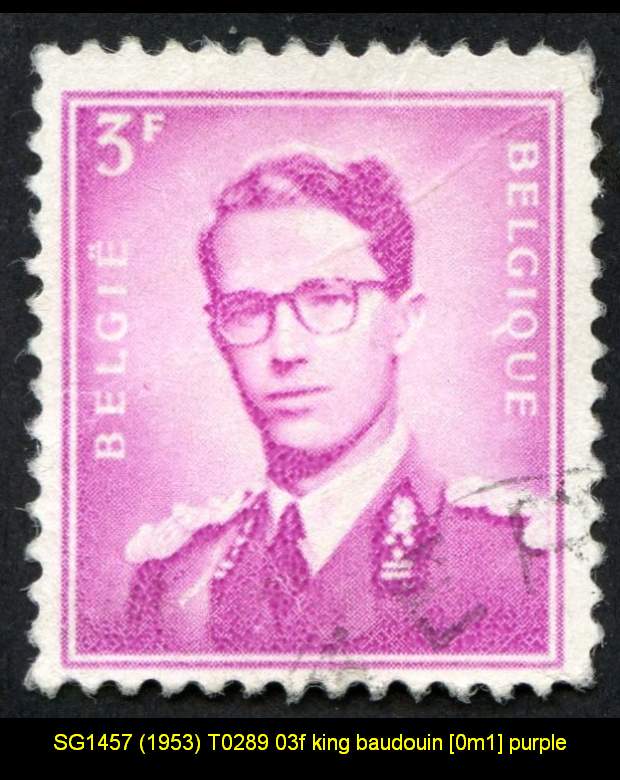 Another issue, not ugly, but confronting is the issue by Slovenia in 1995. I still cannot reconcile the designers work with the theme of the issue, that is peace and freedom. The stamp signifies the liberation of concentration camps. 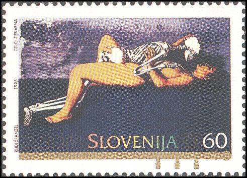 |
|
Send note to Staff
|
|
|
Replies: 103 / Views: 16,662 |
|


