pastime8469, to be blunt, if your camera image colors look the same as your actual stamps, and it's due to your vision, then according to your stated limitations, determining shades and some colors are perhaps not going to be very useful to you.
Quote:
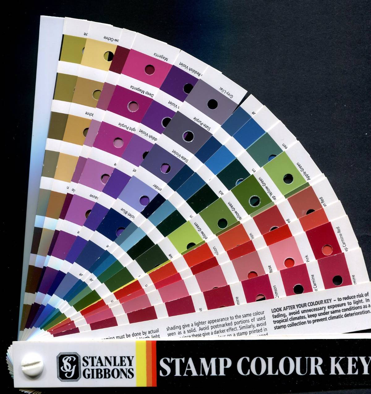
On top of all the other challenges the color charts also can deteriorate.
I'd like you to provide proof of this. Under proper conditions, this really doesn't happen very much if at all. Pantone's suggested lifetime of 5 years clearly appears to be a marketing ploy to sell new expensive color charts, especially since they add new shades every year.
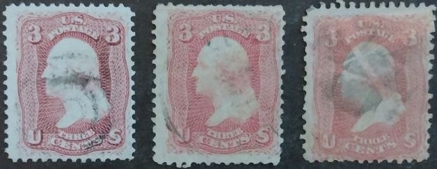
All six commercial artists I've asked have never replaced their Pantone books, the books up to 20 or more years old. You don't normally leave color charts open out in the sun or under fluorescent lights, nor your stamps, so are you saying inks are inherently unstable? If so, then all our stamps have irreversible color deterioration and so colors, much less shades, cannot be identified with any precision. Certain carefully imaged stamps on SCF are the proof that proper storage over years leads to excellent preservation of colors.
Quote:
And with a camera, ambient lighting is also critical (its critical with scanned images when people leave the scanner lid open while scanning).
Don, you're certainly in the camp saying that color charts are unreliable due to deterioration. So why advocate scanner calibration and ambient lighting if colors cannot be reproduced or compared accurately?