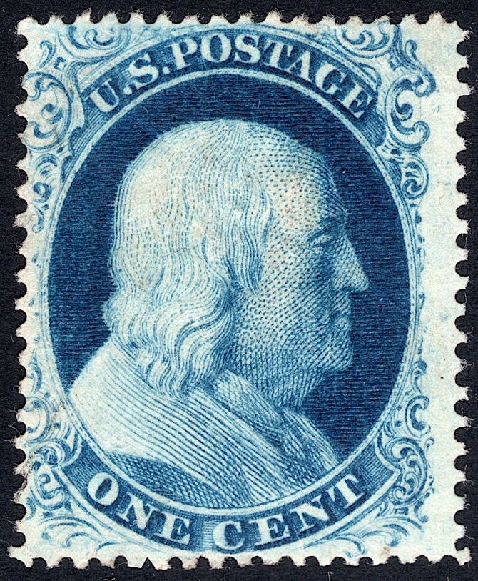
Nasr, looks like you haven't gotten an opinion on the last couple of 1c posts. I did compare yours with Doporto's site, and if it isn't 70L4, it's really close.
Yours is a really nice impression, so I guess that I'd like to see the dash of color in Franklin's hair, but you have matches for the mark in "S", just to the side of "L", the scratch between "L" and "M", and the matches with the scratches in the lower right.
I'm guessing that it is 70L4, and is yours unused? Regardless, it's a heck of a stamp!! Good luck on this one!
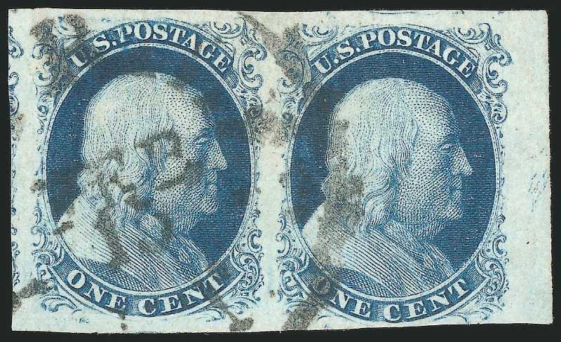
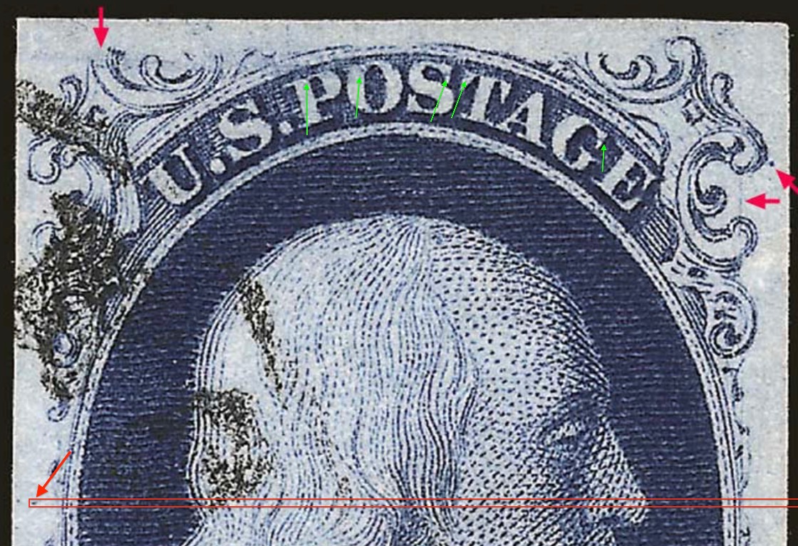
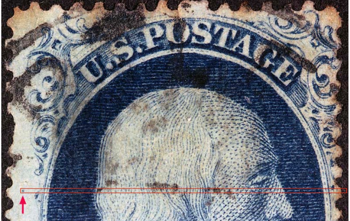
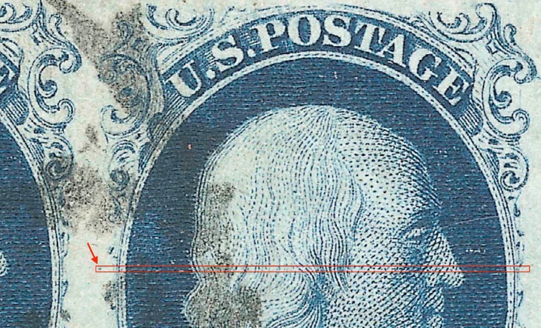
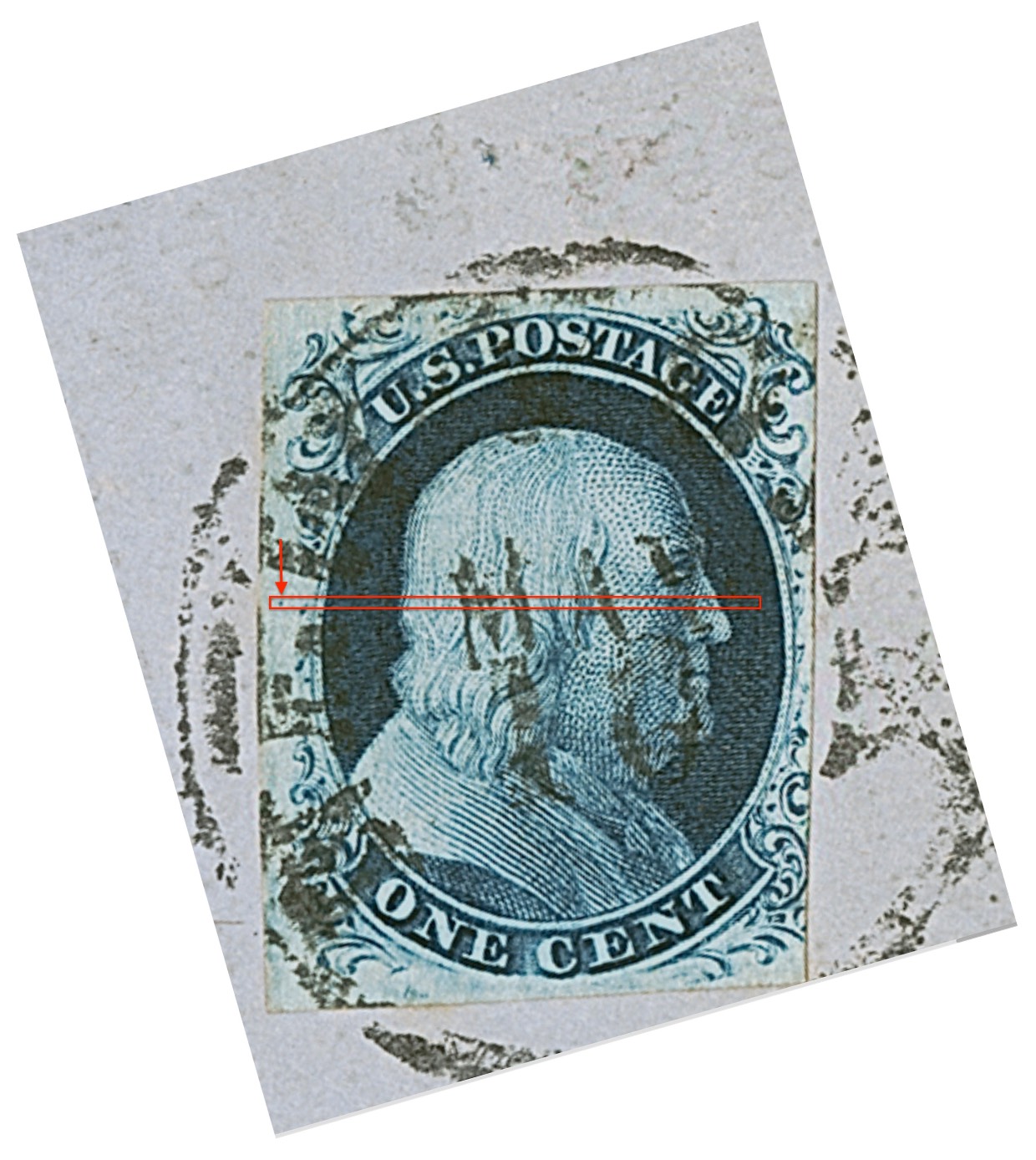
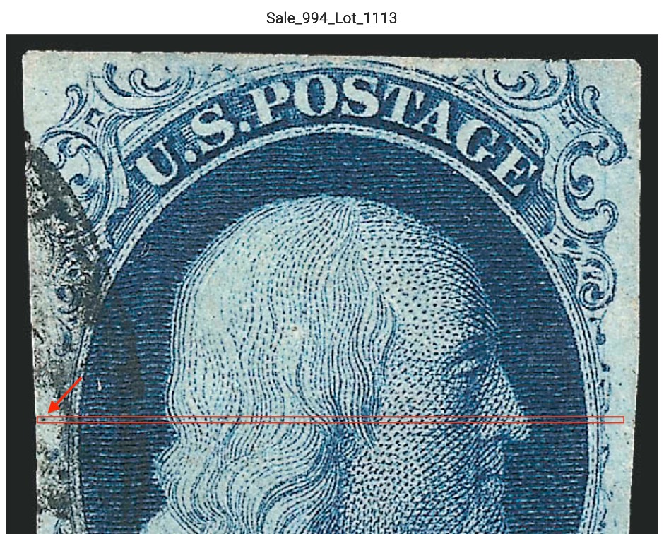
Doporto's site says that the dash in the hair is found on later impressions, but the perf'd stamp shown there lacks all other marks, including the vertical line at right (although perfs cut into design at right, there is still enough room for the line to show between "L" & "M" but no line appears to be there,) the mark at "S", and the marks in top & bottom labels. In addition, the dot mark in left margin between "D" & "E" on the Doporto's perf'd stamp is a little too high than that on Neinken's template and on Doporto's imperf'd stamp.
I didn't look up Doporto's perf'd stamp, and I could be wrong, but I don't think it belongs to 70L4.
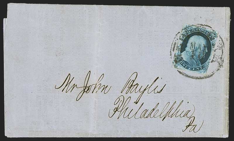
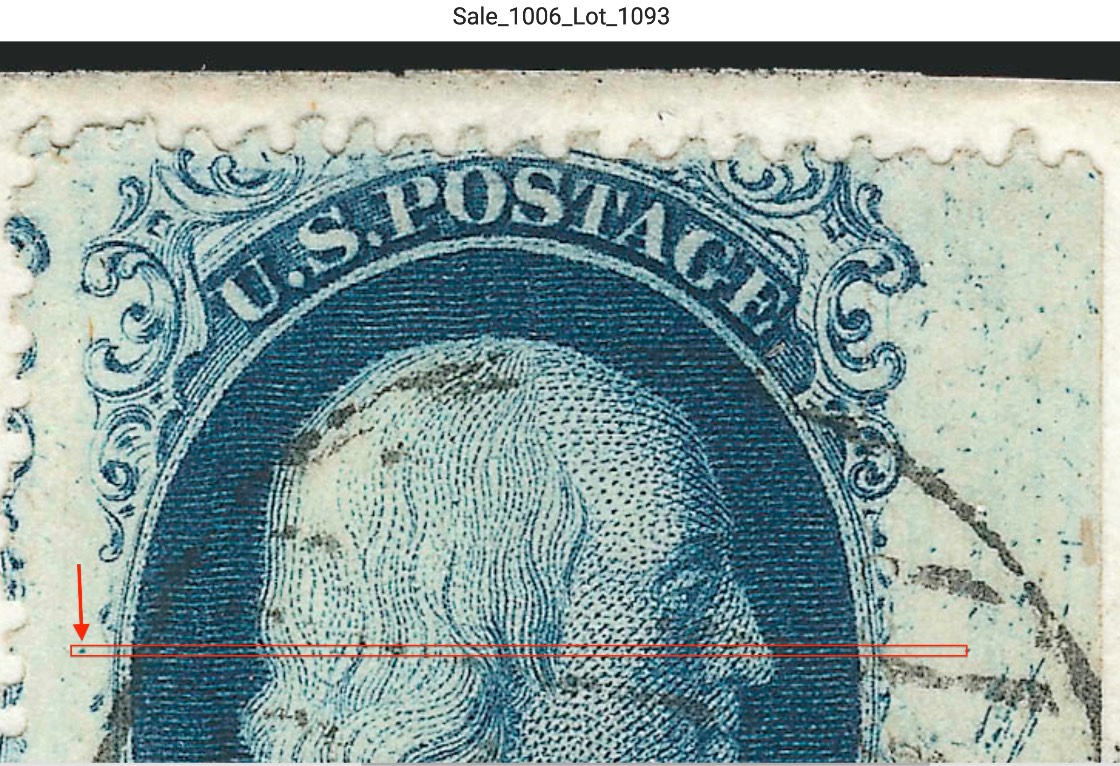
You raise an interesting question, Nasr. Your stamp clearly matches the imperforate stamp illustrated by Doporto as 70L4. The perforated stamp illustrated for this position seems to have none of the marks you list in your post above but features the prominent dot in the left margin. Neinken shows all of these marks, including the dot, in the mat for 70L4. I do not own a copy of this position, and I cannot find an example assigned to 70L4 that shows all of the marks. The Siegel website has a few examples listed as 70L4, most of them (including, significantly, a pair 69-70L4) matching your stamp. However, there is also an example on cover listed as 70L4 that matches the perforated example shown in Doporto (with the left margin dot but evidently without the other marks). See attached photos. The dash in hair is nowhere to be found. I suspect that the Neinken mat is the source of the plating for all these examples, but the question is did Neinken have a specimen that showed all the marks or is his illustration an amalgam? Even though Plate 4 is well-known for its changing appearance with regard to plating marks, the difference between Doporto's two examples is extreme. I am hard-pressed, in the absence of an example showing features from both illustrations, to believe they are from the same position. Perhaps one of our SCF colleagues can supply this evidence?
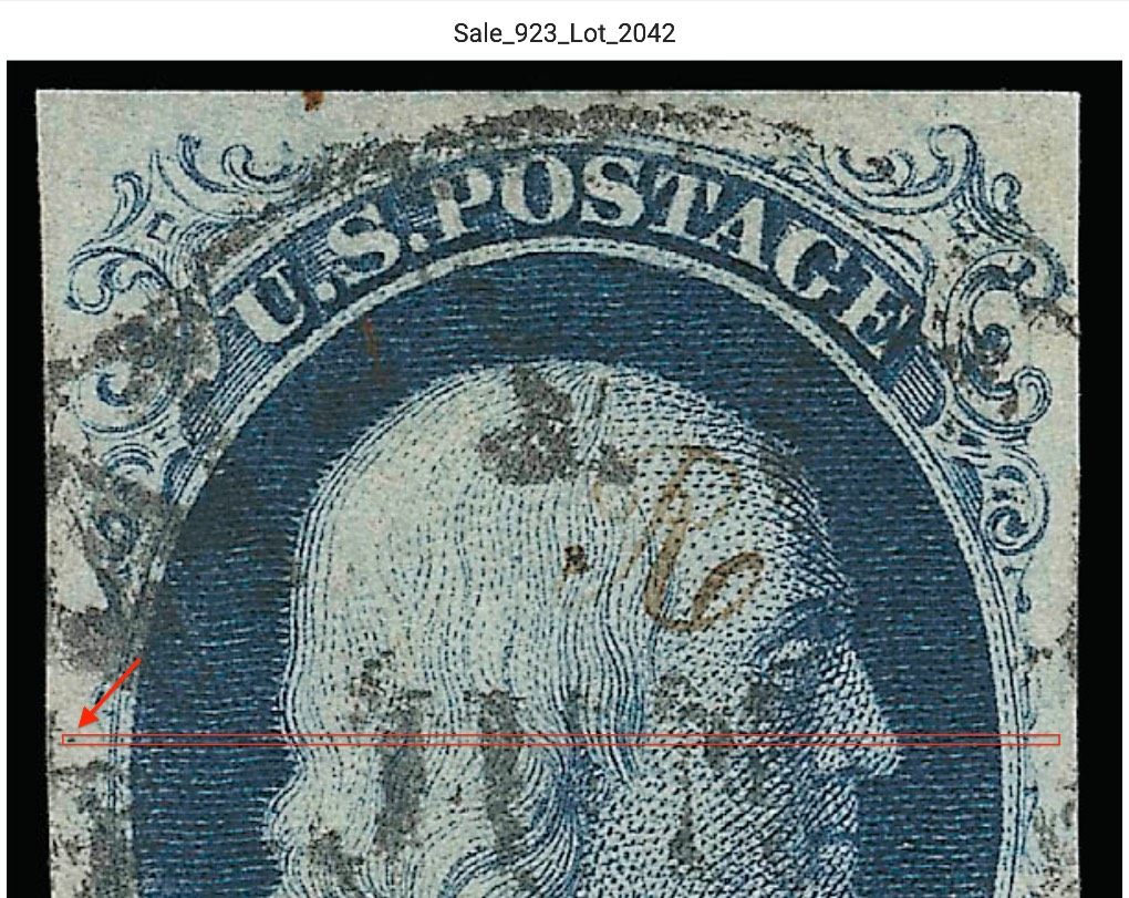
@dudley. Thanks for the reply and the comparisons. I agree with the notes you made. In my reply to @ray.mac, I mentioned that even the dot mark in the left margin on Doporto's imperf stamp doesn't match the dots on other copies of 70L4 (both perf & imperf.) The dot on Siegel's on-cover copy matches the one on Doporto's imperf, but it also lacks all other marks, including the dash. I'm posting a few images of 70L4 from Seigel as well as Doporto's imperf. You can tell that all dots are located at the same spot, except for those on Doporto's imperf and Siegel's on cover example. Also, the green arrows on one of the images show some consistent marks in top label, which aren't shown on Neinken's illustration.
Disclaimer: While a tremendous amount of effort goes into ensuring the accuracy of the information contained in this site, Stamp Community assumes no liability for errors. Copyright 2005 - 2026 Stamp Community Family - All rights reserved worldwide. Use of any images or content on this website without prior written permission of Stamp Community or the original lender is strictly prohibited. Privacy Policy / Terms of UseAdvertise Here