| Author |
 Replies: 27 / Views: 5,449 Replies: 27 / Views: 5,449 |
|
Valued Member
Canada
449 Posts |
|
|
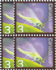
Canada Post actually reprinted the 3 cent beneficial insect stamp (2235) as mentionned in the july to september issue of details. It seems to me that the colour of the stamps was also changed. The copies that I've received seem to be a darker purple than the original ones. The original (with error) 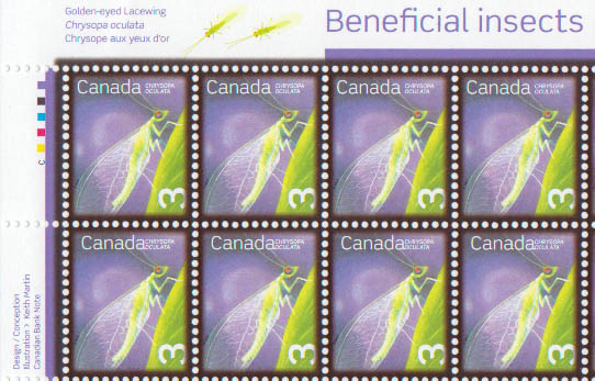 And the reprint 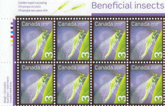 The scans may not represent the true colors of the stamps but you can still see there's a difference.
|
|
Send note to Staff
|
|
|
|
|
Rest in Peace
Canada
6750 Posts |
|
|
Yes, there is a subtle difference, to me with my so-so eyes anyway.
I imagine the difference would be more apparant with the stamps side by side in person also.
I have the original but have not purchased the reprint yet. Soon . . . |
Send note to Staff 
|
|
|
Valued Member
Canada
347 Posts |
|
|
Hello minesweeper and BeeSee.
I have both versions, and the difference is very subtle, but apparent. That's by looking at four sheets of each. When I say very subtle, I mean it. I might not have noticed had minesweeper not mentioned it.
Peter
|
|
Send note to Staff
|
|
|
Valued Member
Canada
449 Posts |
|
|
There's a 2nd difference, this one maybe even more obvious. If you look at the denomination on the first issue you see that almost all of the bottom part of the 3 is under the frame of the stamp unlike on the reprint where the 3 almost clears the frame. |
|
Send note to Staff
|
|
|
Valued Member
Canada
449 Posts |
|
|
Valued Member
Canada
449 Posts |
|
|
If you look at the 3's on the previous picture you can clearly see the difference between the original and the reprint. The 3 on the reprint is more visible, the previous one was hiden in the shadow of the frame. |
|
Send note to Staff
|
|
|
Rest in Peace
Canada
5701 Posts |
|
|
Very interesting Minesweeper. I will check mine when I get home. It appears that the "shadow" is WIDER all around - that would make the stamp completely different in my eyes. |
|
Send note to Staff
|
|
|
|
Valued Member
Canada
449 Posts |
|
|
Exactly, you can easily tell the difference between an original one (plus the one with the "error") and the reprint just by looking at them, no mesuring, no UV, no nothing. |
|
Send note to Staff
|
|
|
Rest in Peace
Canada
6750 Posts |
|
|
The black 'mourning cover' border did make them stand out but I felt it was a bit overkill. Now I like it just because it makes the reprint easy to distinguish. Silver lining in every cloud. |
|
Send note to Staff
|
|
|
Rest in Peace
Canada
5701 Posts |
|
|
The black frame is definitely narrower on the reprint. It should be given a sub number (2235b ?) by Scott/Unitrade. The shifted Canada variety is 2235a. Nice discovery Minesweeper  |
|
Send note to Staff
|
|
|
|
Valued Member
Canada
449 Posts |
|
|
Valued Member
Canada
347 Posts |
|
|
Yup. On second and third close look, you've got a find there, Minesweeper.
BeeSee...will you alert Robin? (though, knowing him, he's on top of it but just hasn't had a chance to post it on his own site!)
Peter
|
|
Send note to Staff
|
|
|
Valued Member
Canada
347 Posts |
|
|
And...as I glanced over from the computer to my little stamp desk, I noticed my framed, signed, uncut press sheet of the first printing of the Beneficial Insects series. I wonder if there will be a similar product issued for/with this new printing?
Peter |
|
Send note to Staff
|
|
|
Rest in Peace
Canada
5701 Posts |
|
|
Peter, I did send the link to this thread Robin Harris. I too have the uncut original press sheet - a real beauty! I will try to put an image up later.
The 3c reprint was apparently done in master sheets 8 panes, all 3c values. |
|
Send note to Staff
|
|
|
|
Rest in Peace
Canada
5701 Posts |
|
|
Here is my scan that clearly shows the reprint (below) with the narrower "mourning frame" (as puzzler calls it  ) 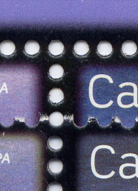 You can even notice the shade difference, but being lithography, that may not mean much. |
|
Send note to Staff
|
|
|
|
Rest in Peace
Canada
5701 Posts |
|
|
The July August 2010 issue of the ESG Corgi Times arrived yesterday, and mentioned this SCF thread on the discovery of the differences in the two 3c printings. Another good plug for SCF! It got the editor Robin Harris to check the other values in the set, and he (and others) found similar reprints of the 5c and 10c with the narrow black frame. I check my used stock and found I had a narrow 10c, and it has been out quite a while before discovery, it is dated 09 12 15 (Dec 15, 2009). It will check the local Post offices shortly. 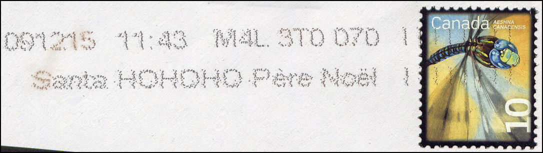 The Unitrade 2011 catalogue is now out, but was not published in time to include any of these varieties. |
|
Send note to Staff
|
|
|
|
Replies: 27 / Views: 5,449 |
|