| Author |
 Replies: 22 / Views: 1,312 Replies: 22 / Views: 1,312 |
|
Pillar Of The Community
Canada
877 Posts |
|
|
Here's something I have never seen (as far as I can remember) before: Two plate blocks of Unitrade 713, both Plate 1 from the same printer, in different colours. Is this something which rates as a variety? 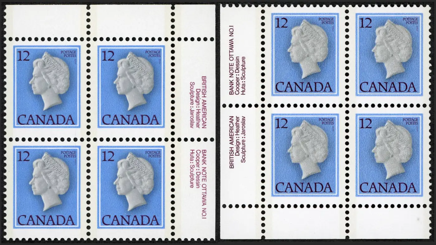 I see that in the case of 741iv (Christmas 1977) the inscription is up and front in describing the variety, so this should perhaps also be considered as a variety, assuming that other copies of the darker brown can be found on Plate 1. All of my other Plate 1's of this stamp are in the lighter shade of brown. The darker brown matches the shade BABN used for the inscription on Plates 2's. It would appear that BABN changed the shade of brown while still printing from Plate 1. Another possibility is that the papers differ. Under UV light I can see the I can easily see that the block with the darker inscription reacts much more strongly to UV light, so I would classify it as 716iii DF/MF with the lighter inscription being DF/DF. Comparing my Plate 1 and one of my plate 2 copies, they both appear to be DF/MF. I do not see, however, how the different papers would affect the shade of the inscription since they have the same fluorescence on the printing side. However, I would leave this up to those with more paper experience. |
|
Send note to Staff
|
|
|
|
|
Pillar Of The Community
Canada
5821 Posts |
|
|
I checked my copies and it appears I also have Unitrade 713 Plate Block 1 with both light and dark maroon inscription. 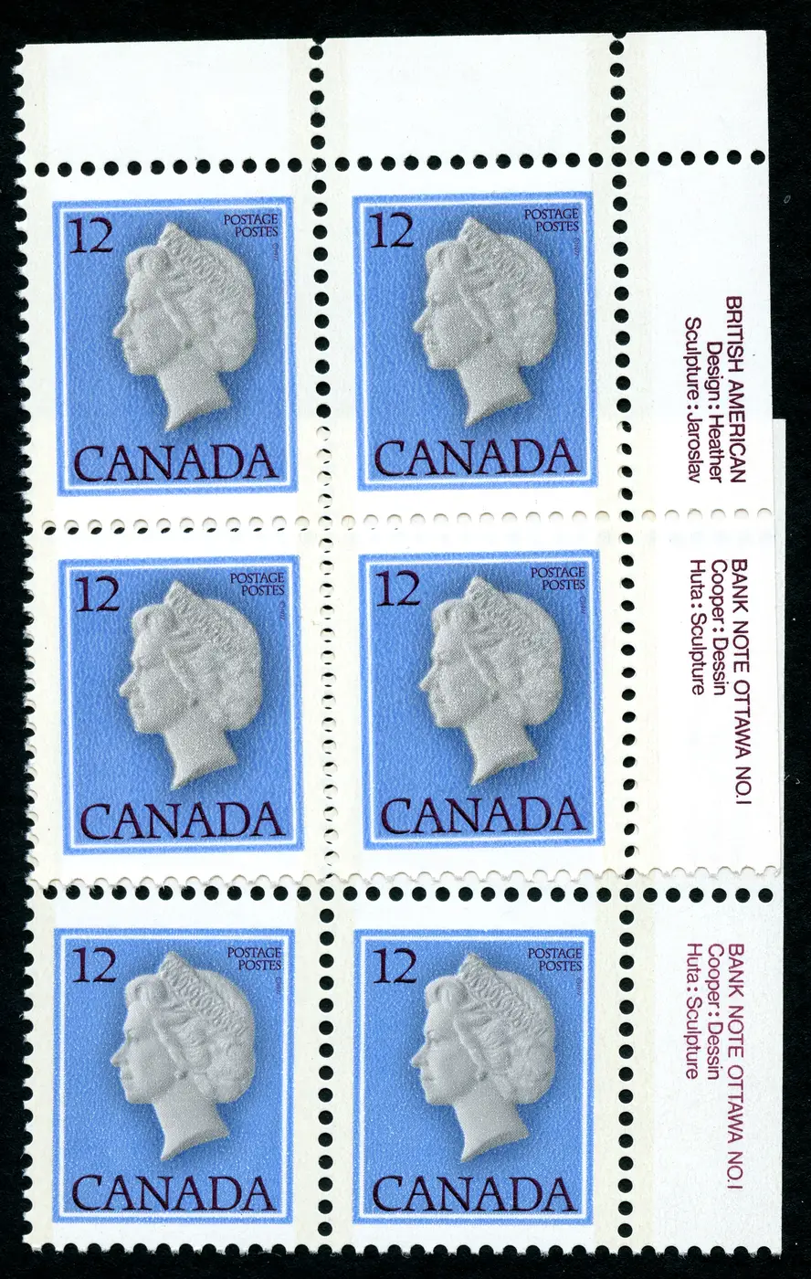 |
Send note to Staff 
|
|
|
Pillar Of The Community
Canada
1637 Posts |
|
|
This was a printing run of 633,800,000 of this definitive issue. I would be pretty well sure that the ink used for the inscriptions would have been refilled numerous times. As the batches would probably have slight inconsistences in mixing, I would believe consideration should be given for the slight pigment variation, thereby attributing to the difference we see.
Edit- #741iv describes that the black inscriptions are doubled, because of kiss print. Not describing the same thing, nothing to do with the color variation of inscriptions . |
|
Send note to Staff
|
| Edited by No1philatelist - 02/01/2026 11:07 pm |
|
|
Pillar Of The Community
Canada
877 Posts |
|
|
Thanks for your responses.
Lithograving:
Have you looked at these under UV light?
No1philatelist:
I wasn't suggesting that 741iv had different shades of inscription color. I was just pointing out that there would seem to be a precedent for differences in the inscription being considered to be varieties of the stamp. Do you know if stats available for the split of stamps printed from Plates 1 and 2, and how many stamps were printed for each printing? |
|
Send note to Staff
|
|
|
Pillar Of The Community
Canada
1637 Posts |
|
|
Itma- ok, I took it as the same, because of "describing the variety", not describing "a" variety. Just my interperation. As for how many of each were printed, good question but I do not have that information available. Probably available from the philatelic archives, which I dont have access to either, living in Eastern Atlantic Canada. |
|
Send note to Staff
|
|
|
Pillar Of The Community
Canada
5821 Posts |
|
|
@itma
Both light and dark 713 Plate 1 copies are dull fluorescent DF/DF
and the same for the only copy of Plate 2 that I have.
Only difference I can tell is that the Queen's cameo is sharper on the
lighter inscription one than on the darker maroon one which is just
another example of poor printing methods and no quality control. |
|
Send note to Staff
|
|
|
Pillar Of The Community
Canada
877 Posts |
|
|
Quote - living in Eastern Atlantic Canada - Unquote (The quote button doesn't seem to be working.)
Me too. I'm in PEI.
I think I've been spoiled, having grown up father whose main hobby was Australia stamps. The Australian Commonwealth Specialist's Catalogue was really an early reader for me. It and other guides/checklists give a surprising amount of detail on the stamps and how they were produced. Perhaps I should contact Unitrade's new owners/editor. They use the terms "sheet" and "pane" but do not really define them in their glossary on page 23 of the new edition. In a few places, they will say e.g. "Sheets of 200 stamps in panes of 50" but in most cases it almost sounds like they are giving "sheet" and "pane" the same meaning.
Re fluorescence, for Plate 1, I have 8 PBs with the light shade inscription and 1 PB with the darker shade, plus 20 PBs in the darker shade inscription. All of them show a sign a significant difference with the back being much more reactive to UV than the front. I used to have a really good (powerful) UV lamp but I dropped it recently and it is now deceased. So I am relying on a Lighthouse 4W lamp and it needs almost total darkness to give good results. I am thinking of coming up with a "multiple lamp in a box" solution since they are so cheap. I am pretty sure my PBs are DF/MF but, in the meantime, I am not sufficiently confident as far as putting them on the market is concerned. |
|
Send note to Staff
|
|
|
Pillar Of The Community
Canada
5821 Posts |
|
|
I found a couple more of both light and dark inscription of the Unitrade 713 Plate 1 UL Both are dull fluorescent DF/DF. 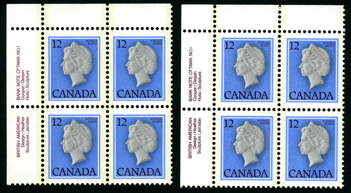 I was hoping to see the "raised eyebrow " flaw in position 1 but no luck. The images in neither the Unitrade nor the Trajan Catalogue are very sharp. Does anyone here have this variety and give us a nice scan? The BABN Goebel printing press I believe had 600 subjects on one cylinder on these small definitive press sheets, then guillotined into panes of 100 stamps. So it appears that only one in six UL Plate Blocks had this flaw. The same "raised eyebrow " variety showed up again on the 14c Queen, Unitrade 716 and the 17c Unitrade 789 and was finally corrected for the 30c Unitrade 791 cameo. |
|
Send note to Staff
|
|
|
Pillar Of The Community
Canada
877 Posts |
|
|
I asked the same question last year and got a great answer. Go to https://goscf.com/t/86147. You will see that the regular eyebrow is still there but just above ie, starting on the left is more "bushiness". This rises along with the regular but, when the regular turns downwards, the "raised eyebrow" continues upwards until it reaches the forehead. This is another case of when is Position 1 not Position 1. |
|
Send note to Staff
|
|
|
Pillar Of The Community
Canada
5821 Posts |
|
|
Pillar Of The Community
Canada
877 Posts |
|
|
Quote:
The BABN Goebel printing press I believe had 600 subjects on one cylinder
on these small definitive press sheets, then guillotined into panes of 100 stamps.
So it appears that only one in six UL Plate Blocks had this flaw.
I have just purchased Robin Harris's book on the "Environment" definitives (I bought the "Caricature" book as well - both great) and it shows that though the BABN printings have 6 panes of 100 stamps, only 3 panes have inscriptions. Thus there is a 50:50 chance that will not appear on a Plate Block. So, I think, that reduces the chance of finding this variety drops to one in twelve. (Statistics were never my best subject.) If it had been printed by CBN, it likely would have had 4 panes, all with inscriptions. |
|
Send note to Staff
|
|
|
Bedrock Of The Community
12551 Posts |
|
|
This falls under "flyspecking". You have to acknowledge that stamps are low value utilitarian objects whose production values are not at national currency levels. In the case of this stamp you paid twelve cents, licked it, stuck it on a piece of mail and away it went to be defaced as used and chucked in the trash. They are intended to be disposable objects so why be surprised that ink is off by a shade or three. If the Queen's head was upside down or the wrong denomination was printed THAT would be something to contemplate.
PS: Before modern manufacturing techniques when you purchased a new car in the 70's you could end up with a not so stellar paint application. Same with these stamps. |
|
Send note to Staff
|
|
|
Pillar Of The Community
Canada
877 Posts |
|
|
I have to say that I disagree with you on several fronts. - Flyspecking
I don't regard a differences in a block of text as flyspecking. To my mind, flyspecking is looking for random and usually small dots, lines, etc. (I still miss good old wer's posts!) I do, however, regard the different shades of the inscriptions as significant. It looks like a decision was taken to change the shade but we will probably never know why.
- Low value definitives
This has always been a major collecting area. If you consider Australia, the main specialist's catalogue devotes 497 pages or 85% for KGV definitives up to 1shilling and 4 pence, while Unitrade has a grand total of 40 pages for all of KGV. British Machins is another area with a large specialist interest in definitions. The BSAP Bulletin devotes about 10% to 20% of its space to varieties of the 1d red 1914-1922.
For the non-specialist, it is a cheap and cheerful way of entering the world of philately. And, heaven only knows, we need a lot more junior stamp collectors to grow up into full-blown philatelists.
- Varieties
Low value stamps are fertile ground for the search for varieties. The extended use and storage over their lifespan and the much larger volume makes for varieties,
- Shades
A number of years back, my Australian specialists' catalogue rationalized its lists of shades for the 1d red of 1914-1922 to 26 shade, combining some slight shadings to a single catalogue entry and eliminating some shades, which on further consideration were not thought to exist. The stamp catalogue numbers were given capital letters A to Z This only lasted a few years before BW71S - salmon eosine - was expanded to include BW71SA -pink eosine.The catalogue values (2018) vary widely from $5 to $2250 for a used single. I believe there is a reason for this. From the very early days of stamp collecting in Australia, there seems to have been a high degree of cooperation between collector groups and the Australian Post Office in determining the dates for the various printing of the stamps and associating these printings with the shades. (The early days of this issue coincided with Word War 1, and the many of the printers volunteered for military service and the stamps had to rely on relatively inexperienced worker for ink mixing - thus the many shades.) As they say: Information is power, and all power to the Australian collectors. From what I hear, similar information is not so easy to obtain in Canada. Every one of those shades is a step in Australia's stamp history and is worth conserving. Perhaps this culture has been missing in Canadian philosophy, or perhaps the work of the various Canadian societies is not making it into catalogues. The two specialists' catalogues for KGV stamps costs $A310. ($A and $C are roughly at par.) The full set of 8 volumes is $A1,040 and, having been introduced in 1922, the individual sections are still being reissued every 5 or 6 years or so.
Another aspect of a stamp's color is that an accurate shade was regarded as a security feature. Counterfeit stamps could then be more likely to be detected by variation from that shade. Perhaps inroads for personal letter mail by eMail, and the use of alternatives to stamps for commercial mail is now such that quality control is no longer viable when compared to the risks.
|
|
Send note to Staff
|
|
|
Bedrock Of The Community
12551 Posts |
|
|
Quote:
I have to say that I disagree with you on several fronts. I predicted that.  Quote:
It looks like a decision was taken to change the shade but we will probably never know why.
Quite the reach on that one. |
|
Send note to Staff
|
|
|
Bedrock Of The Community
12551 Posts |
|
|
Quote:
Edit- #741iv describes that the black inscriptions are doubled, because of kiss print. Not describing the same thing, nothing to do with the color variation of inscriptions . Exactly  |
|
Send note to Staff
|
|
|
Pillar Of The Community
Canada
5821 Posts |
|
|
So what's wrong with flyspecking ? It's great fun looking for these little plate flaws on a miserable cold winter night. And it is very popular, for instance the Michel Deutschland Spezial Katalogs show thousands of what they call Plattenfehler = plate flaws. Check out this BNAPS article by Leopold Beaudet Constant Plate Flaws on Elizabethan Stamps
https://bnaps.org/ore/Beaudet-Eliza...ateFlaws.pdf |
|
Send note to Staff
|
|
|
Replies: 22 / Views: 1,312 |
|


