| Author |
 Replies: 14 / Views: 2,352 Replies: 14 / Views: 2,352 |
|
|
Bedrock Of The Community
United States
12128 Posts |
|
|
Another L-Type Precancel ID request, this time for San Francisco, California (which had a number of different L-Type precancels). In this case, the font has serifs, using upper and lower case letters. Distance between bars is 14 mm; 1.5 mm from top bar to city name; and 2.5 mm from state name to bottom bar. I know it's a dated precancel that looks to be April 1950 (?) but the initials are smeared so badly I can't decipher it. 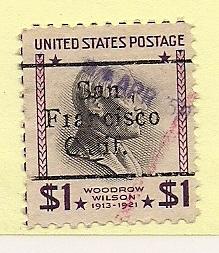 Thanks in advance for any help to ID this one. |
|
Send note to Staff
|
|
|
|
|
Valued Member
United States
184 Posts |
|
|
Pillar Of The Community
United States
2544 Posts |
|
|
Bedrock Of The Community
United States
12128 Posts |
|
|
Thanks for the info. No watermark, so I guess it's just the run of the mill L-9 TS. Being a dated precancel, it's probably worth even less than the catalog value of 10 cents, but I still like it.
As we often say, we're in it for the joy of the hobby; not the monetary value ... and that's especially true for precancel collectors! |
Send note to Staff 
|
|
|
Valued Member
United States
156 Posts |
|
|
I've been sorting through a stack of California precancels for the past two weeks and will tackle San Francisco this weekend. I've got somewhere around 200-300 S.F. precancels to wade through. I believe I spotted the L-9 TS, but I know I don't have ANY S.F. precancels on the $1 Woodrow Wilson stamp that you've got. Nice looking stamp!
|
|
Send note to Staff
|
|
|
Bedrock Of The Community
United States
12128 Posts |
|
|
Given that I have a number of these, I assume they are also common San Francisco precancels, but since they don't match any of the numbered precancels, they must be other L-Types. Can anyone identify these two precancel types for me? 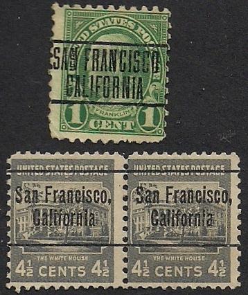 1-cent: Measurements: 11mm between bars; letters 4mm high; 1mm distance between lines. 4-1/2-cent: Measurements: 14mm between bars; letters 2.5mm high; 2.5mm between top bar and top line text and bottom line text and bottom bar; 1.5mm between lines of text. Thanks in advance. |
|
Send note to Staff
|
|
|
Pillar Of The Community
United States
2758 Posts |
|
|
Hey, WT1 What is the height of the date on the Wilson stamp.
The top SF is an L-3 the others are L-7's.
|
|
Send note to Staff
|
|
|
Valued Member
United States
491 Posts |
|
|
Just bumping this to the top in case wt1 didn't notice warrehouse's question about the height of the date on his $1 Wilson S.F. dated. |
|
Send note to Staff
|
|
|
Bedrock Of The Community
United States
12128 Posts |
|
|
Quote:
What is the height of the date on the Wilson stamp 2mm even. As I said in my earlier post, the initials are smeared and cannot be deciphered. I believe the date to be either Apr. '50 or Apr. '56. |
|
Send note to Staff
|
|
|
Pillar Of The Community
United States
2758 Posts |
|
|
I thought by default I might be able to narrow the possibilities.
The 2mm height is not common in San Francisco.
Style types that used a 2mm height date are C-2, C-12 & C-21.
That leaves us with, AMM, 1954; GBC, 1939-43; HC, 1954; RB, 1938; SRC, 1954-55; WEMCO, 1938.
All were C-2, there are no C-12's nor C-21's used in San Fran.
However, I believe I found the answer.
P.O. 1950. This matches the date, the '6' is an illusion created by the design in the stamp.
The date height matches. The 2 splotches matches the fact there are 2 letters.
In the catalog a definitive style type for this one is undefined because there were no reliable initials visible to obtain a reliable measurement.
I think we got it, these may be rare because of the poor handstamp many collectors have discarded it! |
|
Send note to Staff
|
| Edited by warrehouse - 09/10/2011 12:25 pm |
|
|
Pillar Of The Community
United States
2758 Posts |
|
|
Bedrock Of The Community
United States
12128 Posts |
|
|
What great detail you can uncover! I don't know if this will help much, but I actually have two of the same stamps with the same date. If you look closely at the pencil/crayon mark, it looks as if these two stamps were attached together on the same piece but detached afterwards. The same smeared ink appears on both as to the date and initials, but I scanned it at a higher resolution in the event it may be of any help: 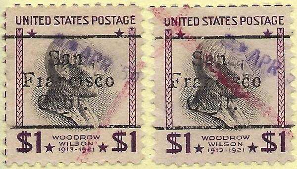 |
|
Send note to Staff
|
|
|
Bedrock Of The Community
United States
12128 Posts |
|
|
Purely a stab in the dark, but could the "PO" relate to this (taken from University of California at Berkeley collection)? Quote:
Chinese language newspapers have witnessed both the ups and downs of Chinese immigration to the U.S., and have also faithfully recorded
the struggles and prosperity of Chinese immigrants in the U.S. In 1998, Kuei Chiu and Yulan Chou (a former librarian at UC Berkeley), did an extensive survey of Chinese newspapers published in the U.S. looking for representative titles for digitization, and identified Chung Sai Yat Po as the one to be digitized. Chung Sai Yat Po was published in San Francisco from Feb. 1900 to 1951. It has a long publishing history and almost all its issues survived. |
|
Send note to Staff
|
|
|
Pillar Of The Community
United States
2758 Posts |
|
|
I agree that those two stamps were used on a letter/package together, but in 1950 how large/heavy would it need to be to need at least $2. postage? Crayon cancels are more common on large/heavy parcel packages.
Though not sold since the catalog is mark "P.O. vs PO", but it seems possible that they would have shipped copies of their newspaper to other hubs around the country to sell the publication, which may have required that amount of postage.
It also could be an error in the catalog, meaning that no punctuation was used.
P.O. could be a person or Co named after a person or the 'O' could be for Organization!
|
|
Send note to Staff
|
|
|
Valued Member
136 Posts |
|
|
Watch your L-7's. The "C" of California lines up anywhere from under the "a" in "San" to the "F" in "Francisco". Makes for some variety sets.
|
|
Send note to Staff
|
|
| |
Replies: 14 / Views: 2,352 |
|


