Stamp Community Family of Web Sites
Thousands of stamps, consistently graded, competitively priced and hundreds of in-depth blog posts to read


Stamp Community Forum
 
Username:
Password:
Save Password
Forgot your Password?

This page may contain links that result in small commissions to keep this free site up and running.

Welcome Guest! Registering and/or logging in will remove the anchor (bottom) ads. It's Free!

Perplexing Scott A140 2 Cents, Perf 12

 
To participate in the forum you must log in or register.
Author Previous TopicReplies: 10 / Views: 3,810Next Topic  
New Member
United States
4 Posts
Posted 11/09/2011   09:16 am  Show Profile Bookmark this topic Add phobrek to your friends list Get a Link to this Message
Hi - My first post here, and looking forward to a lot of stamp chat....

I'm hoping that someone can help me figure out this Scott A140 2c stamp. I've been going through the tedious business of IDing my many 140s, checking watermarks, perfs, types, colors, doing fairly well, I think, for the amateur that I am. But this one has me stumped.


It's a certifiable perf 12, but: what type? To me, this looks like a type VI. But there is no perf 12 type VI.

As for its color, I don't trust myself to identify it... the endless slight differences in shade of the many 2c A140s boggle me. I use a Wonder Color Gauge; is there a different gauge someone might recommend?

I imagine this is an easy answer for some of you, but I'm too inexperienced to figure it. Any help would be greatly appreciated!

Phobrek
Send note to Staff

Pillar Of The Community
Canada
6525 Posts
Posted 11/09/2011   09:49 am  Show Profile Bookmark this reply Add jamesw to your friends list  Get a Link to this Reply
This is a tough series. I keep going back to mine and whittling away, still have some in glassines waiting patiently. If you're sure it's perf 12 then I think it is probably SC#406 1912-14. There don't seem to be any other perf 12 issues, that I can see. Have you checked for watermark (this would be watermark 190).
The line at the top of the toga is quite fine as are the lines around the button. And the curve of the left numeral two isn't heavy, as it would be in a type VI.
Colour is hard to determine in a scan, but it's probably carmine, the lake version of this issue is much rarer.
That's my 'educated' guess anyway. Others here will be more helpful.
Really good scan, by the way. Makes it easy to try to determine these things. Nice looking stamp too. Pretty well centered.
Welcome to the forum. You'll learn lots here. As I said, there are real experts here who are much better qualified than me to help you. Good luck.
Send note to Staff  Go to Top of Page
Edited by jamesw - 11/09/2011 10:13 am
Pillar Of The Community
United States
2480 Posts
Posted 11/09/2011   09:58 am  Show Profile Bookmark this reply Add tomiseksj to your friends list  Get a Link to this Reply
Welcome to SCF phobrek!

I agree with James that perf 12 leads you to Scott 406. There are two very helpful references for identifying the Washington-Franklins:

http://www.askphil.org/W-F/Index.htm and http://www.1847usa.com/washfrankmain.htm

Steve
Send note to Staff  Go to Top of Page
Pillar Of The Community
United States
1348 Posts
Posted 11/09/2011   10:31 am  Show Profile Check ray.mac's eBay Listings Bookmark this reply Add ray.mac to your friends list  Get a Link to this Reply
PHO--
No need to Type for Perf 12 stamps. Only whether written numbers, numbers, wmk type, and paper (bluish, china clay, or not).

Perf 10 reg stamps, no Type, wmk only. Perf 10 coils can be wmk or not, Type I, II, III, and print method (flat plate or rotary).

Perf 11, you see more Types, mostly due to the offset printing method where you can see Types IV, V, Va, VI, VII. Perf 11 you can also see Type Ia, which isn't as difficult as some make it out to be, but you have to look for flat plate printing, more detailed than Type I and a color unlike any other W-F.

Imperfs on flat plate and rotary are Type I, w the exception of the Type Ia imperfect 482A. That one and the rotary Perf coil 459, good luck. You have less than a
1 in 10,000,000 chance of finding one.

I'm at work and did this off the top of my head so may have missed something but hope this helps.

Best literature in all philatelic literature is Martin Armstrong's W-F book, I highly recommend this one for any US collector.

Thanks, Ray
Send note to Staff  Go to Top of Page
Pillar Of The Community
United States
2544 Posts
Posted 11/09/2011   10:51 am  Show Profile Bookmark this reply Add chasa to your friends list  Get a Link to this Reply
This is the color the catalogs call CARMINE.
Send note to Staff  Go to Top of Page
New Member
United States
4 Posts
Posted 11/09/2011   4:43 pm  Show Profile Bookmark this reply Add phobrek to your friends list  Get a Link to this Reply
Thanks for the responses!

I didn't know that type I could have such strong dotting on the nose... my other type I's are so faint by comparison. As are the lips, and toga lines. But... maybe this is just my first type I that isn't horribly faded with age! I checked and couldn't find a watermark, but that doesn't mean it isn't there.

Great guides, Steve - thank you! I'd used another in the past, but it wasn't as well-detailed and organized as these.

Oh, and that pic was actually a photo, James... for some reason my scanner was capturing the image with an incredibly exaggerated hue... still not sure why, as it's operating properly now. So I scanned in this lot of A140s just to look at them, side by side:


A much bigger version of the image is here (if you click on the magnifying glass icon you can make each stamp about the height of your screen): https://picasaweb.google.com/104363...211148356578

My IDs on these was:

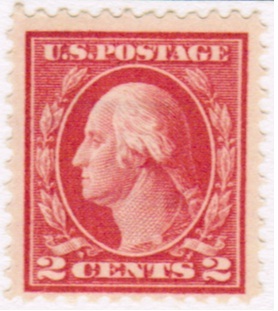
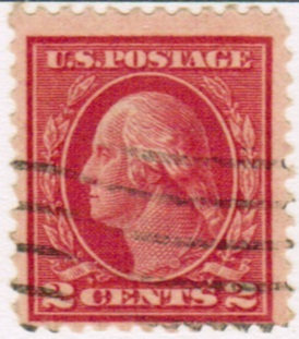
Top row, L to R: Scott 463 (carmine I, perf 10, unw.); the stamp originally posted above, Scott 406 (carmine I, perf 12, unseen w.190); Scott 527 (carmine V, perf 11, unw.)
Bottom row, L to R: Scott 499 (rose I,* perf 11, unw.); Scott 528A (carmine VI, perf 11, unw.); Scott 528B (carmine VII, perf 11, unw.)

* If this were pale carmine red, it would be a rare Scott 461. My Wonder Color Gauge doesn't have pale carmine red, but it's a dead-on match for its sample of "pale red tint," much more so than its "rose tint." I wish I had some other pale carmine red stamp to compare it to... is there a better or different color gauge than Wonder? There are so many colors listed in Scott that it doesn't have (though it may have equivalents using different names; I just don't know what those equivalents would be).

Mind you, anywhere that it says "unw" (unwatermarked) might be a mistake on my part; just because I can't find them doesn't mean they're not there. If anyone cares to check my work, please do. I'd love to see if my IDs are right or wrong. If I had stamps already correctly IDed, I could compare stamp to stamp, which seems to be one of the best means of IDing such variants and determining just what shade of red I'm looking at on my dozens of A140 2c's. The Scott catalogue's guide to the different types are often a bit vague to me.

I guess I also need to get a proper watermark detection kit, because I've only been able to see some of them. Can anyone recommend a favorite method or product? I'm wondering if it's heretical of me to admit that I've been um... using lighter fluid in a black tray.

Again, thanks for the responses and great information!

Phobrek
Send note to Staff  Go to Top of Page
New Member
United States
4 Posts
Posted 11/09/2011   4:58 pm  Show Profile Bookmark this reply Add phobrek to your friends list  Get a Link to this Reply
Ray - thanks for the details... that you can rattle off that list off the top of your head is pretty amazing and slightly frightening.

I think I had actually started typing the stamp originally because it had gotten mixed in with some perf 11s. So I had a bunch of perf 11s in a row, comparing them to one another, writing down types, etc. Then at some point I checked the perfs again and saw it was 12, got flummoxed, and started comparing it to my perf 12 type Is, and it was so much darker than the others, with the toga lines intact, more of a mouth, etc... but with the huge blown-up version of the 6 stamps above (via the link) I can see that it's just like the one to the left of it (Scott 463, difference being the perf), but with a far better contrast, far less fading.

Unless they're also different shades, in which case I'm lost all over again.

I think I'm going to start scanning all stamps I want to type for such tiny details. I've been using a 45x mini-microscope and feel like I'm making myself blind in one eye in the process. Definitely something to be done in moderation and for short durations....

I'll check out that book - thanks, Ray!

Phobrek
Send note to Staff  Go to Top of Page
New Member
United States
4 Posts
Posted 11/09/2011   5:12 pm  Show Profile Bookmark this reply Add phobrek to your friends list  Get a Link to this Reply
Oh: forgot to mention: I added that black line to the image as an after-thought as I was aligning the stamps on-screen, noticing that the 4th stamp (bottom row, left) was noticeably taller than the others. Does this speak to a different method of printing (such as rotary stamps' larger sizes)? I've had this one down as Scott 499, a flat press printing, but I could be wrong (on any/all of these). I don't think there's a non-coil rotary perf 11; there are offset series (no idea how that process affects images' sizes).
Send note to Staff  Go to Top of Page
Rest in Peace
United States
7097 Posts
Posted 11/09/2011   7:36 pm  Show Profile Bookmark this reply Add I_Love_Stamps to your friends list  Get a Link to this Reply
yes rotary printing makes the design taller or wider in some cases than does flat plate printing and and actually how I learned to ID them. as for the rest of your questions...
Send note to Staff  Go to Top of Page
Pillar Of The Community
United States
1348 Posts
Posted 11/10/2011   01:47 am  Show Profile Check ray.mac's eBay Listings Bookmark this reply Add ray.mac to your friends list  Get a Link to this Reply
Pho...here is my 461, APS certed.....


Really difficult stamp, and it's pale color again is unique to all of the other WF's

And as I mentioned earlier, here's a Type Ia:


Note on the Type Ia, not only the toga rope and button, but the overall stronger detailed images. When the transfer roll rocked the images onto the plate, there was X-fold more pressure than normal (maybe 10x, IIRC), thus, more detailed images, and a little difference in color. That's where you get the stronger lines.

Hope this is helpful....Ray
Send note to Staff  Go to Top of Page
Rest in Peace
United States
1225 Posts
Posted 11/10/2011   08:44 am  Show Profile Bookmark this reply Add artlaunier to your friends list  Get a Link to this Reply
You might want to check out this site, it has the details of W/F series and its a great resource.

http://1847usa.com/1908WashingtonIdentifier.htm

Art
Send note to Staff  Go to Top of Page
A well regulated Militia, being necessary to the security of a free State, the right of the people to keep and bear Arms, shall not be infringed. (The exact & entire wording of the 2nd Amendment to the U.S. Constitution)
  Previous TopicReplies: 10 / Views: 3,810Next Topic  
 
To participate in the forum you must log in or register.

Go to Top of Page

Disclaimer: While a tremendous amount of effort goes into ensuring the accuracy of the information contained in this site, Stamp Community assumes no liability for errors. Copyright 2005 - 2026 Stamp Community Family - All rights reserved worldwide. Use of any images or content on this website without prior written permission of Stamp Community or the original lender is strictly prohibited.
Privacy Policy / Terms of Use    Advertise Here
Stamp Community Forum © 2007 - 2026 Stamp Community Forums
It took 0.41 seconds to lick this stamp. Powered By: Snitz Forums 2000 Version 3.4.05