| Author |
 Replies: 58 / Views: 13,143 Replies: 58 / Views: 13,143 |
|
|
|
Valued Member
United States
96 Posts |
|
|
I mostly used 1847usa.com for help in identifying the different varieties. Also pnc3.org. I missed the 2466b Bright Blue (with low gloss gum) clearly identified in the Scott Catalog and not on 1847usa.com. Perhaps I'll go after that. I lay out my pages in Microsoft Publisher. I've got other options but I find Publisher the easiest to use. Here's a little better version of the pages; 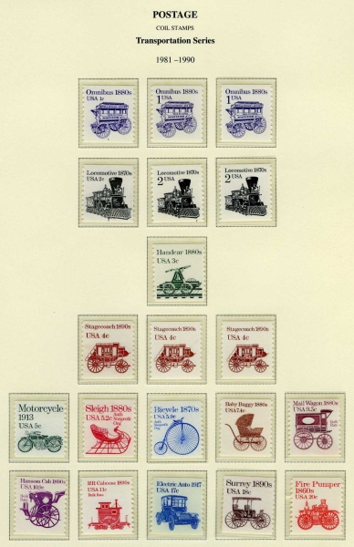 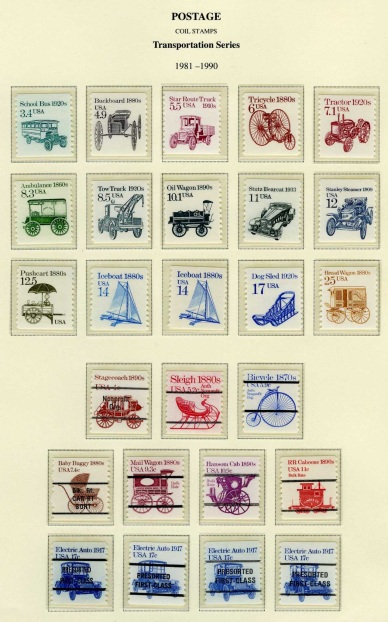 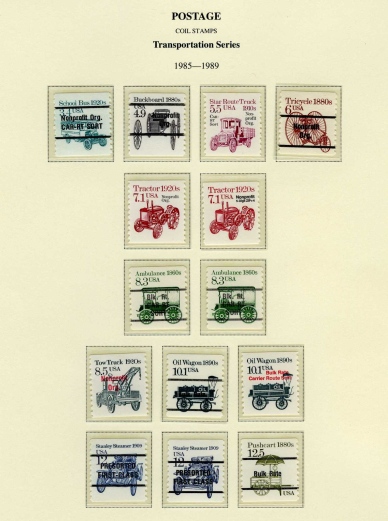 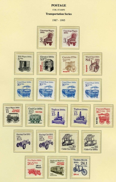 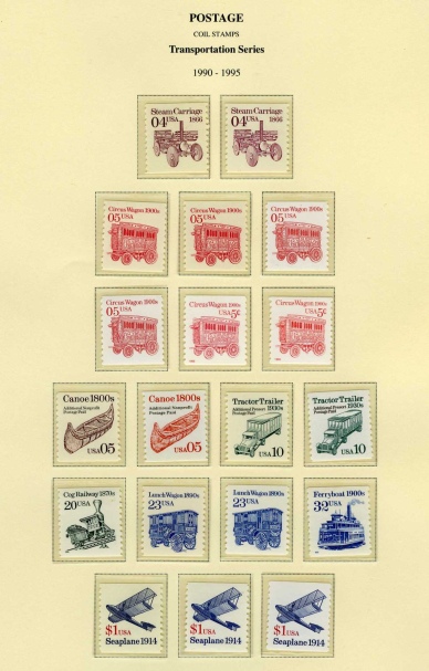 Although not that much of a difference. |
Send note to Staff 
|
|
|
Pillar Of The Community
United States
1128 Posts |
|
|
You have done an outstanding job creating these pages. I like the fact that you did not include a lot of words since the stamps themselves are self explanatory. |
|
Send note to Staff
|
|
|
Valued Member
United States
53 Posts |
|
|
A great display of an attractive modern series! Thanks for sharing, PaulC.  I have been debating with myself over whether to use stock pages or print custom pages. There is no question that the custom pages enhance the presentation. One of the great benefits to designing your own custom pages is that they showcase your collection in a way that is visually pleasing to you the collector. I agree with ncbuckeye that in the case of the Transportation Coils, no additional description is necessary. Perfect as is! |
|
Send note to Staff
|
|
|
Bedrock Of The Community
United States
12128 Posts |
|
|
I certainly second the motion that you have one great display of Transportation Coils. Although this has been posted before, I find it a very entertaining read on how the stamps of the mid-1990s (including those such as the Circus Wagon in the Transportation Series) came to change the denomination from reading "05" to "5c" or "5¢" as the case may be: http://www.sfgate.com/news/article/...-3039529.php |
|
Send note to Staff
|
|
|
Pillar Of The Community
Canada
5821 Posts |
|
|
I also would like to compliment you PaulC for showing us those
sharp looking pages.
Thank you.
Years ago I started collecting some of them mainly because I love the engravings but somehow I got sidetracked and didn't get too far with them.
|
|
Send note to Staff
|
|
|
Valued Member
United States
96 Posts |
|
|
Thanks everyone for the kind comments. I love it when we share things like this. A little nudge and inspiration. That's what inspired me to finish this. What's next... |
|
Send note to Staff
|
|
|
Pillar Of The Community
United States
4092 Posts |
|
|
ok, here goes my first try at including an image If all goes right it will show both color versions of the 32c Ferry Boat (the so called Bronx Blue is the lighter one). 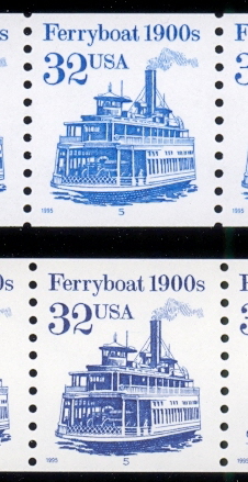 |
|
Send note to Staff
|
|
|
Pillar Of The Community
United States
4092 Posts |
|
|
looks like it worked. I should explain that the Bronx Blue name is another name for the Bright Blue (Sc. 2466b) |
|
Send note to Staff
|
|
|
Pillar Of The Community
United States
8956 Posts |
|
|
Great job, Eyeonwall! The picture you show reminds me of a little known fact about these coils. Out of all the different Transportation Coils only two show a human being. One is the 32 cent Ferryboat, two people are visible on the cardeck. The other one is the $1.00 Seaplane, also with two people visible!
Peter |
|
Send note to Staff
|
|
|
Pillar Of The Community
United States
527 Posts |
|
|
I noticed that on eyeonwall's #2466b that the design is significantly closer to the upper edge than with the #2466. The two copies of the #2466b that I have are essentially the same with the design a shade less than 1mm from the top edge rather than on the #2466 which is about 2mm from the edge. Is this just a coincidence or the particular way the #2466b coil was cut? |
|
Send note to Staff
|
|
|
Pillar Of The Community
United States
8956 Posts |
|
|
Lpmiller, these coils come with their "margins" all over the place. Good centered specimens are preferred but sometimes hard to find.
A lot of times a roll starts of perfectly centered, but the further you get into it the worse it gets.
Miscut stamps, with the platenumber on top are very much sought after, as are misperforations if they are bad enough.
Peter |
|
Send note to Staff
|
|
|
Pillar Of The Community
United States
4092 Posts |
|
|
Somewhere I have another bight blue strip I can't find, but I did find a pair and it runs even higher - design almost touches the top. |
|
Send note to Staff
|
|
|
Pillar Of The Community
United States
8956 Posts |
|
|
PaulC, I do like your display. If you feel like re-doing one of the pages I will be more than happy to send you a copy of the Bronx Blue. Just send me your address in an E-mail!
Peter |
|
Send note to Staff
|
|
|
Valued Member
United States
96 Posts |
|
|
I'm with Peter, margins/centering are all over the place. I gave up trying to collect the individual stamps with the plate number. But I have tried to collect only the well centered stamps. |
|
Send note to Staff
|
|
|
Pillar Of The Community
United States
4092 Posts |
|
|
Here is another fun thing to look for on the 32c Ferryboat. It is a constant plate variety (caused by either a plate scratch or plate crack). I think it is called the lightning bolt and is in the 9 in 1900 on the stamp to the right of the plate numbered stamp on some plate plate #5  strips (comes from a particular row on the plate so strips from other rows do not have it). |
|
Send note to Staff
|
|
|
Replies: 58 / Views: 13,143 |
|


