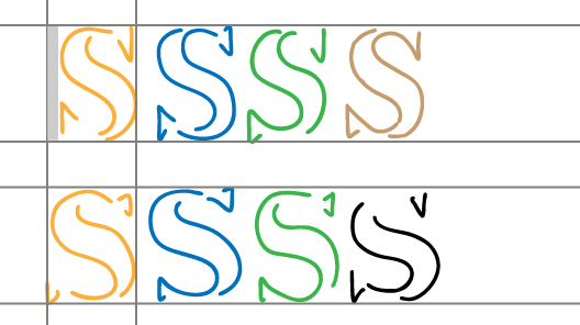
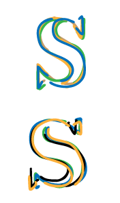
I searched a bit in the internet and didn't find any "errors of watermark production", but indeed I found two different versions of the "S" in a DL watermark. I made a picture here which shows:
- the known watermark graphics for USPS and the USPS "S" (photo I made)
- a watermark graphic and a scan of a USIR "S", both from here:
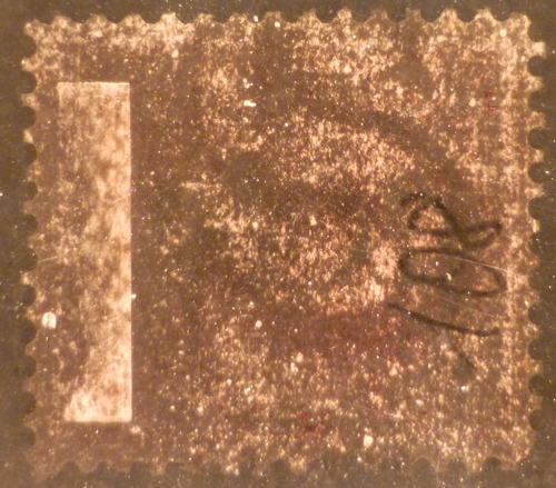
http://philatelics.org/~allan/shrop...usirwmk.html- the photo of the "S" of the stamp I showed above
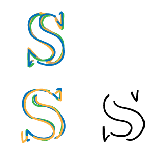
In my opinion (and also in the opinion of those who made these watermark graphics) there is quite a big difference between the "S" of the two watermarks. And also in the scans I can find exactly this difference. The watermark I showed above fits (of course...) very well into the "S" of the USIR graphic. These two just look more "round" and have different endings and another middle area.
I found also, that for a certified USIR stamp you need a "I" or "R". Sure, that's the easiest way. But hasn't there been made any research about the USPS and USIR watermark about their differences? Hasn't there been any article about the letters and their appearance? I think the images here just show it.