| Author |
 Replies: 12 / Views: 2,003 Replies: 12 / Views: 2,003 |
|
|
Pillar Of The Community
USA
3315 Posts |
|
|
|
The latest edition of Linn's has a couple of Letter's to the Editor about USPS's use of the spray on Kermit the From cancellations. They are not complimentary, to say the least.
What do you think about the subject matter and maybe more importantly, the quality of Kermit cancellations?
|
|
Send note to Staff
|
|
|
|
|
Pillar Of The Community
United States
2972 Posts |
|
|
Most of the cancellations I see are under inked and therefore indecipherable. I wouldn't mind having a good clear postmark, I like Kermit. |
Send note to Staff 
|
|
|
Pillar Of The Community
USA
2736 Posts |
|
|
I voted in favor of... it may catch a kids eye |
|
Send note to Staff
|
A Philatelic mind
is a terrible thing to waste |
|
|
Moderator

United States
4788 Posts |
|
|
I vote NO, but my objection isn't to Kermit. I hate all those 'ink jet' spray on cancellations. --KirkS |
|
Send note to Staff
|
|
|
Pillar Of The Community
USA
867 Posts |
|
|
What is green and red and travels at 100mph?
Kermit the Frog in a blender. |
|
Send note to Staff
|
|
|
Pillar Of The Community
United States
1721 Posts |
|
|
I have a more interesting question(I think). In these economic times where the P.O. says it is loosing money hand over fist. Does the USPS really need to pay royalty fees to use the Kermit the Frog image??????? |
|
Send note to Staff
|
|
|
Pillar Of The Community
USA
3315 Posts |
|
|
Pillar Of The Community
USA
2736 Posts |
|
|
Whats green and smells like Miss Piggy
Kermits ------- You fill in the blanks |
|
Send note to Staff
|
A Philatelic mind
is a terrible thing to waste |
|
|
Pillar Of The Community
United States
576 Posts |
|
|
Put me in the same column with KirkS. These things really need to be pretty thoroughly 'road-tested' before they are inflicted on the public. They can't be positive marketing if they can't be made out or don't cause one to read them or otherwise note them mentally. |
|
Send note to Staff
|
|
|
Pillar Of The Community
United States
1106 Posts |
|
|
For those of you who haven't seen the cancellation: 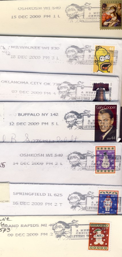 I think it looks more like Dr. Seuss' Grinch.... Dan  |
|
Send note to Staff
|
Experienced stamps need a home too. I'd rather have an example that is imperfect than no example.
I collect for enjoyment, not investment.
APS Member #223433
Postmark Collectors Club Member #6333
Meter Stamp Society Member #1409 |
|
|
Pillar Of The Community
Philippines
505 Posts |
|
|
Thank you danstamps for the intro pics, got it. A cartoon frog on a very serious 8 color stamp artwork? Sort of promotes levity and refocuses away from the appreciation of very nice artwork on stamps. It grabs too much attention from the main star (the stamp), for just being a mere cancelation  |
|
Send note to Staff
|
|
|
Rest in Peace
Canada
6750 Posts |
|
|
 with nic. In some ways the spray on cancels (Canada has them too) detract from the stamp's appeal for me. The human eye (and mind) is soothed and is happier with rounded or natural shapes so the circular date stamps (CDSs) by different countries always seem nicer than no-shape or rectangular or square cancels. I like Kermie (he was /is a hero of mine or at the very least a memorable character) and the above cancel does not look like the Kermit I know and remember. It is drawn or shaded wrong somehow. (me not an artist) 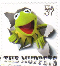 |
|
Send note to Staff
|
|
|
Pillar Of The Community
Philippines
505 Posts |
|
|
Yes kermit is also my favorite moppet, specially when kermit guested on kylie mynouge the singer's show (did I get kylie's spelling right?) |
|
Send note to Staff
|
|
| |
Replies: 12 / Views: 2,003 |
|


