Quote:
Does the L-1-TS and L-2-TS define the different widths between the bars and the two line city being closer together?
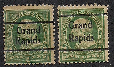
Precancel catalogues generally show the overprint at the actual size. You can use the illustrations as a type of template - if you took one of your stamps and placed it beside the illustration for styles L-1 and L-2, you would quickly see that the spacing between the lines is correct for one style and is wrong for the other.
In looking at this in my PSS Town & Type catalogue, I noticed that the illustration for L-1 (the one with the narrow line spacing) doesn't show the pointed tail on the "R". The Hoover Bros. catalogue gives that pointed tail a sublisting, worth a bit more than twice as much as a copy that doesn't show a tail on the "R". And in an odd twist, the L-2 type also has a sublisting in Hoover for a tail on the "R", and it's priced at less than the copies without the tail!
For some of the listings, the catalogue might give some dimensions for distance between lines, or spacing between lines of text, but it's usually quicker to just lay the stamp up against the illustration rather than getting out a ruler. Unless it's already hinged in your album, of course ....
Ryan
Edit - oops, should have read the other postings to see that others have already spotted the tail / no tail listings.