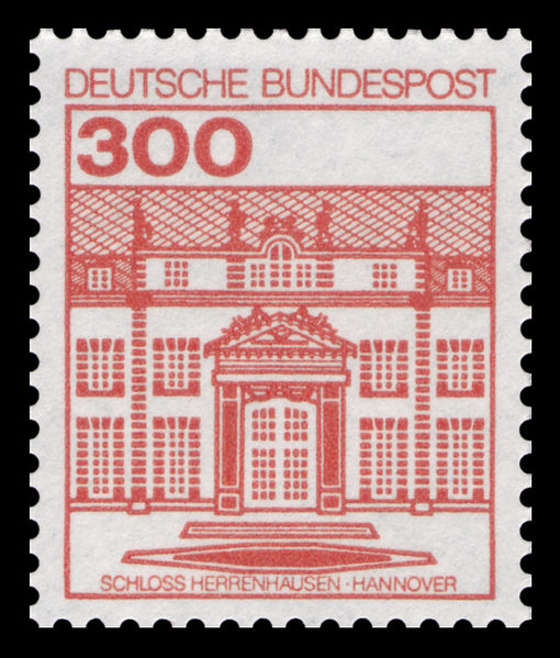
Here's the visual comparison you mentioned seeing in Michel.
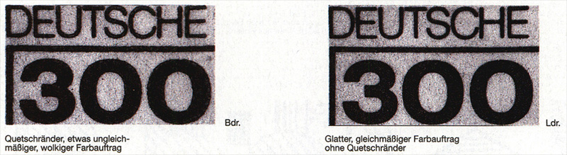
The text translates as:
Bdr. [typography] -- Squashed edges, slightly uneven, cloudy color application
Ldr. [indirect lithography (letterset)] -- Smooth, uniform paint application without squashed edges
I'd guess yours is typography. The edges appear slightly squashed, and the numbers don't look crisp. Also note the unevenness of the number thickness, especially the left versus right sides of the last "0".