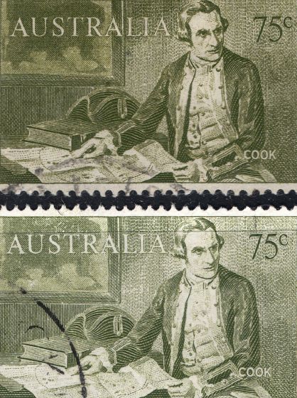
I don't have a specialist catalogue for the decimal era, so I'm a bit mystified by the unusual appearance of one of my 75c Captain Cook stamps. The one on the top in this composite image shows the normal version of the stamp. The one at the bottom, the one I'm intrigued by, obviously looks rather different. Does anyone know if its lighter appearance is due to some kind of printing error or whether there was a different printing that intentionally looked like this?
Thanks for looking!


