| Author |
 Replies: 19 / Views: 3,194 Replies: 19 / Views: 3,194 |
|
Valued Member
168 Posts |
|
|
Having been inspired by eyeonwall, I thought I'd pose my own choice of stamps. One stamp has very nice centering, but it has a coarse cancel. The other has one jumbo margin making it look poorly centered, but it has a single line manuscript cancel and nice eye appeal. Which would you choose? 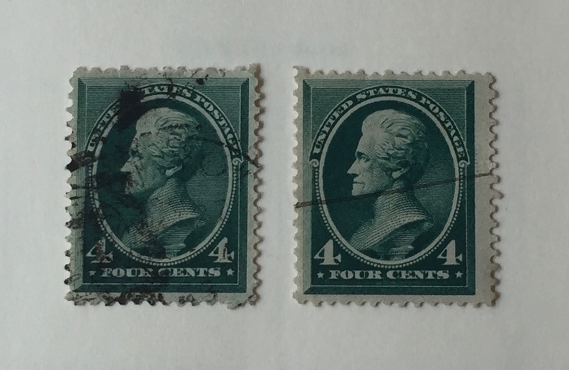 |
|
Send note to Staff
|
|
|
|
|
Pillar Of The Community
1151 Posts |
|
|
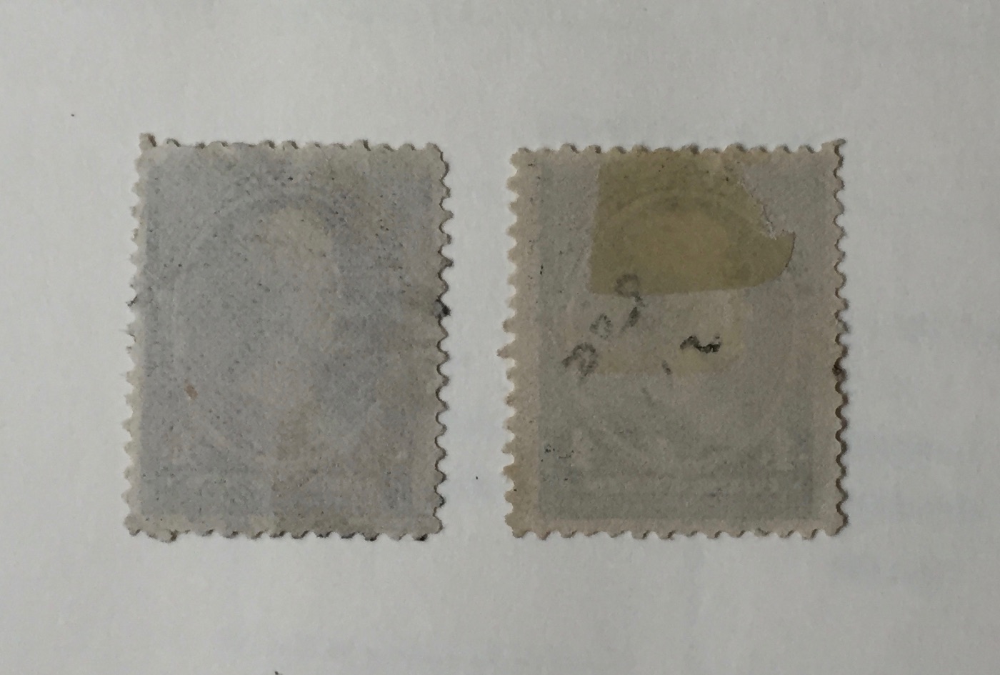
Hi, before I pick, may I see the reverse scan of both stamps? Is this permitted in your pose?
Could (unless its asking too much, for you to watermark both stamps and let us all know you observe?
Stampmaster |
Send note to Staff 
|
|
|
Pillar Of The Community
United States
1808 Posts |
|
|
All other things being equal (hidden faults), the one on the left in a heartbeat. |
|
Send note to Staff
|
|
|
Pillar Of The Community
United States
7239 Posts |
|
|
I'd take the one on the right...assuming that the acids in the cancelling ink haven't eaten through the paper. |
|
Send note to Staff
|
|
|
Pillar Of The Community
1515 Posts |
|
|
Valued Member
168 Posts |
|
|
Pillar Of The Community
United States
910 Posts |
|
|
I'd soak the hinge off.There might be hidden damage there.
the one on the left seems to have short perfs on top.That would bother me more than the manuscript cancel.
|
|
Send note to Staff
|
|
|
Rest in Peace
United States
1189 Posts |
|
|
I'd take the one on the right. Clear image of stamp, small manuscript cancel, sound perfs. I don't have a problem with manuscript cancels, particularly on 19th century stamps. |
|
Send note to Staff
|
|
|
Bedrock Of The Community
12569 Posts |
|
|
Pillar Of The Community
1151 Posts |
|
|
Hi, without the results of watermarking both stamps and without being able to make my right and proper in person examination, I am leaning towards the right hand stamp.
Rogdcam, you'd take neither one. You want MNH 98 Jumbo. Good luck, would you examine it first or just buy it?
Stampmaster |
|
Send note to Staff
|
|
|
Pillar Of The Community
United States
6433 Posts |
|
|
Rightmost stamp without a doubt for me. Then again, I've always weighed the overal aesthetic appearance of a stamp more than technical centering specs. Centering means far less to me than it does to others. |
|
Send note to Staff
|
|
|
|
Pillar Of The Community
United States
2226 Posts |
|
|
The one on the right. I don't mind pen cancels that much.
What I find unappealing about the stamp on the left is the cancel obscuring part of the face. The face is the prime focal area for definitive stamps with a bust at center.
Bottom line; I think the stamp on the right has more eye appeal. |
|
Send note to Staff
|
|
|
Pillar Of The Community
United States
1566 Posts |
|
|
Ok we are talking about an used 211. So putting it perspective basically a $2 TO $4 dollar stamp. So if properly described do I need to see it or the back? No. I going to assume any faults are described. So getting to your basic question based on only the front which would I take. Like I said no need to think over the top on it. My personal taste is the left one if only these two were my options |
|
Send note to Staff
|
|
|
Pillar Of The Community
United States
1414 Posts |
|
|
The stamp on the left has some short perforations at the top and stamp on the right needs a bath to remove the hinge remnant. |
|
Send note to Staff
|
|
|
Valued Member
United Kingdom
68 Posts |
|
|
Valued Member
United States
196 Posts |
|
|
I like your question, and also the varied responses. Assuming they are the same catalog number stamp, I would choose the one on the left. The centering is much better, and I don't care for pen cancellations. I'd make the same choice regardless of the catalog value. |
|
Send note to Staff
|
|
|
Replies: 19 / Views: 3,194 |
|