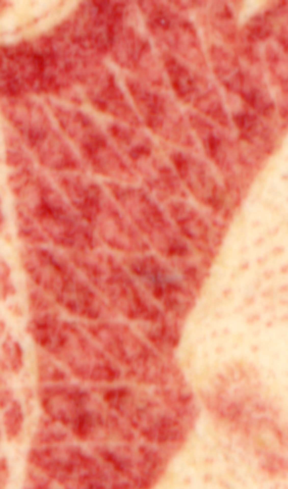
I generally reject most stamps that are mounted in the Scott #64 space, but this one is different. Rose-Pink? Pigeon-blood pink? (highly unlikely I know) What stands out to me is first - the very different color from most 65s and second - the tiny speckles of deep red color in the stamp. How can I make sense of it? I've attached a 600 dpi scan for comparison to a typical 65 and a very high res (9600 dpi) scan of a bit of it where you can see the speckles.
I'm leaning towards 64b - rose pink. I don't know, I'm looking at a pile of 3c stamps and this one just pops out. Hard to accept as just a plain 65 but could be.
I am assuming the stamp you suspect is a pink-related shade is the left-hand stamp? The problem with scanners, is without a known color reference, your scanner can show a whole range of colors vs. other scanners.
Your stamp on the left is a bit dark-ish, but I can see that it could be possible if placed in a good light may show a rose-pink related color, but it is a bit dark in shade. If you had a known reference stamp, or a color chart (ala R. H. White), it would be easier to speculate...
I agree. Color variations are the toughest. Have a certified pink that doesn't look pink and I fail regularly on Scott 70 / 78 colors. One of these days I'll build up a reference collection. I appreciate the thoughts. Maybe bright rose? Well, I'll keep on it.
Probably one of the 1863 rose shades. See Mike McClung's articles in the following Chronicle's of the U.S. Classic Society: November 1989; August 1993 and May 1995. Definitely not an 1861 pink/rose pink/Pigeon blood pink (at least as I see it on my monitor).
rlsny, the stamp being pink or pinkish isn't the specks of red, which is carmine, and most of the 64's 65's have some carmine. One of the keys if you do high res scans, and I know Don will "boo-hoo" this, but it's the wash in-between the pixels of carmine.
If the wash is a yellow color, well, yellow added to red makes a brown, and a bit of brown added to red makes rose.
You want to see less yellow wash, and more plain white. I can't see it from your hi-res scan. You'll also want to see some purples, which help to make up the pink. More shades on the violet side of red and lack of yellow wash makes your best case for pink/rose pink.
The place you want to look is in the concentrated area in the shadow of the upper left or upper right "3". On this stamp, that's where there is the highest concentration of color.
Good luck. It's an absolutely beautiful shade...... Ray
...and the pigeon blood pink has then some blue wash maybe?
what about the difference in the lack of color between the upper left "3" and the pattern/network below, is this still seen as an indicator for pink vs. rose?
Quote: ...More shades on the violet side of red and lack of yellow wash makes your best case for pink/rose pink.
The place you want to look is in the concentrated area in the shadow of the upper left or upper right "3". On this stamp, that's where there is the highest concentration of color.
Good luck. It's an absolutely beautiful shade.
Hi Ray! I would be remiss in my pooh-poohing if I did not comment!
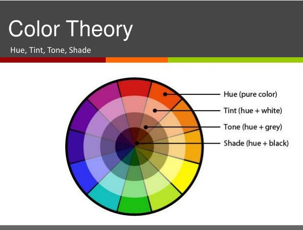
I assume that you did not really mean 'shade' above; shade is a pure color mixed with black. The correct terminology is as follows; Hue = Pure Color Tint = Hue + White Tone = Hue + Gray Shade = Hue + Black Some might argue that the improper use of the word shade is widespread so it is acceptable but those who study color would argue otherwise.
If you think about it, shade = hue + black makes sense. If something is in the shade, it is darker. Don
I don't know what is used in English and what is correct, but I miss the mixture of different colors (not only grey, black and white) in your chart, so I guess people also say shade if different colors are mixed and so shade has become the standard word for all mixtures?
Yes, the word shade is often misused. This is the same as a non-collector incorrectly using the term 'mint' to describe a used stamp in really good condition because 'mint' is a term often used by lay people to describe something that is simply in very good condition. So just as students of philately should use the correct philatelic terminology, students of color theory should use the correct color terminology.
Mixing different colors results in different hues. Don
Disclaimer: While a tremendous amount of effort goes into ensuring the accuracy of the information contained in this site, Stamp Community assumes no liability for errors. Copyright 2005 - 2026 Stamp Community Family - All rights reserved worldwide. Use of any images or content on this website without prior written permission of Stamp Community or the original lender is strictly prohibited. Privacy Policy / Terms of UseAdvertise Here





 Posted 07/19/2018 1:26 pm