Stamp Community Family of Web Sites
Thousands of stamps, consistently graded, competitively priced and hundreds of in-depth blog posts to read


Stamp Community Forum
 
Username:
Password:
Save Password
Forgot your Password?

This page may contain links that result in small commissions to keep this free site up and running.

Welcome Guest! Registering and/or logging in will remove the anchor (bottom) ads. It's Free!

Likely Scott 233A - Pictures And Comparisons Included

 
To participate in the forum you must log in or register.
Author Previous TopicReplies: 5 / Views: 2,928Next Topic  
New Member

1 Posts
Posted 03/25/2019   12:01 pm  Show Profile Bookmark this topic Add pmann1300 to your friends list Get a Link to this Message
I have a stamp book that was handed down to me from a relative and inside was a 4c Columbian marked as a possible 233a. I've included a picture of the 233a, a 1c I had on hand, taken in the same light as the 233a, and a shot from the Smithsonian study about various errors. What do you guys think?

From what I've seen in previous forum posts the color is pretty unmistakable, and in person this stamp is a much closer blue to the 1c than it is to pictures of normal 233's.


Send note to Staff
Edited by pmann1300 - 03/25/2019 12:14 pm

Valued Member
United States
283 Posts
Posted 03/25/2019   2:42 pm  Show Profile Bookmark this reply Add craigk to your friends list  Get a Link to this Reply
Yours is a shade of ultramarine, but here is a recent thread on the subject.

https://goscf.com/t/67064
Send note to Staff  Go to Top of Page
Valued Member
United States
85 Posts
Posted 03/25/2019   2:43 pm  Show Profile Bookmark this reply Add CL_Arctos to your friends list  Get a Link to this Reply
Looks like a pretty regular Scott #233 to me. If anything, I think it looks like the original ink simply faded over time – perhaps it was exposed to the sun or other chemicals that altered the pigment. I am absolutely just guessing, in reality I have no idea. Just throwing my guess in and waiting to see what the experts on this forum have to say about your mystery. I hope someone is able to figured it out definitively for you.

craigk: Your link just goes back to this thread... Seems like you copied the wrong link by mistake?
Send note to Staff  Go to Top of Page
Edited by CL_Arctos - 03/25/2019 2:44 pm
Bedrock Of The Community
Australia
38679 Posts
Posted 03/25/2019   2:54 pm  Show Profile Bookmark this reply Add rod222 to your friends list  Get a Link to this Reply
As a neophyte with US material, I would have thought your image of Sc#233 and #233A were around the wrong way.
I would have adjudged Sc#233 to be "bright blue"
Interesting.

Send note to Staff  Go to Top of Page
Pillar Of The Community
673 Posts
Posted 03/25/2019   3:22 pm  Show Profile Bookmark this reply Add ClassicPhilatelist to your friends list  Get a Link to this Reply
Yes, this is not a 233a, but I like how you are comparing against the 230, which is the right (wrong) ink that was used in printing the 233a error.
But it is just an Ultramarine shade.
Send note to Staff  Go to Top of Page
Rest in Peace
United States
205 Posts
Posted 03/25/2019   5:58 pm  Show Profile Bookmark this reply Add Tipzi to your friends list  Get a Link to this Reply
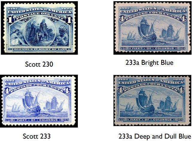
pmann, the image from the Smithsonian study is misleading. The images of the four stamps are from different sources, so do not represent real comparisons. You can see this in the tone of the paper in each image; one is yellowish, one violet, one pale white and one grayish.

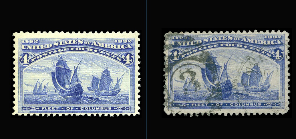
In the image below, both stamps coming from the Philatelic Foundation database, the left stamp is a certified #233a (probably the Bright Blue) and the right stamp is a certified #233, ultramarine shade. These images were taken about 4000 submittals apart but presumably utilizing the same equipment. I am cautious in that last statement because it seems that higher resolution images are made for rare items than for common material, so the blue error may be a photograph instead of a scan, for example. Anyway, note how much more similar the bright blue shade is to a strong ultra than appears to be so in the Smithsonian study:


Send note to Staff  Go to Top of Page
Edited by Tipzi - 03/25/2019 6:14 pm
  Previous TopicReplies: 5 / Views: 2,928Next Topic  
 
To participate in the forum you must log in or register.

Go to Top of Page

Disclaimer: While a tremendous amount of effort goes into ensuring the accuracy of the information contained in this site, Stamp Community assumes no liability for errors. Copyright 2005 - 2026 Stamp Community Family - All rights reserved worldwide. Use of any images or content on this website without prior written permission of Stamp Community or the original lender is strictly prohibited.
Privacy Policy / Terms of Use    Advertise Here
Stamp Community Forum © 2007 - 2026 Stamp Community Forums
It took 0.15 seconds to lick this stamp. Powered By: Snitz Forums 2000 Version 3.4.05