| Author |
 Replies: 10 / Views: 762 Replies: 10 / Views: 762 |
|
|
Moderator

United States
5094 Posts |
|
|
Something very odd about this one. I show this as Scott 174, 174a (SG 162, 162a). Here is a mint copy that really looks good as Scott 174a (SG 162): 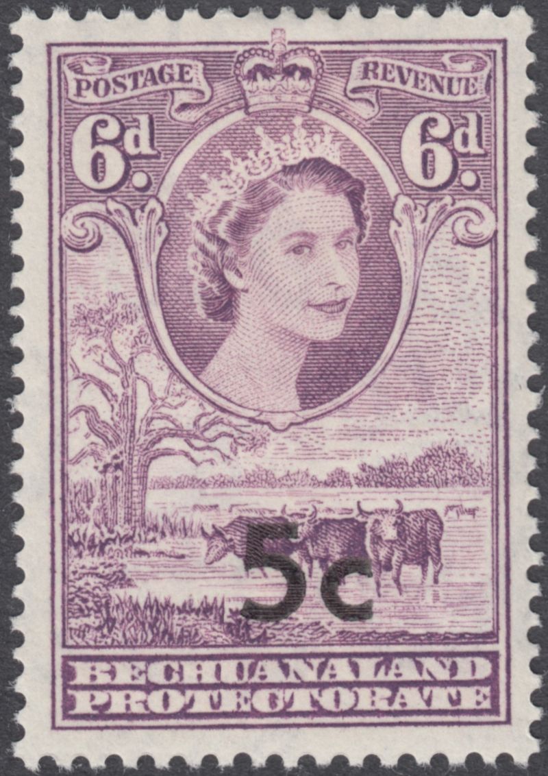 The overprint is nice and clear, wide 5 and c symbol. Looks good. Here are two on a cover fragment. The left appears to have Scott 174, SG 162a, which is a narrower 5 and c symbol. But the right hand stamp not only is a slightly different color, but also has a completely different overprint. I don't see this in either Scott or SG, but I could be mistaken (I have been many times before.) Any help would be appreciated. 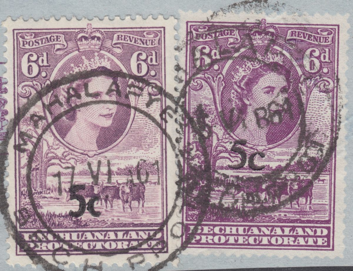 I hate to make this statement, but maybe a Doppelganger? |
|
Send note to Staff
|
|
|
|
|
Pillar Of The Community
1326 Posts |
|
|
Scott says the "174 Type I" overprint (the wider numerals) is the more valuable one, but its value is just a few dollars more than 174 Type II, so hardly worth faking.
On the other hand, if you faked the narrower overprint (174 Type II), you'd be creating a cheaper stamp -- so that doesn't make a lot of sense. .
The stamp these two overprints are on is #160 (6p rose violet) which is worth a little more than a Type II overprint and a little less than a Type I overprint. If that makes any sense.
Used prices from cheap to more expensive are:
174 II (narrow o/p)
160 (original stamp with no o/p)
174 I (wide o/p)
So if you're faking an overprint, more than likely you'd make #174 Type I (wide overprint), but since the difference in value is so small, why even bother? Surely no one would bother to fake that overprint. Just buy the stamp for a few dollars and be done with it.
I see no other overprints anywhere on #160, not even in "back of the book", so that's out.
And, later, the independent and renamed country, Malawi, also did not overprint this stamp. That runs out of my possibilities.
Your questionable stamp has a very non-standard overprint. It's font is completely different. I see no other version of 160 overprinted as 174 -- or as any other stamp, so that's out. So, having exhausted all posibilities . . . I think someone got out the old rubber stamp and stamp pad and just made this up. Why you would bother to do that when all three varieties are so cheap I have no idea? So I'm going say it was done by some child just to see if they could do it -- or a clueless person without a catalogue. Since this sort of thing is bad for the hobby and certainly causes confusion, what I do is mark them on the back "fake" or "fake o/p", or I throw them away so later no one else is confused by it.
Unless Scott missed this overprint which turns out to be rare and valuable and you can retire a wealthy man. Let us know if that happens. |
Send note to Staff 
|
| Edited by DrewM - 07/22/2022 9:17 pm |
|
|
Moderator
United States
5094 Posts |
|
|
Drew, thanks for your comments. I am leaning towards a fake, but then the color of the underlying stamp also confuses me. Were there two different printings of this item. Odd. Anyway, let's see if someone else chimes in. |
|
Send note to Staff
|
|
|
Bedrock Of The Community
12552 Posts |
|
|
Pillar Of The Community
1326 Posts |
|
|
You say "color," but I think you mean "shade". I think there's way too much made of minor color (sorry "shade") differences which this seems to be. Years ago, some stamps came out darker and some lighter with no effort made to do that. I imagined this happened "just because". It may have depended on who mixed the ink, how heavy the ink was, the pressure of the rollers, and for all I know the attitude of the workers and whether or not they were paying careful attention. There are a lot of intentional shade differences out there, but I tend to see these kinds of slightly darker or lighter stamps as just normal variations.
It's interesting, though, to collect shade variations. In some of my albums I've lined up stamps with different shades but which are not recognized that way in the catalogues. You might do that with these. One is definitely darker. Maybe it just got more ink or more pressure when printed. Nigel, the printing press man could have set the pressure slightly differently that day or added a little too much ink. |
|
Send note to Staff
|
| Edited by DrewM - 07/22/2022 11:34 pm |
|
|
Valued Member
Canada
434 Posts |
|
|
I have a number of examples of SG148 6d purple, the stamp without the surcharge. Although not listed as such there does seem to be two distinct shades.
There were two printings of this stamp, first in May 1954 and again in August 1957, which likely accounts for the shade differences.
Looking at the shape of the 'C' on your second stamp, I think that it is more likely the wide Type I surcharge than the narrow Type II.
The Type 1 surcharge is known with a damaged 'C', however, I don't have an example to compare to yours, so it is possible that is what you have along with a damaged '5' as well.
Clive
|
|
Send note to Staff
|
AlbumEasy - Free software for creating custom stamp album pages ChromaMate - Compare, match, analyse, free colour matching software ImageSleuth - Images, hidden inside images, revealed. A retroReveal alternative PSGSA - The Philatelic Society for Greater Southern Africa |
|
|
Moderator
United States
5094 Posts |
|
|
Thanks to all for their comments. The link by rogdcam was particularly useful as I didn't know it existed, and I may email them with some questions. And yes, it is a shade, not a color, difference. I zoomed in on my mint copies of the Scott 174a, and both are positioned about the same, with same color and printing pressure. These were taken with my digital microscope: 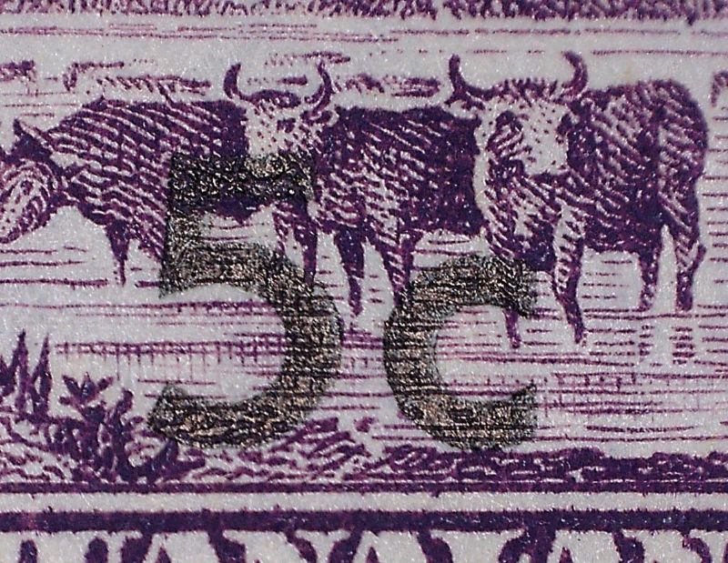 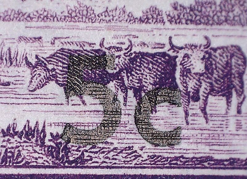 The overprint on the left hand Scott 174 used stamp has a slightly different location on the stamp, but appears to be the same color and printing pressure: 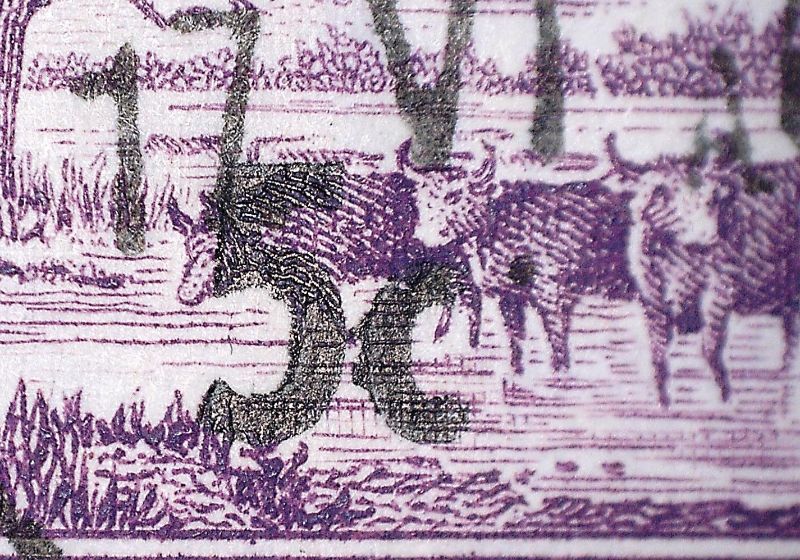 And here is the unknown, odd example. The overprint is in a completely different location, but appears to be the same ink color and looks like a bit more pressure was applied: 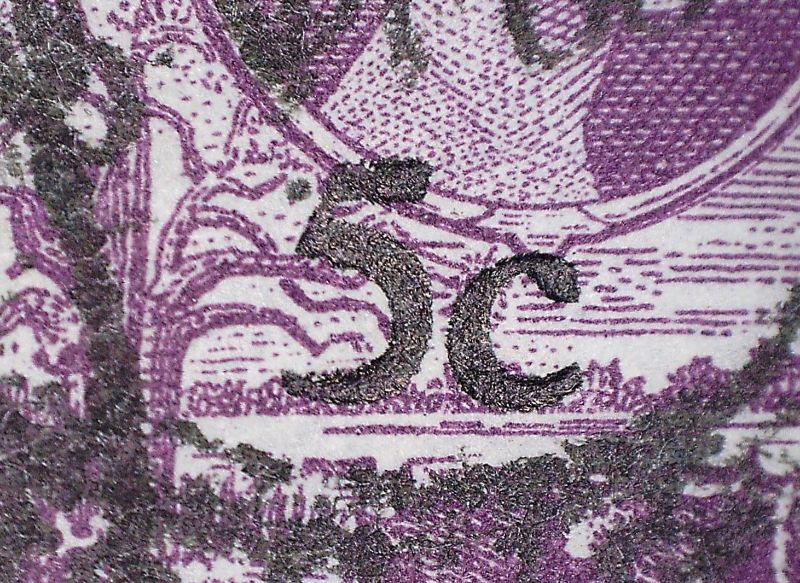 I'm going to forward them to the webmaster on the link that rogdcam provided, as they may be able to provide a bit more insight. Thanks again to all. |
|
Send note to Staff
|
|
|
Pillar Of The Community
Australia
578 Posts |
|
|
The example on the right isn't a stamp, it is a cutout from postal stationery - a re-valued Air Letter from 1961 - H&G F8. |
|
Send note to Staff
|
|
|
Bedrock Of The Community
Australia
38679 Posts |
|
|
Bedrock Of The Community
12552 Posts |
|
|
Moderator
United States
5094 Posts |
|
| |
Replies: 10 / Views: 762 |
|


