| Author |
 Replies: 18 / Views: 3,096 Replies: 18 / Views: 3,096 |
|
Valued Member
144 Posts |
|
|
Unitrade does not describe this issue with a missing period. Is the faint dot to the right of the "S" a poorly imaged period? I am wondering as it seems below the "S", while all other periods are in line with the letters. 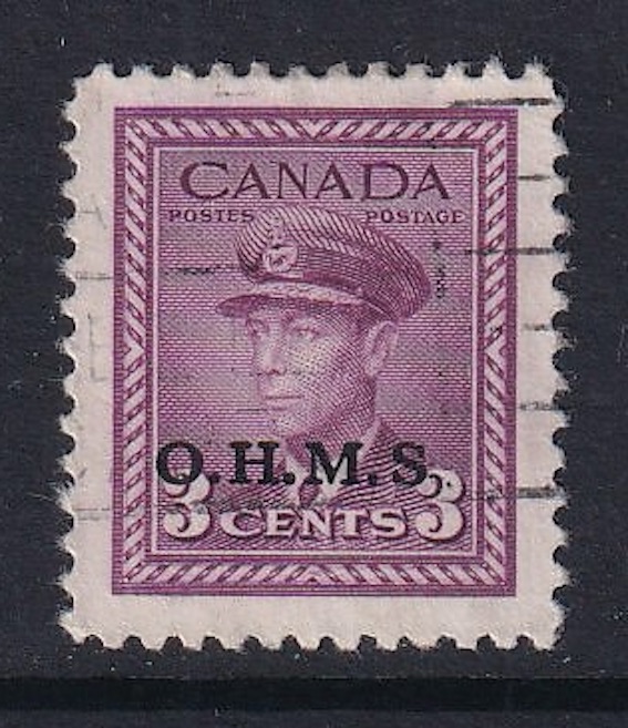 |
|
Send note to Staff
|
| Edited by Riley111 - 08/13/2025 5:55 pm |
|
|
|
|
Valued Member
Czechia
34 Posts |
|
|
Hi Riley,
I would say that it is clearly a missing period after the S variety. I don't know why Unitrade does not include it in the catalogue. Perhaps it is very rare. Nice find ! |
Send note to Staff 
|
|
|
Pillar Of The Community
Canada
1637 Posts |
|
|
Too far away to be part of dot after S. Maybe part of cancelation? Is it legit? Check the print, size and spacing to known real ones for comparision. This is the type of item that very well may have to be sent into the Vincent Graves Foundation for verification. It would be assessed at the lowest catalogue value of $1.75. And if legit would skyrocket its worth to collectors as maybe the first? it would make it a more sought after item. |
|
Send note to Staff
|
|
|
Pillar Of The Community
Canada
644 Posts |
|
|
Since it does not exist based on the plate/sheet studies, it is likely just poor inking. |
|
Send note to Staff
|
|
|
|
Pillar Of The Community
Canada
1637 Posts |
|
|
Well yes, technically that may explain it, but it is still missing! Therefore a variety of unknown quantity. There are several unique items in the Unitrade specialised catalogue missing something or other. |
|
Send note to Staff
|
|
|
Pillar Of The Community
Canada
1394 Posts |
|
|
Pillar Of The Community
719 Posts |
|
|
Can you measure the height of the O especially in comparison to a regular copy? OHMS, both the 5 hole and the Ovpt style, have been heavily forged. I believe the genuine Ovpt has a 2.25mm O and the forgeries usually are 2mm. Another thing to look at closely is if the period after the H is larger then the other two? |
|
Send note to Staff
|
|
|
Pillar Of The Community
Canada
1394 Posts |
|
|
These are 3 of my stamps (1,2 and 4 cent) and a scan of a Unitrade 5 cent for comparison. The overprinted OHMS does vary in depth of ink applied and the font as noted on the tops of various letters - some are straight and others are slanted. So sending to the VVG is a good suggestion as the 3 cent does not appear to be a fake in my opinion. 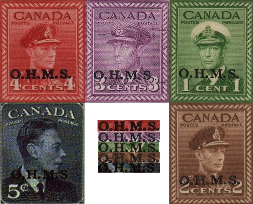 |
|
Send note to Staff
|
|
|
Valued Member
144 Posts |
|
|
Thank you to all for taking the time to give your thoughts. I showed it to an expert in our city, and he feels that it is likely a poor inking, as this variety is not known on this issue.
Thank you once again.
|
|
Send note to Staff
|
|
|
Pillar Of The Community
Canada
1637 Posts |
|
|
I just received my 2026 Trajan catalogue and did a quick review. Interesting to note the issue of Jean Talon of May 3, 1962. It lists the regular issue as a #398. But also noted is a #398a (unique) which is missing value as well as pos of postage. Catalogue - $2000.00 So that probably means that there are no others to reference it too. So has that been found in in a plate or press sheet study? |
|
Send note to Staff
|
|
|
Pillar Of The Community
Canada
1394 Posts |
|
|
I'm been aware of it for some time. I do not have access now to Unitrade so do not know if that's where I saw it. It is the top right stamp on a pane, so probably position 10. 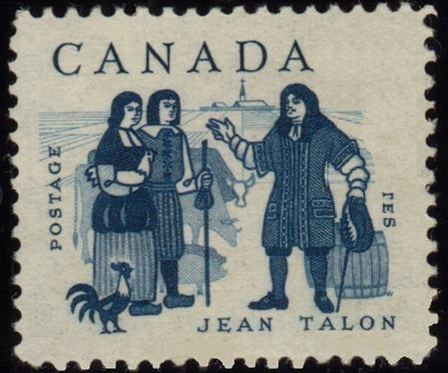 |
|
Send note to Staff
|
|
|
Pillar Of The Community
Canada
1637 Posts |
|
|
Yes, exactly the same as the unitrade shows.because they both use the Scott numbering system under license.
Edit: neither catalogue gives a position, but is shown in both as the one in top right corner of pair in both catalogues. |
|
Send note to Staff
|
| Edited by No1philatelist - 08/21/2025 7:24 pm |
|
|
Pillar Of The Community
Canada
5821 Posts |
|
|
@BlackJag Just curious where you found that image of 398 aIs it yours perhaps? Because if this is a unique item then why does the one in the catalogue show a joined pair with selvedge on two sides and yours is a single with no selvedge. 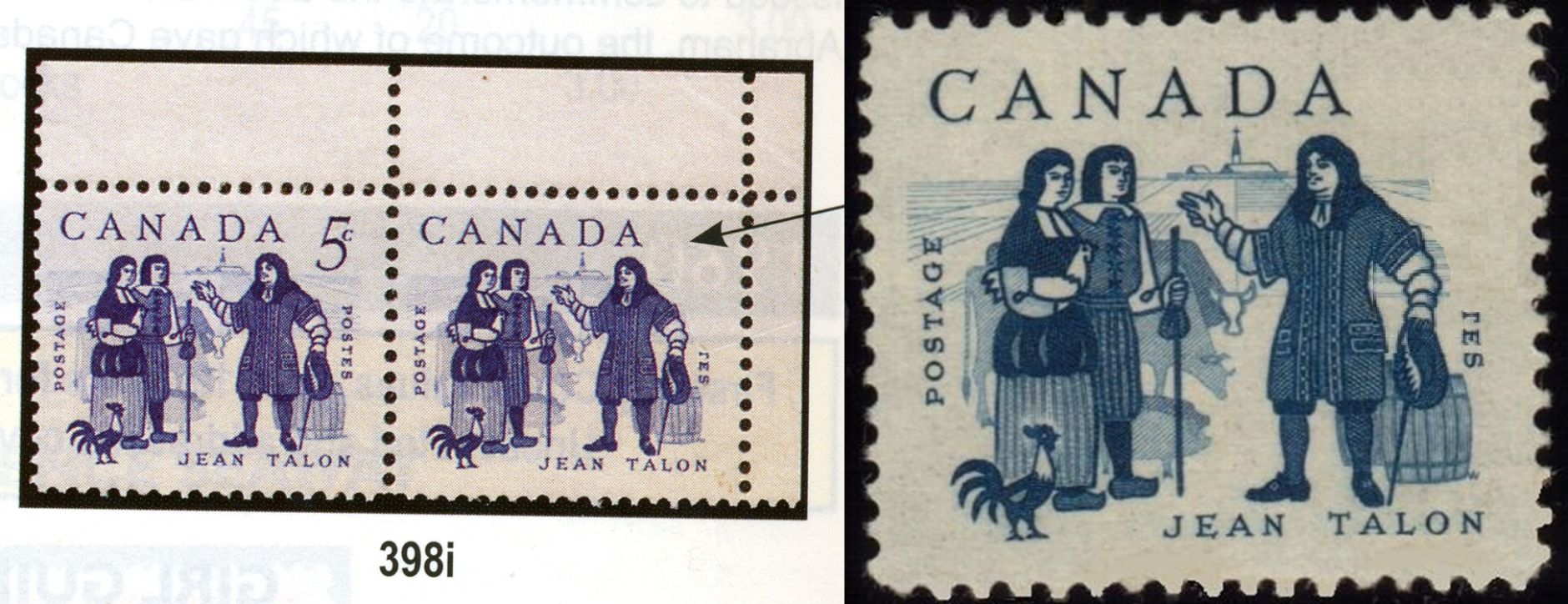 |
|
Send note to Staff
|
|
|
Pillar Of The Community
Canada
1637 Posts |
|
|
At first I thought it's probably the magic of editing the image, but after looking again it is different. See how the s has moved to the right on the single image. And the perfs are not 100 % exactly the same. |
|
Send note to Staff
|
| Edited by No1philatelist - 08/22/2025 08:22 am |
|
|
Pillar Of The Community
United States
1085 Posts |
|
|
The single stamp image looks suspicious to me. It looks like there are vertical "paint" strokes (at least 6 of them) perhaps covering the image underneath. |
|
Send note to Staff
|
|
|
Pillar Of The Community

United States
1055 Posts |
|
|
Correct, pretty sure the image of the single stamp is Photoshopped. This is not necessarily nefarious, I suppose this could have been done by a catalog editor to create a printable high-resolution image, if the editor did not have access to a high quality scan of the genuine stamp.
Zooming in on the affected area, the pixelization pattern is significantly different than the rest of the stamp. Vertical brush strokes can be seen as described by NicholasC, and oddly the 'S' is misaligned. Note that when zooming in, the 'S' is nice and smooth fuzzy, but the "TE" that are out of alignment are jagged and pixelated after being affected by the image editing software. Possibly the 'radius' of the brush stroke to erase the background was too wide and affected the adjacent text.
Also note that the genuine stamp (the corner stamp in the pair) has a visible indentation in the ink pattern where a piece of cardboard or other foreign matter landed on the printing plate to cause the lack of printing. The edge of the printed area is a clean straight line caused by this foreign matter or possibly a foldover. On the single stamp, the edge of printing is a wavy and clearly hand-drawn line.
Curious. Good observation NicholasC. |
|
Send note to Staff
|
|
|
Replies: 18 / Views: 3,096 |
|


