| Author |
 Replies: 13 / Views: 2,417 Replies: 13 / Views: 2,417 |
|
|
Pillar Of The Community
1849 Posts |
|
|
|
|
Valued Member
United States
240 Posts |
|
|
Hi Kevin, So what is the real sure way of knowing if they are fakes? Just the boldness of the ink? These look like the ones that were in that box that had "fakes" on alot of the stuff. Respectfully, Gary |
Send note to Staff 
|
|
|
Pillar Of The Community
1849 Posts |
|
|
Gary.....
just looking at these (from the front) you can easily tell they were made on a typewriter.
The gum on the ovpt issues is a TYPE II gum breaker....only on Kans/Nebr ovpts.
If you look at the gum, tilted to a light source, you will see a HZ ridge (not actually a ridge)
These issues have only 1....approx 22mm apart.
|
|
Send note to Staff
|
|
|
Pillar Of The Community
United States
670 Posts |
|
|
Pillar Of The Community
1849 Posts |
|
|
I did send the seller a email explaining about the ovpts....
He replied....I was correct and he will end the auction.
Glad to see he did.....(everyone makes mistakes, he replied nicely)
He also has some fakes on the other values..... |
|
Send note to Staff
|
|
|
Valued Member
United States
240 Posts |
|
|
Sure is quite easily seen if one knows what he's looking for. Just found the #673 I have is a fake. Thanks Kevin, I appreciate the help, as always. Gary |
|
Send note to Staff
|
|
|
Valued Member
Canada
242 Posts |
|
|
It's always nice to see a seller actually take action, rather than tell you to mind your own business and hopes an ignorant buyer will bite.
Dan |
|
Send note to Staff
|
|
|
Pillar Of The Community
1545 Posts |
|
|
There are the word lengths of "Kans." and "Nebr". ...From very left tip of the "K" to the very right tip of the period "." in "Kans.", the overprint should measure 9.2 mm. By the same notion, the tip to tip measurement of "Nebr." should be 9.0 mm.
-IBFS |
|
Send note to Staff
|
All science is either Physics or Stamp Collecting. -- Ernest Rutherford |
|
|
Valued Member
United States
44 Posts |
|
|
Fonts are different too... aside from the weight, I mean. Note the ascender on the lower case "B" - the real one has a notch in the serif, while the fake is just a straight serif.
If it was made by rolling up into a typewriter, it would have impact damage on the back. No way a key could strike paper that thin and not leave an mark. |
|
Send note to Staff
|
|
|
Valued Member
United States
180 Posts |
|
|
Wow I guess I am a newbie. I couldn't see the differences. I wonder how many stamps I have that are fake. |
|
Send note to Staff
|
|
|
Valued Member
United States
44 Posts |
|
|
Quote:
Wow I guess I am a newbie. I couldn't see the differences. I wonder how many stamps I have that are fake. Ha! I've been collecting since 1968 and I still feel like a newbie. The great thing about a community like this is that the real pros are patient and take the trouble to explain everything - so long as you don't try to flog a new-found C3a. As for fakes, people in the art world have built collections off of known forgeries, and these collections are exhibited as such. I suppose you could do the same with stamps, but it's not the same. |
|
Send note to Staff
|
|
|
Bedrock Of The Community
United States
12128 Posts |
|
|
Just to put a graphic comparison in this thread (rather than the links previously posted) here are the two blocks of stamps shown side-by-side: 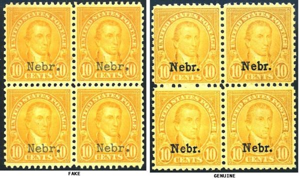 |
|
Send note to Staff
|
|
|
Pillar Of The Community
1849 Posts |
|
|
Pillar Of The Community
United States
1624 Posts |
|
| |
Replies: 13 / Views: 2,417 |
|




 Posted 12/20/2013 09:40 am


