| Author |
 Replies: 20 / Views: 7,452 Replies: 20 / Views: 7,452 |
|
Bedrock Of The Community
United States
12128 Posts |
|
|
The new Winter Fun booklet of stamps scheduled for issue on October 23, 2014 is now available for pre-order sales at the USPS Store's website: https://store.usps.com/store/browse...d=buy-stampsAs I take a closer look at the designs, is anyone else "freaked out" by the appearance of the skaters stamp? It looks to me as if the skaters either have no heads or at least the heads are freakishly small compared to the rest of their bodies. 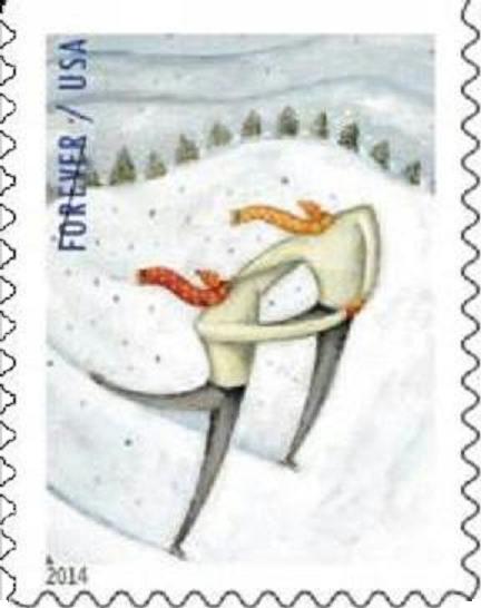  I guess one chalks it up to "artistic license". What do you think? |
|
Send note to Staff
|
| Edited by wt1 - 09/26/2014 10:48 am |
|
|
|
|
Pillar Of The Community
Canada
6525 Posts |
|
|
I don't mind it. Simply a drawing style.
I'm wondering if the more conservative of US citizens will be taken aback that the skaters are both male. They seem to have great form! |
Send note to Staff 
|
|
|
Pillar Of The Community
United States
789 Posts |
|
|
androgynous artistic depiction in an attempted political correct view???? |
|
Send note to Staff
|
|
|
Pillar Of The Community
1515 Posts |
|
|
Pillar Of The Community
United States
845 Posts |
|
|
I agree. Typical stamp trash. I see very little in this stamp that relates to ice skating besides the tiny skates and then obviously winter stuff. But what about ice or even an attempt at depicting an actual skating form - how can anyone skate without knees? And where's the fun? I see a couple of pinheads with steel rods up their backsides. Ah well... |
|
Send note to Staff
|
|
|
Pillar Of The Community
United States
8956 Posts |
|
|
Another vote against. Getting more and more glad that I do not collect this any more!
Peter |
|
Send note to Staff
|
|
|
Pillar Of The Community
United Kingdom
623 Posts |
|
|
Sorry, but it is just a label. Like Peter4522 I wouldn't buy these, or indeed any new stamp issues from any country (I'm not just US biased!). Classic stamp design stopped in the 1960s, with the Machins. Just my '2 cents'.  |
|
Send note to Staff
|
|
|
Rest in Peace
United States
4052 Posts |
|
|
Awful. Is the artist the most politically correct? Hard to believe there was an open competition, and a fair-minded group of people picked this design.
There is an artist in Israel who paints whimsical clothing fantasies; the ball gown hanging in the closet comes out to dance with the tuxedo, etc. No heads; just the hangers. Very, very good.
Cheers,
/s/ ikeyPikey |
|
Send note to Staff
|
|
|
Rest in Peace
720 Posts |
|
|
Once again we hear the same old complaint: these stamps are the classic stamp designs of the past. Of course not, ideas, art, clothing changes. It would be a boring world if we stayed always with the past. I like the designs. The depiction of the free spirit of the skater.
Glenn Estus |
|
Send note to Staff
|
|
|
Bedrock Of The Community
United States
10625 Posts |
|
|
This is an early holiday stamp, plain and simple. It's clearly meant to be lighthearted, since winter brings enough misery on it's own. It always amazes me that people get so bent out of shape about stamps like this. It isn't meant to convey any significant message; just a whimsical attitude. Something that we probably need a bit more of in troubled times. |
|
Send note to Staff
|
|
|
Moderator
1589 Posts |
|
|
I can accept the "whimsical" justification. But it doesn't explain (to me) the original question. Are they headless or not? What is with that? I has to be more than "whimsy." It has to be some art style us simple folk don't get. |
|
Send note to Staff
|
|
|
Bedrock Of The Community
United States
10625 Posts |
|
|
Bedrock Of The Community
United States
10625 Posts |
|
|
Valued Member
United States
86 Posts |
|
|
I also am "freaked out" by the appearance of these mini-headed skaters; appears that the postal service sought advice from some Amazon rain forest headhunting tribe with expertise in the art of head-shrinking. Yikes, enough already! |
|
Send note to Staff
|
|
|
Pillar Of The Community
Canada
6525 Posts |
|
|
I"m glad you found the site of the illustrator, recollector. I really like her work, very contemporary and expressive. Not for everyone I suppose.
I'm not sure, considering the size a postage stamp, that particular image works well, though as I've already said in a previous post, I like it.
I'm thinking the problem with the stamp is the overall design. The use of text, such as it is, is weak, and doesn't help the overall layout at all. Perhaps too the image could have been cropped differently to give the design more impact.
I should point out too, after reading some comments about the illustration, this is a conceptual image, not an anatomy lesson. If they wanted a realistic approach, the designer could or would have used a photograph. A painting can't always be a Leonardo. |
|
Send note to Staff
|
| Edited by jamesw - 09/26/2014 11:21 pm |
|
|
Rest in Peace
United States
7097 Posts |
|
|
Replies: 20 / Views: 7,452 |
|


