| Author |
 Replies: 68 / Views: 77,557 Replies: 68 / Views: 77,557 |
|
|
|
Valued Member
Australia
6 Posts |
|
|
Valued Member
Australia
6 Posts |
|
|
Had to alter my username as I lost my password and had ro re register.from c102 to cc102. |
Send note to Staff 
|
|
|
Valued Member
Australia
6 Posts |
|
|
I have 4 superb lyrebird two have watermarks two do not I am sure they are the green mist retouch with no watermarks ,any interest of any kind is welcome |
|
Send note to Staff
|
|
|
Valued Member
Australia
6 Posts |
|
|
To cjd sorry this reply took so long I have 2with no watermark any interest is welcome |
|
Send note to Staff
|
|
|
Valued Member
Australia
6 Posts |
|
|
Hello to kgb im responding to any interest on my 4superb lyrebird 2with wm 2 without wm |
|
Send note to Staff
|
|
|
Valued Member
United States
254 Posts |
|
|
My reasearch online brought me here anyway. ))) It looks like that googling is not necessary anymore. You are the BEST! So.. I do have a two stamps, used, no watermarks; one of two in a pretty good condition (I think). Could you please help me - what does the " Var. g in piece of 40" mean? Thank you. 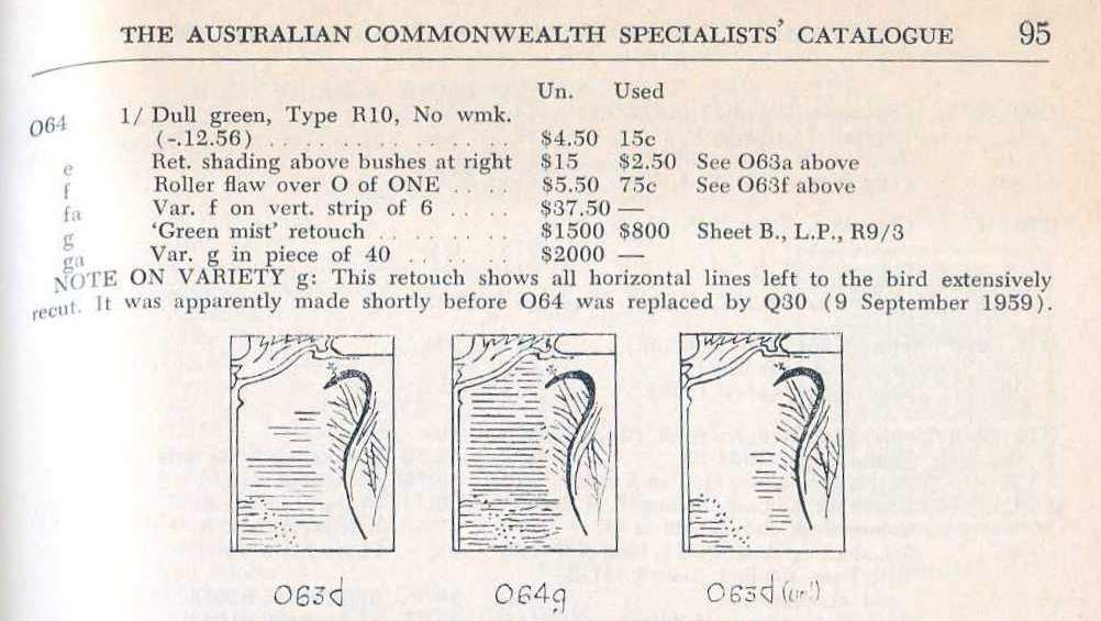 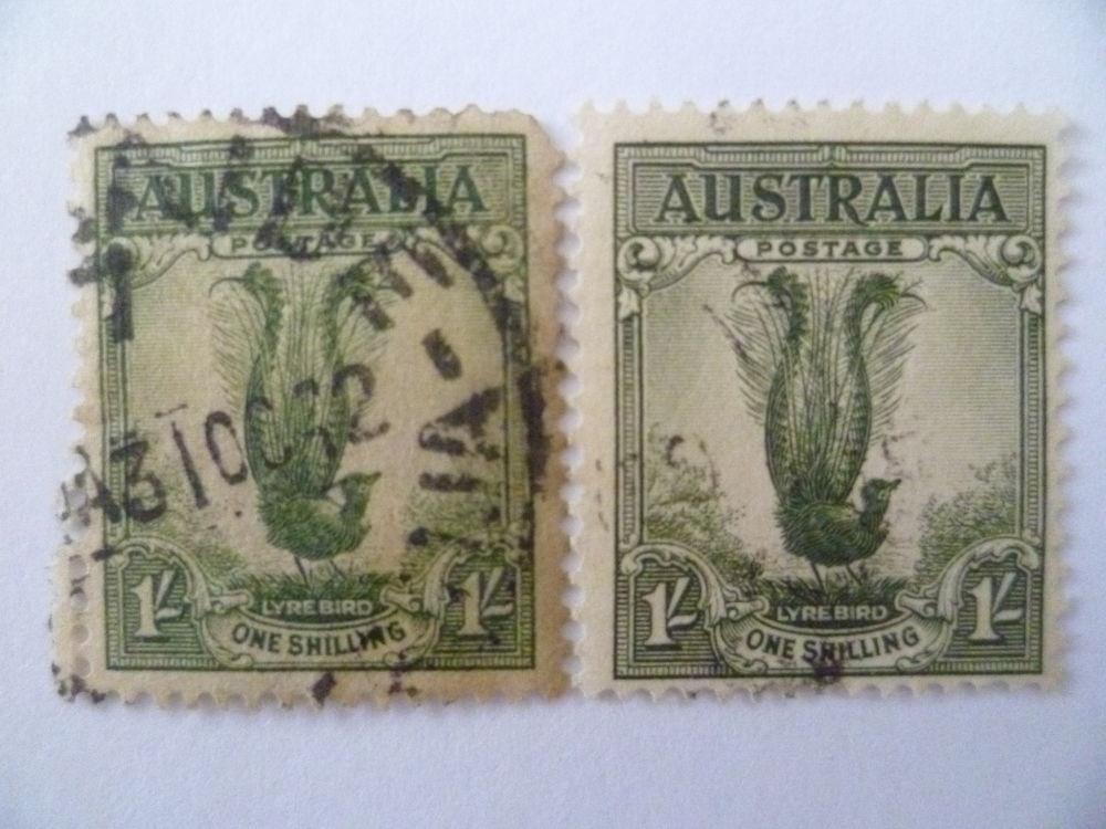 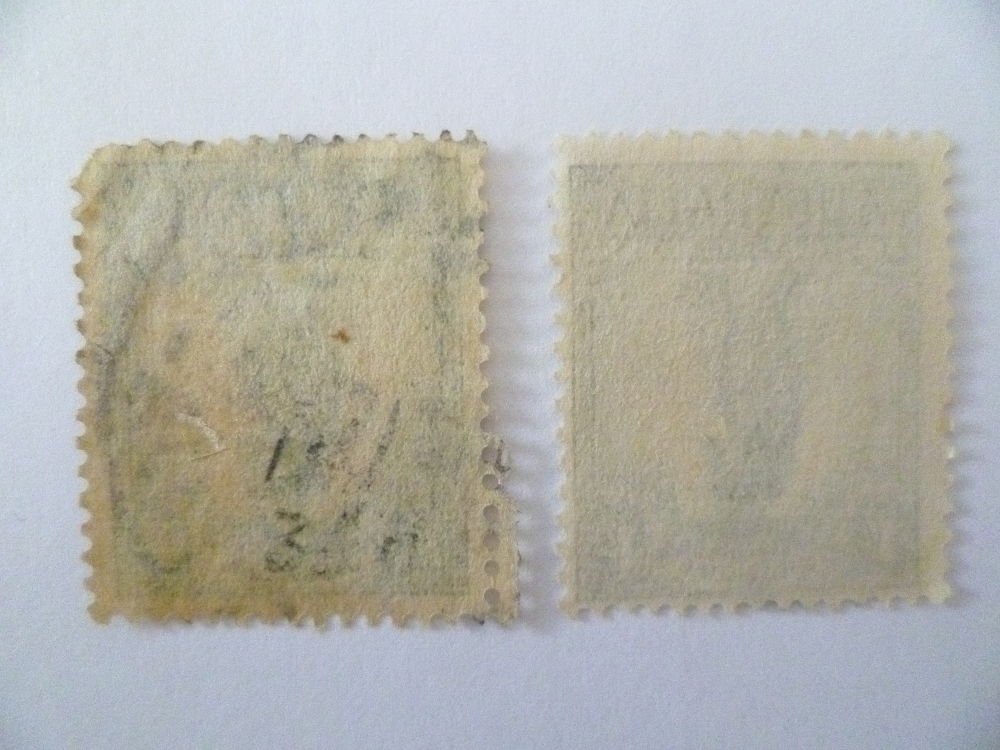 |
|
Send note to Staff
|
| Edited by Aurora - 08/17/2016 2:32 pm |
|
|
Moderator

United States
5094 Posts |
|
|
Quote:
what does the "Var. g in piece of 40" mean? It simply means that you have a green mist retouch example in a large block of 40 stamps. Your copies are not the green mist retouch, though, as evidenced by picture O64g. You have the normal stamp, poor quality in one case. Keep looking. |
|
Send note to Staff
|
|
|
Valued Member
United States
254 Posts |
|
|
Thank you. I need a second opinion. Please kindly review my pics. Really... isn't 064g? 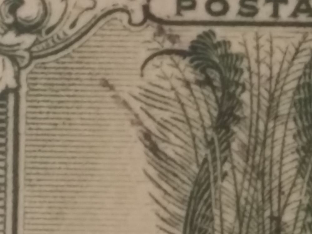 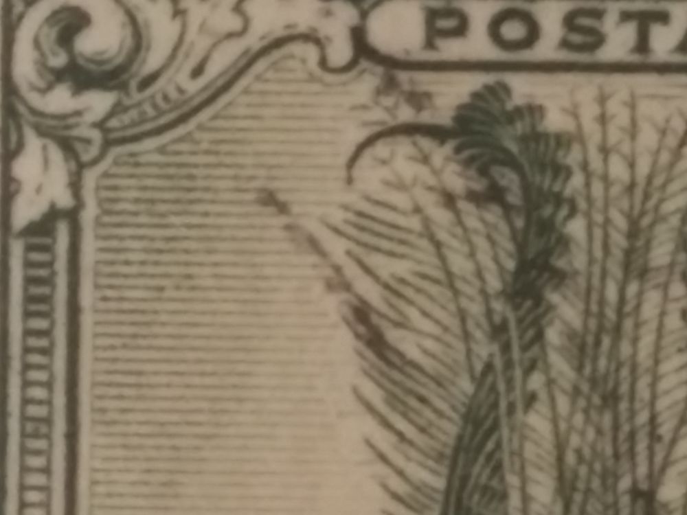 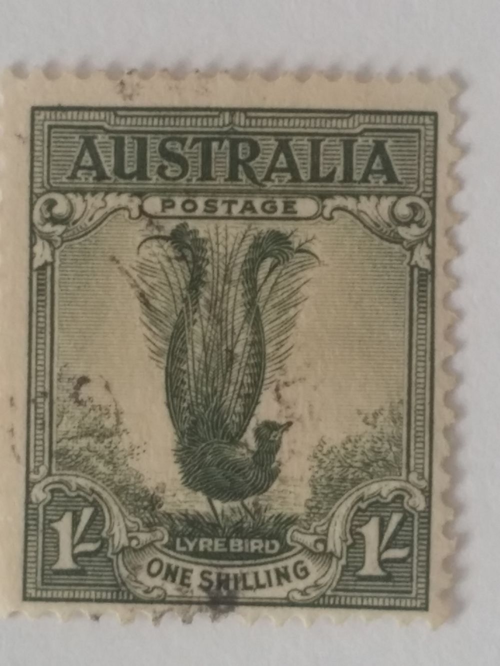 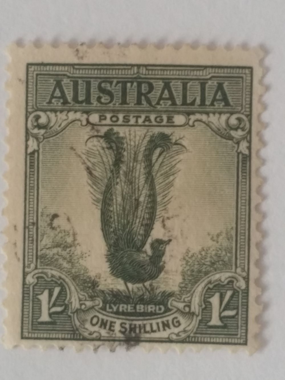 |
|
Send note to Staff
|
|
|
Valued Member
United States
254 Posts |
|
|
Valued Member
Australia
127 Posts |
|
|
So many times I have pondered this stamp. I only have one example of the 1956 lyrebird (about a dozen of the earlier version) and it's mint. After much searching online (like everyone else) and originally missing the extra pages on this post I finally have seen an example of the "mist retouch" good enough to work with, well on blow-up not as good an image as mine (good enough with time spent looking closely at the mist lines that are almost invisible in the lower portion - show up better on mine - clearer picture). Easier to see is that the mist lines in the upper portion go through the lyrebird tail rather than stopping. left = mine Having said all that I think my example is the real deal however I would appreciate others views. The more the better! 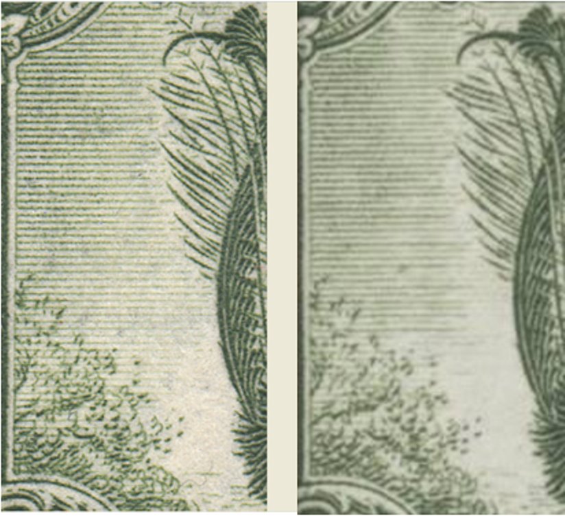 |
|
Send note to Staff
|
| Edited by castor - 01/09/2018 10:55 pm |
|
|
Pillar Of The Community
Australia
3282 Posts |
|
|
In Aurora's illustration from the catalogue there are breaks in the horizontal lines, which I've attempted to point out below. Is this what we would be looking for? Or am I barking up the wrong tree? To my eyes the variety looks easier to see in the image of the block.  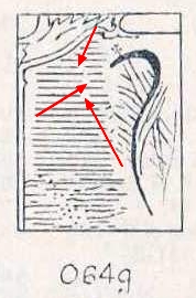 |
|
Send note to Staff
|
|
|
Valued Member
Australia
127 Posts |
|
|
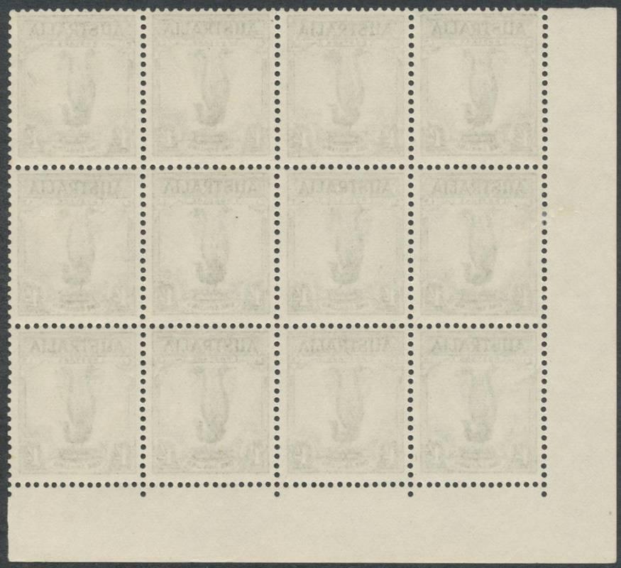
I should have explained in my previous post that the picture on the right is taken from an auction house and is from a block of 12. This is it, and so I'm taking that to be the Real Deal. 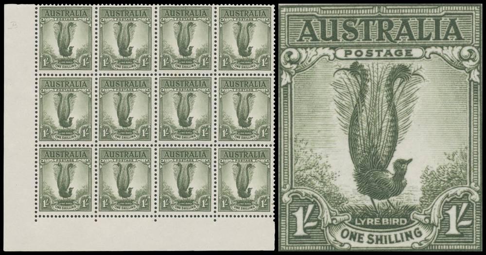 So my original picture shows my image on the left and the real deal on the right. The left image looks like the one on the right. Going to the drawing you posted Bobby, I have some concerns - the feathers on the lyrebird arc out and down while the actual stamp shows arcing out and up (or more or less straight) and have breaks where the "Real Deal" image don't. I have the same drawing (you posted) in an ACSC catalogue 73g (old edition) and then an image in an up-to-date- SG catalogue 203da which agrees with the two images. I believe both drawings are not an indication (how they were then and aren't now is interesting?) So my thoughts are the drawing brings more confusion to the matter and shouldn't be considered. I'm taking the auction picture and the SG image as correct and in that case my stamp looks the same ??? |
|
Send note to Staff
|
|
|
Pillar Of The Community
602 Posts |
|
|
Hi, don't think you have it sorry. To me, the overall effect of the retouch looks like folds in a curtain, a curving with alternating light and dark features. It is better to view this image from a distance than examine the minutiae. I think the cartoon is a poor rendering of the variety. That being said, what I know about Aussie stamps would not fill many pages in a book. |
|
Send note to Staff
|
|
|
Pillar Of The Community
Australia
3282 Posts |
|
|
Hi Castor, I stood about 6 feet away from my screen and the one on the right appears to have a white void (for want of a better description) from about half way across to three quarters of the way across the area. I agree that the catalogue illustration didn't help...... I'm not so sure that you have the variety  |
|
Send note to Staff
|
| Edited by Bobby De La Rue - 01/10/2018 01:23 am |
|
|
Valued Member
Australia
127 Posts |
|
|
Hi Bobby, I appreciate your time on this.
I have read this stamp is extremely difficult to assess.
I'm using my tv so what I'm looking at is a 88cm x 50cm (2.89 x 1.65 ft) screen. Same distance as you and where the "white void" is you can see faint lines (slightly darker where mine are - respectively). Ignore the 'curly hair' very near the bottom that crosses a mist line and continues down then curving up and again down and into the flora on the left. So with this size screen the 'void' is not so void. Bobby what size screen are you looking at?
ps. Even though the image of the 'real deal' is not as good, having said that mine may be a better example (as they do have variations of the variations - check out my image to appear soon-ish under the "Decimal varieties" post for the "double spear" on the Cook stamp. |
|
Send note to Staff
|
| Edited by castor - 01/10/2018 09:14 am |
|
|
Replies: 68 / Views: 77,557 |
|