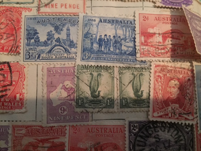
I got a glimpse of one once also Eiger and I agree to actually see one in the wild is pretty special.
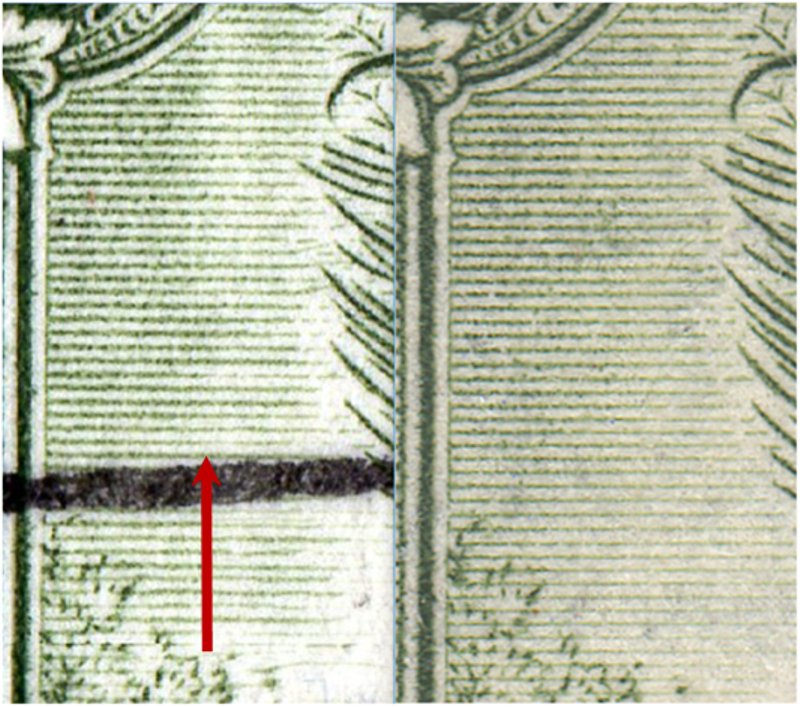
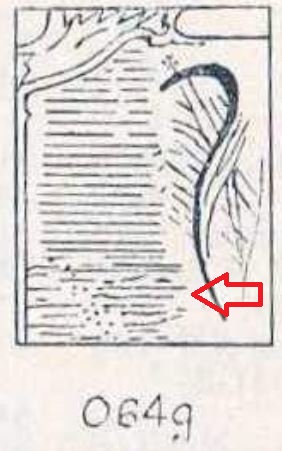
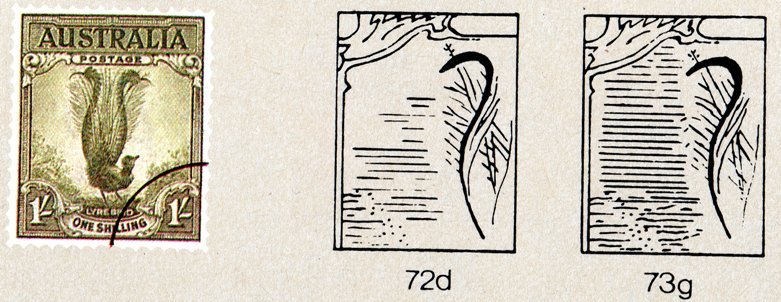
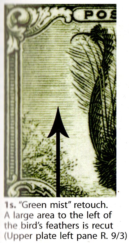
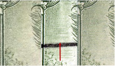
I came across an image on another site that is supposed to be the 'real deal'. Taking into account the two differing scans etc, I put this image together. On the left is the 'real deal' with an arrow in place as per the position from Stanley Gibbons (which also gives the following information "A large area to the left of the birds feathers is recut").
Even though I had read this before I got lost in the lower area to the left of the bird (below the feathers) that you could call a 'white void'. It appears (now that I've let the above REALLY sink in) that this area has nothing to do with the "green mist" retouch. So please ignore earlier posts in relation to this area. Where we should ONLY be looking is left of the "birds feathers".
Working on SG's words it is a "large area". So how large? Does the area start from the arrow point and continue all the way to the top of the feathers? Is it that there generally appears to be a 'left' and 'right' in thickness of lines? Is the retouch actually a thinning of lines (Is that possible without replacing?)
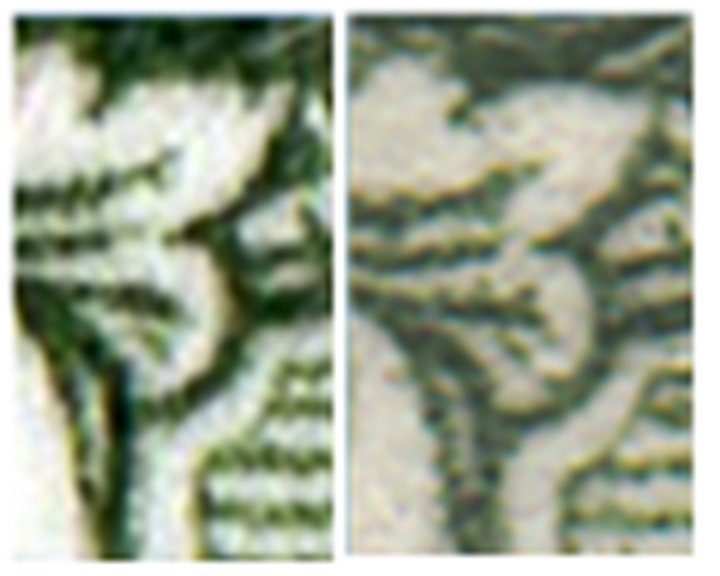
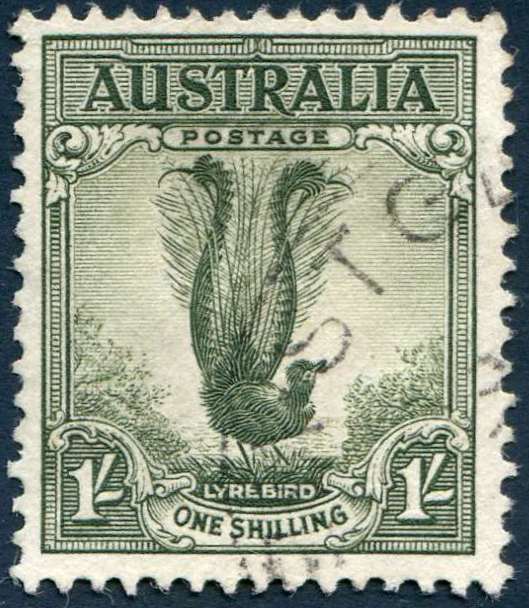
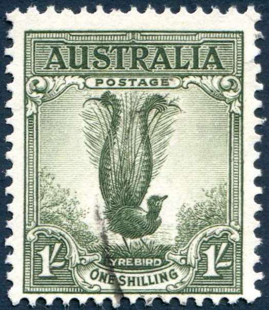
Having said that the 'left' lines on mine (right stamp) appear to have the same thickness but mine doesn't appear to have the same distinction between 'left and 'right'. Was the retouch to reduce the lines on the 'right' (rather than thicken) to make a distinction.
Mine doesn't appear to be the same as the stamp on the left (in that respect) and so I tend to defer to (alas) mine is not the 'real deal' but I'm still not 100% satisfied, still a niggle.
Is this 'left' and 'right' even part of the distinction or just a partial light inking? Still so many questions. I'm not satisfied... yet. Left stamp is 'real deal' and used, right stamp is mint - could anything have occurred to 'lighten' this area as a result of posting?
Note, if you look closely at the petal top left you will see mine has more detail (thicker and complete) lines where the 'real deal' doesn't - just to add to the confusion.
There is no talk on a distinction between 'left' and 'right'. Is this, like the 'white void', a complete furphy. Is mine (mint) just a 'fuller' inking than the 'real deal'? That's where my thinking is...
Can anyone provide an image of the normal stamp for comparison as I only have this one mint stamp to work with.
Sorry if this is convoluted.